
County Employment and Wages, First Quarter 2026: A Small Revision, a Big Reallocation
ECONOMIC INDICATOR REPORT · COUNTY EMPLOYMENT AND WAGES, FIRST QUARTER 2026
A Small Revision, a Big Reallocation
The Preliminary Benchmark Revision to Payrolls Is Only 79,000 Jobs, a Fraction of Last Year's. The County Data Underneath It Show a Labor Market That Barely Grew, Growth Pushing to the Metro Edge, and the Federal Payroll as the Nation's Largest Local Drag
EARLY SIGNAL
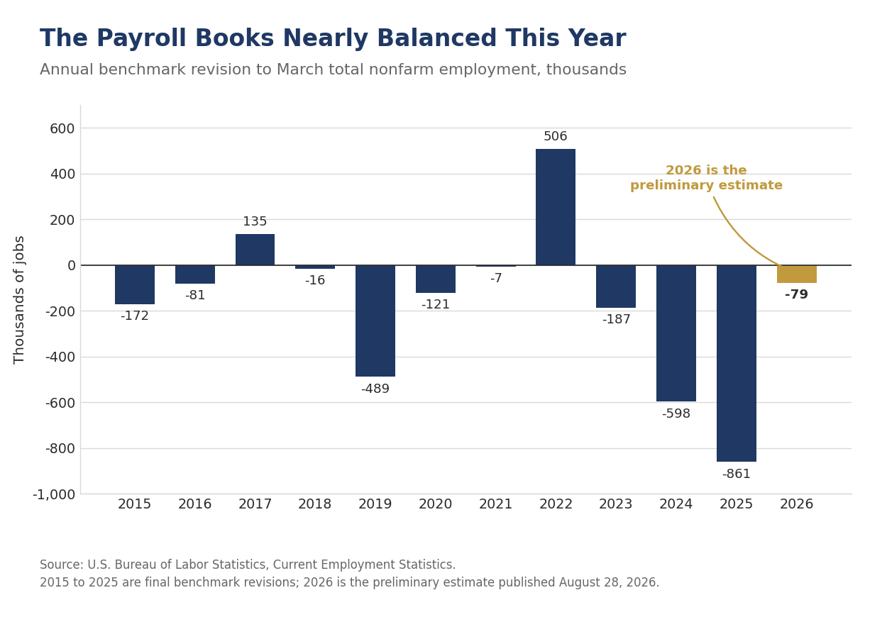
- The preliminary benchmark revision to March 2026 nonfarm payrolls is -79,000 jobs, or -0.1%. The revision equals 0.05% of the March payroll level, against preliminary estimates of -911,000 last year, -818,000 in 2024 and -306,000 in 2023, and against an average absolute annual revision of 0.2% over the prior decade. In our July employment report we wrote that the date that mattered was August 28 and that we wanted to see this revision before changing our second half forecast. We are not changing it.
- The composition of the revision is the story, not the total. Transportation and warehousing was revised up 135,100, government up 99,000, information up 87,000, financial activities up 85,000 and construction up 62,000. Retail trade was revised down 154,600, private education and health services down 96,000 and wholesale trade down 86,200. The level was close. The map was not, and the mix is healthier and more heavily weighted toward higher value-added industries.
- The county data behind the benchmark describe a labor market that barely grew. National covered employment rose 0.1% over the year through March, to 154.8 million, and only 151 of the 376 largest counties, two in five, added jobs at all.
- Apply the benchmark to the payroll data and the underlying pace of hiring is somewhere between 11,000 and 16,000 jobs a month. The unadjusted universe count that BLS benchmarks against added about 132,000 jobs between March 2025 and March 2026, or 11,000 a month; carrying the revision through the seasonally adjusted series puts the figure near 194,000, or 16,000 a month. Over those same twelve months the unemployment rate rose a single tenth, to 4.3%, and it has since fallen to 4.1%. The breakeven rate of job growth is far below the 50,000 to 75,000 we have been carrying.
- Education and health services added roughly twice the entire private sector's net job gain. Covered employment in the sector rose 2.0% over the year while private employment overall rose 0.2%. Only construction, at 0.9%, and leisure & hospitality, at 0.3%, added anything at all besides. Manufacturing fell 1.4%, trade, transportation and utilities fell 0.9% and government fell 0.7%.
- Five of the twelve fastest-growing large counties in the country are in North Carolina. New Hanover was up 2.4%, Cabarrus and Wake 2.3% each, and Buncombe and Union 2.1% each. This is the employment counterpart to the population story we told in Beyond the Beltlines in August, and it is a stronger claim, because population is counted where people sleep and these data count where they work.
- The federal payroll is the largest single local drag in the country. Washington, D.C. and Arlington County each shed 4.5% of their covered employment, the steepest declines among the 376 largest counties. Within Washington, combined government, which in the District is overwhelmingly federal, lost 25,704 jobs, down 11.0%. Maryland lost 1.7% of its covered employment, the worst of any state.
- Wages rose almost everywhere jobs did not, and first-quarter wage data need a caveat. The national average weekly wage rose 3.9% to $1,654, against a 3.4% gain in average hourly earnings over the same twelve months. QCEW wages include bonuses and exercised stock options, and those land in the first quarter.
THE NUMBER WE SAID TO WAIT FOR
The preliminary benchmark revision to total nonfarm employment for March 2026 is -79,000 jobs, or -0.1%. Private employment was revised down 178,000, also -0.1%, and government was revised up 99,000. Each year the Bureau of Labor Statistics compares its sample-based payroll survey against a near-universe count built mostly from state unemployment insurance tax records, which is the same Quarterly Census of Employment and Wages that produced this morning's county data. The two releases landed within the same hour, which is why we are treating them as one report.
This is a small number by any standard, and it follows two very large ones. The preliminary estimate a year ago was -911,000 jobs and the year before that -818,000. Over the prior ten years the annual benchmark revision has averaged 0.2% of total nonfarm employment in absolute terms. This year's revision works out to 0.05% of the March payroll level, a quarter of that average and less than a tenth of last year's estimate. The last comparable reading was the 2023 benchmark.
The right explanation is arithmetic rather than a sudden improvement in the survey. A benchmark revision measures the gap between two independently estimated counts, and the gap has room to open only when the estimate is moving. The establishment survey's net birth-death model adds jobs for firms too new to have entered the sample, and when business formation runs well below what the model assumes, those additions accumulate into a large annual correction. Payrolls as published have grown about 23,000 a month over the past year. There is very little room in a number that small for the model to be wrong by very much. The revisions of 2024 and 2025 were the correction of an era of rapid post-pandemic churn; this one is the arithmetic of a slow year.
Two cautions belong with the number. First, it is preliminary, and the final revision will be incorporated into the official estimates with the January 2027 Employment Situation report next February, and in each of the last two years the final came in smaller in absolute terms than the preliminary, -598,000 against -818,000 in 2024 and -861,000 against -911,000 in 2025. Second, a small revision at the total is not a clean bill of health for the detail. Sampling error grows as the industry detail gets finer, and this year's sector revisions are large against a total that is nearly zero.
THE LEVEL WAS CLOSE, THE MAP WAS NOT
Strip the total away and the revision describes a substantial reallocation of jobs across the economy. Transportation and warehousing was revised up 135,100 jobs, or 2.0%, the largest upward revision of any industry. Information was revised up 87,000, or 3.0%, the largest in percentage terms. Financial activities gained 85,000, construction 62,000 and utilities 8,100. Government was revised up 99,000. On the other side, retail trade was revised down 154,600 jobs, private education and health services 96,000, wholesale trade 86,200, professional and business services 76,000 and manufacturing 67,000.
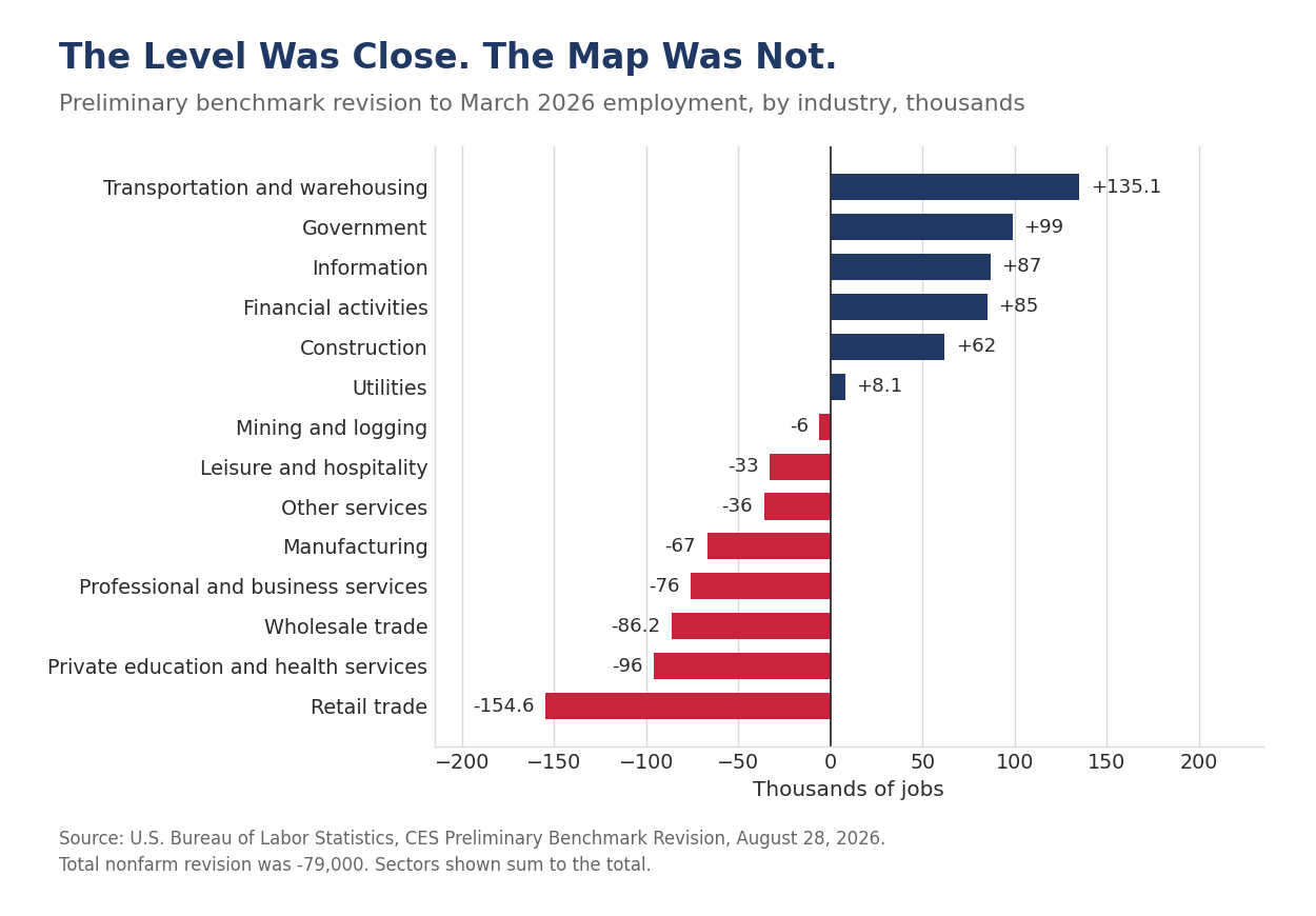
The industries revised up are the ones that build, move and finance things. The industries revised down sell things and staff offices. That pattern is consistent with the capital-led expansion we have described all year, in which business investment in plants, equipment and logistics rather than consumer borrowing is doing the work. We would not lean on a single year of benchmark data to prove a thesis, since these are exactly the cells where sampling error is largest. The direction is worth noting, however, because the survey has been understating the goods-handling side of the economy and overstating the selling side for two years running.
Retail is the revision to sit with. Retail trade was revised down 126,200 jobs last year and 154,600 this year, roughly 1% of the industry in each case. Retail sales have not been weak over that stretch. What has changed is how many people it takes to produce a dollar of sales, as fulfillment moves from the store floor into the warehouse. The 135,100-job upward revision to transportation and warehousing sits directly opposite the 154,600-job downward revision to retail trade, and the two are close enough in size to be worth treating as one movement rather than two.
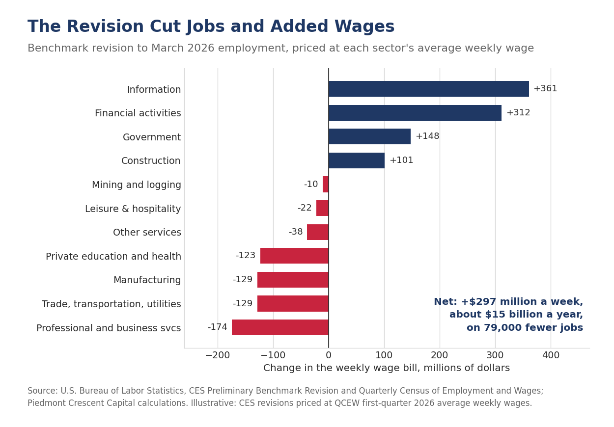
The revision also moved jobs up the wage ladder, which is what makes the mix healthier than the total suggests. Price each sector's revision at its own average weekly wage in the first quarter and the jobs added carried an average of $2,769 a week against $1,518 for the jobs removed, on a national average of $1,654. Information at $4,147 a week and financial activities at $3,668 account for most of the upward revision, while retail trade and private education and health services, the two largest downward revisions, sit near the bottom of the wage table. On that arithmetic the revision subtracted 79,000 jobs and added close to $297 million a week to the estimated national wage bill, or roughly $15 billion a year. The calculation is illustrative rather than official, since it prices CES revisions at QCEW wages, but the direction of it does not depend on the method.
The upward revision to government sits awkwardly beside everything else in this release. Federal payrolls have been falling all year in the monthly employment reports, and the county data show exactly where. The reconciliation is that the benchmark revision is a level correction across all of government, most of which is state and local, while the federal reductions are a flow that ran through the same twelve months. Both can be true. We would watch whether the February revision holds that upward adjustment.
WHAT THE UNIVERSE COUNT SAYS ABOUT THE BREAKEVEN
The two releases together let us estimate the pace of hiring without the survey in the middle. Benchmarking sets the March level of the payroll survey equal to the universe count, so the unadjusted March 2025 payroll figure of 157.540 million is also the universe count for that month. The universe count for March 2026 is the published unadjusted figure of 157.751 million less the 79,000 revision, or about 157.672 million. The universe therefore added roughly 132,000 jobs over the twelve months, close to 11,000 a month. Carrying the same revision through the seasonally adjusted series, which shows 273,000 as published, leaves about 194,000, or 16,000 a month. The two figures bracket the truth, so call the underlying pace 11,000 to 16,000 jobs a month; the argument that follows does not depend on which end of that range you choose.
Fewer than 20,000 jobs a month did not raise the unemployment rate. The rate went from 4.2% in March 2025 to 4.3% in March 2026, a single tenth, and it has fallen since, to 4.1% in July. A labor market that absorbs its entrants at that pace is not a weak labor market. It is a small one. Labor force growth has slowed sharply as the first half of the Baby Boom passes deeper into its seventies and net immigration falls back, and the arithmetic of the breakeven follows labor force growth, not demand.
We are marking our estimate of the breakeven rate of payroll growth down to a range of zero to 40,000 a month, from 50,000 to 75,000. We flagged the old range as probably too high on August 7, when payroll growth over the prior twelve months was running well below anything a 50,000 breakeven could reconcile with a falling unemployment rate. The benchmark now supplies the arithmetic to replace it rather than merely to doubt it. The revision changes our estimate of how many jobs the economy created; it does not change our view of what those jobs mean, because the denominator moved with the numerator.
This is the most consequential thing in either release for policy. If the breakeven sits below 40,000, a run of prints in the 20,000 to 50,000 range is a labor market in balance rather than one deteriorating, and the Federal Reserve should read it that way. It also means the labor market will look weak on the headline for as long as the supply constraint lasts, and there is nothing monetary policy can do about a shrinking labor force. The zero to 40,000 range describes the year through March. We feel the breakeven is now slowly rising, however, as jobs are being created in parts of the economy, manufacturing in particular, where they have been lagging. Covered manufacturing employment fell 1.4% over the year to March, but the establishment survey has added 31,000 factory jobs since December after shedding 56,000 over the second half of last year. The foreign-born labor force is still shrinking, down roughly 550,000 over the year to July with its participation rate off to 65.5% from 66.1%, and we expect workers with valid documentation to return gradually from here as processing normalizes. Neither force is large enough to change the arithmetic this year, and both argue for a higher breakeven by 2027.
THE GROWTH FRONTIER SHOWS UP IN THE PAYROLL DATA
Only 151 of the 376 largest counties added jobs over the year, and where they are is the most useful thing in this release. Licking County, Ohio, immediately east of Columbus and home to Intel's Ohio semiconductor campus and a fast-expanding distribution cluster, led the nation at 3.6%, with trade, transportation and utilities adding 677 jobs, or 3.7%, its largest contribution. Licking is one of five counties added to the publication tables this year on crossing the 75,000-employee threshold, alongside Kenton, Kentucky; Union, North Carolina; Gregg, Texas; and Kenosha, Wisconsin. It topped the list in its first year in the tables.
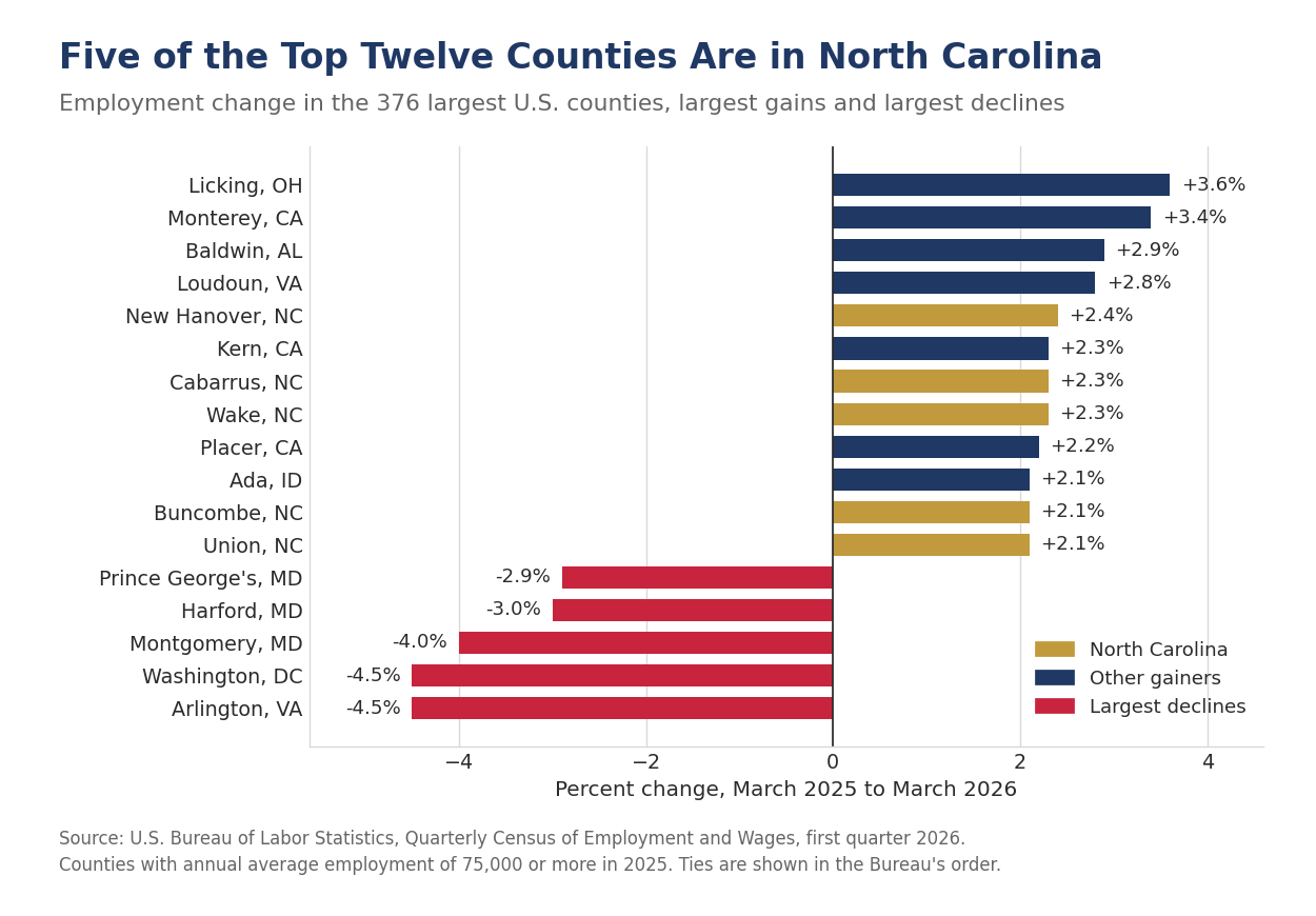
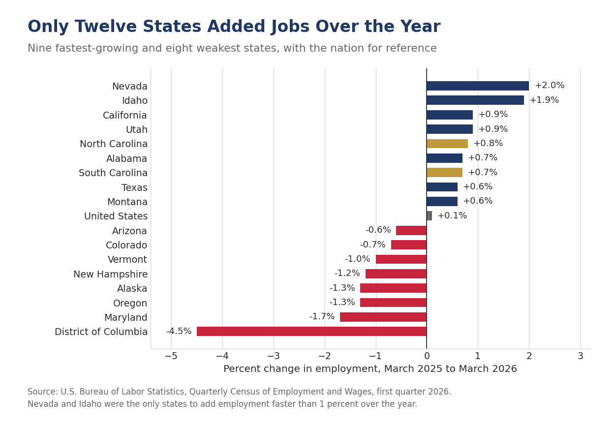
Five of the twelve fastest-growing counties in the country are in North Carolina. New Hanover, which is Wilmington (+2.4%), leads the group, followed by Cabarrus, which is Concord and Kannapolis just northeast of Charlotte, and Wake, which is Raleigh (+2.3% each), then Buncombe, which is Asheville, and Union, which is Monroe just southeast of Charlotte (+2.1% each). California placed three, Monterey, Kern and Placer, and no other state placed more than one. North Carolina's covered employment rose 0.8% statewide and South Carolina's 0.7%, against 0.1% nationally, while Nevada (+2.0%) and Idaho (+1.9%) were the only states to add employment faster than 1%. The Southeast is not one economy in these data either, with Alabama up 0.7%, Georgia and Florida flat, and Tennessee and Virginia each down 0.2%.
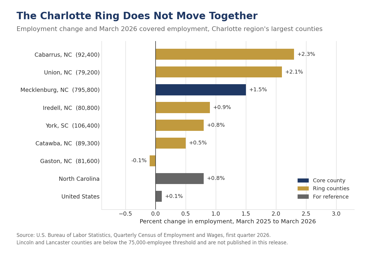
This is the same story we told in Beyond the Beltlines, told with better evidence. That report rested on the Census Bureau's population estimates, which count people where they sleep. These data count them where they work. The distinction matters because the standing objection to the beyond-the-metro thesis has always been that the frontier counties are bedroom communities, absorbing households whose paychecks are still earned downtown. Cabarrus and Union counties are the first ring outside Charlotte and both are now growing employment faster than Mecklenburg, which grew 1.5%. The frontier is producing jobs, not only housing them.
York County, South Carolina, directly south of Charlotte, needs a word of its own. York grew 0.8% over the year, half Mecklenburg's pace, which reads as a laggard set beside Cabarrus and Union. It is not one. York is a large and mature market in its own right, with 106,400 covered jobs in March, more than Cabarrus, Union, Iredell or Catawba, anchored by Rock Hill's long-established manufacturing, health care and services base. Fort Mill, which has expanded nearly 58% since April 2020 and ranks sixth among all American cities and towns over that span, is growing against that base rather than adding to a small one, and the county rate averages the two together. The same arithmetic will run the other way as Octapharma's $1.5 billion critical care plant in Rock Hill, confirmed in July, moves from announcement to payroll.
The ring does not move together, which is the more useful finding for anyone allocating capital across it. Cabarrus (+2.3%) and Union (+2.1%) outran Mecklenburg (+1.5%), while Iredell (+0.9%), York (+0.8%) and Catawba (+0.5%) trailed it and Gaston (-0.1%) lost ground. A spread of 2.4 percentage points inside a single commuting shed is a reminder that the frontier is a set of individual county decisions about land, water, schools and power rather than a wave that lifts everything at a given radius from the core.
Buncombe County is a separate issue. It lost population over the year to July 2025, the only large North Carolina county to do so, as Hurricane Helene displaced households from the Asheville area. Its covered employment rose 2.1% over the year to March 2026 even so. Rebuilding shows up in the payroll data well before it shows up in the population data, and we would expect the population figures to follow.
The wider Sun Belt reads the same way, one ring out from the employment centers. Baldwin County, Alabama, across the bay from Mobile and home to Daphne, Fairhope and Gulf Shores, grew 2.9% and ranked third in the country, followed by Placer County outside Sacramento (+2.2%), Ada County, which is Boise (+2.1%), Hays County between Austin and San Antonio (+2.0%), and Washington County, Utah, which is St. George, and Boone County, Kentucky, outside Cincinnati (+1.9% each). Fort Bend outside Houston, Hamilton outside Indianapolis and Utah County outside Provo each grew 1.8%. Every one of them is either the next ring beyond a larger labor market or a coast that retirees are still choosing.
| County | March 2026 employment (thousands) | Employment, % change | Q1 2026 average weekly wage | Wage, % change |
|---|---|---|---|---|
| Licking, OH | 77.0 | +3.6 | $1,289 | +5.7 |
| Baldwin, AL | 89.5 | +2.9 | $1,033 | +3.6 |
| New Hanover, NC | 132.7 | +2.4 | $1,347 | +4.6 |
| Cabarrus, NC | 92.4 | +2.3 | $1,205 | +3.2 |
| Wake, NC | 666.8 | +2.3 | $1,680 | +3.2 |
| Ada, ID | 295.3 | +2.1 | $1,503 | +7.9 |
| Buncombe, NC | 135.1 | +2.1 | $1,197 | +0.9 |
| Union, NC | 79.2 | +2.1 | $1,340 | +4.4 |
| Hays, TX | 99.4 | +2.0 | $1,089 | +3.5 |
| Mecklenburg, NC | 795.8 | +1.5 | $2,167 | +3.1 |
| Charleston, SC | 285.4 | +1.3 | $1,492 | +5.7 |
| Spartanburg, SC | 160.9 | +1.2 | $1,234 | +4.0 |
| Horry, SC | 145.4 | +1.2 | $974 | +3.4 |
| Orange, FL | 961.0 | +1.2 | $1,432 | +3.2 |
| York, SC | 106.4 | +0.8 | $1,306 | +2.9 |
| Greenville, SC | 302.8 | +0.6 | $1,346 | +4.5 |
| United States | 154,771.9 | +0.1 | $1,654 | +3.9 |
Selected counties among the 376 largest, ranked by employment growth. National leaders with Southeast comparisons. Employment change is March 2025 to March 2026; wage change is first quarter 2025 to first quarter 2026. Source: U.S. Bureau of Labor Statistics, Quarterly Census of Employment and Wages.
One caveat of this release is worth noting. This morning's report covers only the 376 counties with annual average employment of 75,000 or more, which together hold 73.5% of covered workers, and it measures counties rather than towns. The frontier communities at the center of Beyond the Beltlines are buried inside county averages. Fort Mill's growth sits inside York County's 0.8%, Wendell's inside Wake County's 2.3%, and Greer's and Woodruff's inside Greenville's 0.6% and Spartanburg's 1.2%. Only Leland, in Brunswick County, sits in a county too small to appear at all. County averages understate what is happening at the leading edge of the frontier, which is where the Bureau's full county file, covering every county in the country, has to do the work.
WASHINGTON IS THE NATION'S LARGEST LOCAL DRAG
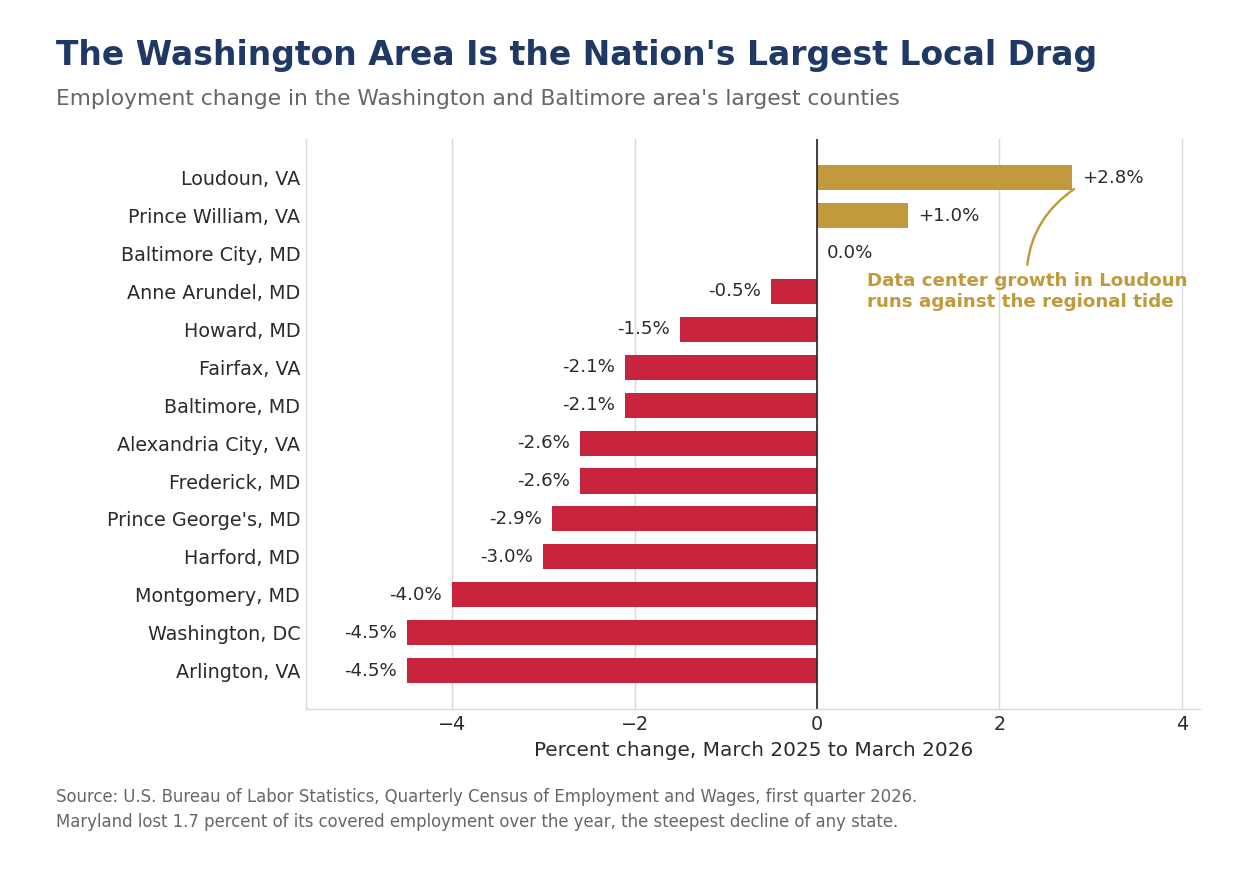
Washington, D.C. and Arlington County, Virginia each lost 4.5% of their covered employment over the year, the steepest declines among the 376 largest counties. Within Washington, combined government, the great majority of which in the District is federal, shed 25,704 jobs, a decline of 11.0%. Montgomery County, Maryland fell 4.0%, Harford County 3.0%, Prince George's County 2.9%, and Alexandria City and Frederick County 2.6% each. Maryland lost 1.7% of its covered employment, the largest decline of any state, and the District lost 4.5%.
The most important detail is where Arlington's losses landed. The largest decline inside Arlington was not in government at all. It was professional and business services, down 3,563 jobs or 5.6%. That is the contractor channel, and it is the reason a reduction in federal spending shows up in the private payroll data of the surrounding counties rather than staying inside the government line. Anyone forecasting the Washington regional economy off federal headcount alone will understate the effect by a wide margin.
Arlington also supplies this release's cleanest warning about reading wage data. Its average weekly wage rose 8.8% even as its employment fell 4.5%. When a labor market sheds its lower-paid positions first, the average wage of those who remain goes up. Arlington's wage gain is a composition effect and should not be read as evidence of a strong local economy.
Loudoun County runs against the entire regional tide, and the reason is instructive. Loudoun grew 2.8%, fourth fastest in the country, while every neighbor except Prince William contracted. Loudoun sits at the center of the largest data center market in the world. We made the case to the ElectriCities membership in August that large-load development is now a first-order variable in local economic performance, and Loudoun is that argument in a single bar on a chart. It is also a reminder that the employment gain from a data center campus is modest next to its tax base and its load, which is why the tariff question matters more to a municipal system than the job count does. Virginia lost 0.2% of its covered employment statewide, a figure that conceals both ends of this distribution.
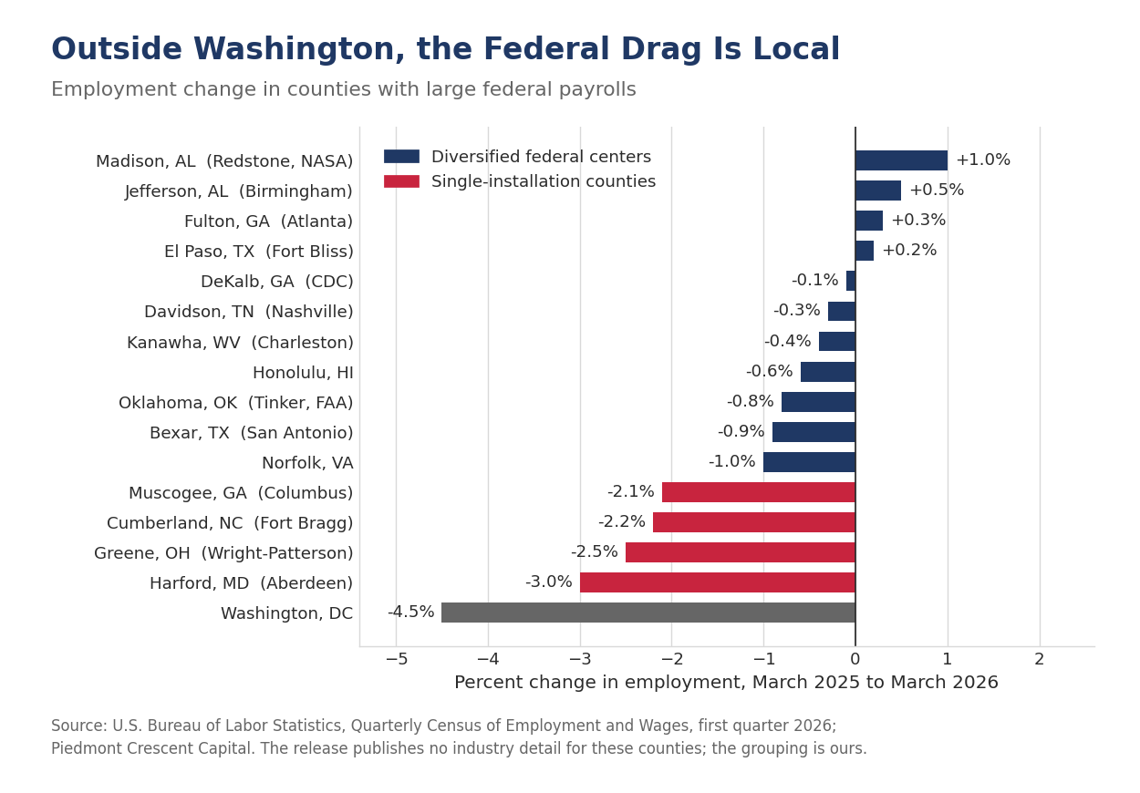
The obvious question is where else a large federal payroll shows up in these data, and the answer is that it mostly does not. DeKalb County, Georgia, home to the Centers for Disease Control and Prevention, was essentially flat (-0.1%) and Fulton County next door grew 0.3%. Jefferson County, Alabama, which is Birmingham, grew 0.5%, and Kanawha County, West Virginia, which is Charleston, slipped 0.4%. Madison County, Alabama, which is Huntsville and holds Redstone Arsenal along with NASA's Marshall Space Flight Center, grew 1.0%. Bexar County, Texas, home to Joint Base San Antonio, fell 0.9%, Honolulu 0.6% and Oklahoma County, which holds Tinker Air Force Base and the FAA's Mike Monroney Aeronautical Center, 0.8%. A federal payroll sitting inside a diversified metropolitan economy is not large enough to set the direction, even where it is large in absolute terms.
The exception is the county built around a single installation. Harford County, Maryland, which contains Aberdeen Proving Ground (-3.0%), Greene County, Ohio, beside Wright-Patterson Air Force Base (-2.5%), Cumberland County, North Carolina, which is Fayetteville and Fort Bragg (-2.2%), and Muscogee County, Georgia, which is Columbus and the Army post beside it (-2.1%), all rank in the bottom thirty counties in the release. The Bureau publishes industry detail only for the extremes and the ten largest counties, so the attribution is ours rather than its own, though the pattern is difficult to read another way. A county whose employment base rests on one federal facility has nothing to diversify into when that facility retrenches, which was the lesson of the base closure rounds and applies again now.
WAGES ROSE ALMOST EVERYWHERE JOBS DID NOT
The national average weekly wage rose 3.9% to $1,654 in the first quarter, and 358 of the 376 largest counties posted increases. Set that against the 151 counties that added jobs and the shape of this labor market is clear enough. Employers are paying more and hiring less. Average hourly earnings from the payroll survey rose 3.4% over the same twelve months, and the half-point difference is mostly bonuses and exercised stock options, which QCEW captures and which land in the first quarter.
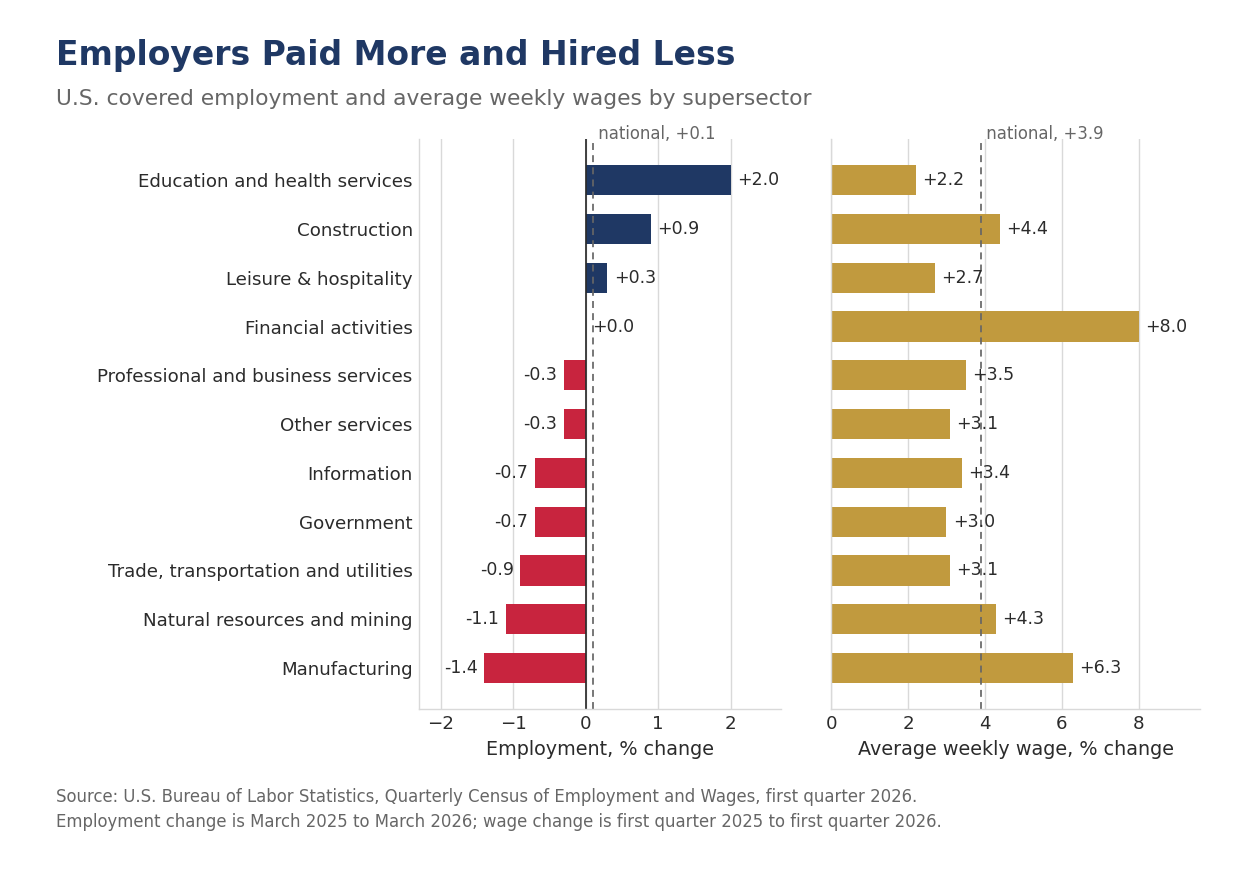
| Industry | March 2026 employment (thousands) | Employment, % change | Q1 2026 average weekly wage | Wage, % change |
|---|---|---|---|---|
| Total, all industries | 154,771.9 | +0.1 | $1,654 | +3.9 |
| Private industry | 132,003.9 | +0.2 | $1,681 | +4.0 |
| Natural resources and mining | 1,669.0 | -1.1 | $1,711 | +4.3 |
| Construction | 8,113.8 | +0.9 | $1,634 | +4.4 |
| Manufacturing | 12,451.2 | -1.4 | $1,918 | +6.3 |
| Trade, transportation and utilities | 28,145.8 | -0.9 | $1,317 | +3.1 |
| Information | 2,853.3 | -0.7 | $4,147 | +3.4 |
| Financial activities | 8,679.5 | 0.0 | $3,668 | +8.0 |
| Professional and business services | 22,065.1 | -0.3 | $2,295 | +3.5 |
| Education and health services | 26,618.7 | +2.0 | $1,282 | +2.2 |
| Leisure and hospitality | 16,453.0 | +0.3 | $655 | +2.7 |
| Other services | 4,625.3 | -0.3 | $1,067 | +3.1 |
| Government | 22,768.0 | -0.7 | $1,496 | +3.0 |
U.S. covered employment and wages by supersector. Employment change is March 2025 to March 2026; wage change is first quarter 2025 to first quarter 2026. Source: U.S. Bureau of Labor Statistics, Quarterly Census of Employment and Wages.
Two county wage figures should be read as accounting events rather than labor market signals. St. Tammany Parish, Louisiana posted the largest wage gain in the country at 23.4%, driven by an increase of $29,561 in the average weekly wage in natural resources and mining, a rise of 771.8%. A single high-compensation event in one small industry can move a whole parish's average. At the other end, San Francisco recorded the largest decline at 9.6%, on a drop of $2,092, or 27.9%, in professional and business services, even as San Francisco employment rose 2.0% and ranked thirteenth in the country. That is equity compensation normalizing against an extraordinary first quarter of 2025, not a labor market weakening.
The largest counties tell the compensation story most plainly. All ten of the largest counties recorded wage increases and only three added jobs. New York County led on wages at 7.9%, to $4,902 a week, with financial activities up $1,477, or 11.1%, to $14,770. Orange County, California posted the largest employment gain among the ten at 0.7%, on the strength of education and health services, which added 10,753 jobs, or 4.0%. Every state in the Southeast remains below the $1,654 national average weekly wage except Virginia, from $1,296 in South Carolina and $1,515 in North Carolina to $1,539 in Georgia and $1,518 in Florida. Texas at $1,646 sits just under it, and Virginia's $1,665 is a Northern Virginia number attached to a Southern state. That gap is the frontier's recruiting argument and, over time, its ceiling.
OUR CALL
The Trend Was Right. Mark the Breakeven Down.
The revision we said to wait for came in at -79,000 jobs, and it does not change our forecast for the second half of the year. The payroll survey has tracked the universe count more closely over the past twelve months than in either of the two years before it, and the argument that the labor market has been falling apart behind a flattering survey does not survive this release.
What does survive is the level. Stacking the benchmark on the county data puts underlying job growth between 11,000 and 16,000 a month over the year through March, against an unemployment rate that rose one tenth and has since fallen to 4.1%. We are therefore reducing our estimate of the breakeven rate of payroll growth to a range of zero to 40,000 a month from 50,000 to 75,000, and that change matters more for policy than the revision does. A labor market that holds its unemployment rate steady on that little hiring is resilient, not weak, and the binding constraint is a shrinking labor force against which monetary policy has nothing to offer. We now see a greater chance that the Fed will hike the federal funds rate in December and firmly believe they will hold off moving before the midterm elections. That pulls the first hike forward from the first quarter of 2027 in our August 18 forecast. We still carry one more in 2027, so the path ends where it did, at 4.00% to 4.25%.
The next near-term test is the August employment report on September 4, where the latest possible Labor Day should hold summer staff on payrolls through the survey week and produce a stronger print than the past three months have delivered. The later test is falsifiable and we will report it either way: the final benchmark revision, published with the January 2027 Employment Situation next February, will be less negative than -79,000 jobs. In each of the last two years the final came in smaller in absolute terms than the preliminary, and this year's starting point already sits inside the noise.
Mark P. Vitner
Chief Economist, Piedmont Crescent Capital
mark.vitner@piedmontcrescentcapital.com
Sources: U.S. Bureau of Labor Statistics, County Employment and Wages, First Quarter 2026, and CES Preliminary Benchmark Revision, both August 28, 2026; U.S. Bureau of Labor Statistics, The Employment Situation, July 2026, Current Employment Statistics benchmark article and Current Population Survey; U.S. Census Bureau, Vintage 2025 Population Estimates; Piedmont Crescent Capital and Southeast Economic Advisors calculations.
This report is for informational purposes only and does not constitute investment advice. Views expressed are those of Piedmont Crescent Capital as of the date of publication and are subject to change without notice.

The Speech and the Curve | The View from Jackson Hole
A View from the Piedmont — Previewing Warsh’s Jackson Hole Speech
The Speech and the Curve
A special outlook ahead of Jackson Hole. Chair Warsh has removed the Committee's guidance on purpose and Secretary Bessent has stepped into the long end on purpose, and Friday is the first chance anyone has had to hear what the first of those two is for.
Chair Warsh delivers his first Jackson Hole keynote on Friday morning, nineteen days before the September meeting, and he does it into a bond market that has stopped being sure what he is for. He took office on May 22. The market has three months of votes, one press conference and one round of testimony to read him by, and in that time the 30-year has closed at or above 5 percent for thirty-four consecutive sessions and touched 5.34 percent on Tuesday, a level last seen in June 2007. This report sets out what we think he is trying to accomplish, what the evidence says it has cost so far, and the five things we will listen for on Friday. The companion weekly published this morning carries the week's data, the latest on the strait, the consumer and the market dashboard.
Also published today: The Long End Does the Tightening, this week's View from the Piedmont, which carries the week's data, the latest on the strait, the consumer and the market dashboard.
What the Chair Is Trying to Accomplish
Our read on Chair Warsh's objectives is that he wants to move policy off the crisis footing it has held since 2008. The Federal Reserve has spent eighteen years running a policy built for emergencies, first the financial crisis and then the pandemic, and the balance sheet still carries $6.75 trillion of the evidence. If policy takes on a more normal tenor, rates settle higher than anything markets have been accustomed to since 2007. The 30-year touching 5.34 percent on Tuesday, a level last seen in June of that year, is what that transition looks like from the inside. The Warsh Fed appears set on exorcising the ghosts of two once-in-a-century events, and policymakers would do well to remember that the restless spirits are in the here and now, around sovereign debt in the western democracies and in Japan. How do you end crisis-driven monetary policy without triggering the next crisis?
There are now two principals acting on the long end and they hold opposite theories of how a bond market should form prices, which is a new fact and an underrated one. Chair Warsh has withdrawn forward guidance deliberately. He declined to submit a dot in the June projections, having encouraged his colleagues to submit theirs, cut the June statement to 130 words from 341 in April, and told the July press conference that market participants are “learning to play the ball, not the referee,” and that by not “spoon-feeding markets, by not previewing our decisions, by not sort of giving nudges and leans,” the Committee gets the market’s own judgment back instead of an echo of its own forecast. Secretary Bessent has moved the other way. He doubled long-end buybacks on Wednesday, said the next day the number “could be more than the $4 billion per issue,” and framed the purpose as signaling: “We believe that the yields don't reflect the underlying fundamentals.” He describes his own role as being “the nation's top bond salesman” and Treasury yields as “a strong barometer for measuring success.” One official is trying to take his own footprints out of the price. The other is trying to put his in. Investors are pricing a curve on which both are true.
What It Has Cost So Far
Mark Zandi made the sharpest version of the first half of this argument on August 2, and we think he is right about the mechanism and early on the evidence. His post held that the risk to the economy is not the level of the funds rate but the Committee's unwillingness to provide “even a modicum of forward guidance — or a broad sense of their reaction function,” that most meetings will therefore be live and investors “left guessing and repeatedly wrong-footed,” and that this “means more volatility in bond and stock markets, which is likely already reflected in a larger term premium, rising long-term interest rates, and a wobbly equity market.” The mechanism is sound. The evidence, when we go and get it, says something more specific and more useful.
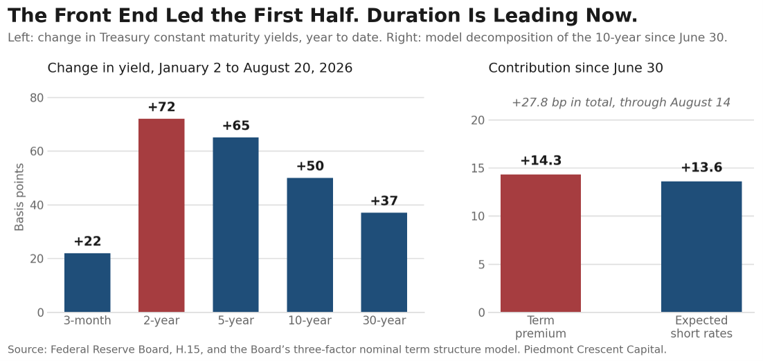
Start with the term premium, because it did not do the work he assigns it, at least not until midsummer. On the Federal Reserve Board's own three-factor model, the 10-year term premium was 0.84 percent on August 14. That is positive and it is not extreme; the series has ranged from negative 0.66 percent in 2020 to 2.52 percent in 1992. More to the point, the first half of this year was a front-end story rather than a duration story. The 2-year rose 72 basis points against 37 at the 30-year, which is a market taking out any further rate cuts and repricing the odds of a hike, not one demanding compensation for term. It is only since June 30 that the split changes: of the 28 basis points the 10-year has added since then, the model attributes roughly half to term premium and half to expected short rates. Zandi's channel is opening. It is not what moved the market in the first half, and dating it correctly matters, because the cure for a policy-expectations problem and the cure for a term-premium problem are not the same. Figure 1 shows both halves of that, and the shift between them is the whole of the argument about what the missing reaction function has cost.
Now take the volatility claim, which is where the received story is wrong and where the correction is more interesting than the claim. The MOVE index, which prices implied volatility in Treasuries, closed the week near 73. Its typical range in a normal decade is 90 to 110, and it ran above 150 through 2022 and 2023. By level, the Treasury market is calm. But it is the only cross-asset volatility gauge higher on the year, up roughly 15 percent, and it rose 6 percent this week. The VIX made a 2026 low at 14.25 in the same stretch, with the S&P 500 up 12 percent for the year. Equity volatility is falling while rate volatility is rising. That is not “a wobbly equity market.” It is a bond market that has become less sure of itself while the equity market has become more so, and the divergence is the cleanest evidence available that the uncertainty in question is specifically about policy and specifically about the curve.
The better test of disagreement is not volatility at all, it is dispersion, and there the evidence is stronger than anyone has made it. Reuters polled 22 bond strategists between August 6 and 11. The median had the 10-year at 4.50 percent in three months, which is 19 basis points below where it currently sits. Eighteen of the twenty-two said the risk to their own number was to the upside. That is not a distribution of views. That is a profession that does not believe its own consensus, and it is what you would expect from forecasters asked to predict a Committee that has stopped describing how it decides crucial policy debates. Mark Cabana of Bank of America put the cost in one line: “There is literally a price to be paid for the lack of guidance — higher interest rates and a higher cost to taxpayer.”
Why Long Rates Have Risen
The decomposition on the week points to inflation compensation rather than term premium. The 5-year TIPS breakeven rose 10 basis points to 2.34 percent and the 10-year rose 7 basis points to the same level, while the nominal 30-year fell 2 basis points and the 2s-30s spread narrowed 4 basis points. Read those together and the marginal investor spent the week marking up expected inflation, mostly on oil and to an even greater extent diesel and jet fuel staying higher for longer, and taking a little back out of the real term premium after the buyback news.
Take the year rather than the week, however, and the answer inverts, and it is the single most useful fact we can put in front of a client right now. The Federal Reserve Bank of Cleveland publishes a decomposition of the nominal Treasury curve into an expected inflation component and a real interest rate, estimated from yields, inflation swaps and surveys. Figure 2 plots it for the 10-year through August. The expected inflation piece has gone from 2.33 percent in January to 2.49 percent in August, a gain of 16 basis points. The real interest rate has gone from 1.67 percent to 2.20 percent, a gain of 53. The market decomposition says the same thing without a model: the 10-year TIPS real yield has risen 44 basis points this year while the 10-year breakeven has fallen 6. Cleveland's inflation risk premium is unchanged on the year at 44 basis points. This year's rise in long-term interest rates has essentially nothing to do with expected inflation. The Committee's own minutes said so twice, in June and again in July, when the staff reported that higher nominal yields “reflected higher real rates” while longer-term inflation compensation “remained stable and consistent with the Committee's 2 percent longer-run inflation objective.”
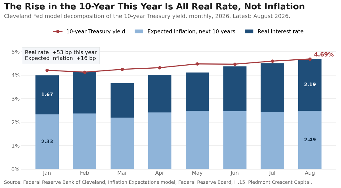
That reframes the question from what people expect prices to do to what they demand for lending long, and those are separate arguments with separate cures. An inflation-compensation problem is a central bank problem and the Committee has a tool for it. A real-rate problem is a supply-of-savings problem, and the three claimants on that supply are the ones we listed at the top: a federal government borrowing $2 trillion a year, an energy shock that raises the real cost of everything that moves, and a capital program in artificial intelligence that has issued $220 billion of hyperscaler debt through August 10 against $12.5 billion in the same period last year. Neither the funds rate nor a buyback operation is a tool for that. We would put it plainly: the long end is not asking the Federal Reserve for anything. It is asking to be paid more for term, and it is asking three separate borrowers at once.
The Collision Nobody Has Priced
And there is a collision coming that neither institution has acknowledged. One of Chair Warsh's five task forces is examining the ample-reserves regime and the composition of the portfolio, and a Fed moving toward a shorter, more market-neutral balance sheet would push duration out of the central bank and into private hands. That is Operation Twist run backwards, and it steepens the curve and raises the term premium. Treasury, at the same moment, is buying long duration back in through the buyback window. The two arms of the government would be trading against each other in the same maturity, the Federal Reserve supplying duration and Treasury retiring it. We do not think this is deliberate on either side and we do not think it is priced. If Chair Warsh says anything on Friday about the maturity composition of the portfolio, that is the sentence to read twice.
So we would restate the proposition in a form that can be scored. A missing reaction function raises the price of duration, and the evidence should appear first in rate volatility and forecast dispersion, then in the term premium, and only last in the level of long-term yields. On that ordering we are one stage further along than the commentary assumes: dispersion is extreme, rate volatility is rising against falling equity volatility, and the term premium has been contributing about half the move since June 30 after contributing essentially none before it. The number to watch is not the 30-year. It is the MOVE index, and our marker is that it holds above 70 through the September meeting. If Chair Warsh uses Friday to describe how the Committee decides rather than what it will decide, that number falls and the long end gets a bid without anyone having to buy a bond.
Five Things to Listen For on Friday
One. Any description of the reaction function, as distinct from forward guidance. These are not the same thing and the distinction is the whole argument. Forward guidance tells the market what the Committee will do. A reaction function tells the market how it decides, which is what allows anyone to price the next meeting without being told the answer. Governor Waller has drawn that line publicly. If the Chair draws it too, and names the two or three series he weighs most heavily, that is the single most consequential sentence available to him, and it is worth more to the long end than another buyback announcement.
Two. The maturity composition of the portfolio, not just its size. One of the Chair's five task forces is examining the ample-reserves regime and the composition of the balance sheet. The New York Fed's survey of market expectations now has the median participant looking for a $7.1 trillion balance sheet at the end of 2028 against $6.75 trillion today, down from $7.3 trillion expected in April. A Fed that shortens its own portfolio pushes duration into private hands, which steepens the curve and raises the term premium. That would be Operation Twist run backwards, and it would run directly against what Treasury is doing at the same moment.
Three. Whether he characterizes the long-end selloff as a monetary problem or a fiscal one. He has already said that nominal and real yields are materially higher across the curve and that some of the increases are among the most significant in two decades. The question is whose problem he says that is. If he frames it as a monetary problem, the reaction function has changed and the odds of a hike earlier than our first-half 2027 call go up.
Four. The meeting calendar. There is a live discussion of moving from eight scheduled meetings a year to six beginning next year, on the argument that more information accumulates between meetings and policymakers get more time on strategy. Six meetings instead of eight would change how this Committee is read more than anything in the September statement, because it lengthens the interval over which the market has to price policy with no official input at all.
Five. Anything on the inflation target itself, or on how inflation is measured. Inflation has run above 2 percent for more than five years. The Chair said in July that some in financial markets had formed a misimpression that central bankers were tolerant of a somewhat higher target. A task force is examining the data the Committee relies on. We would not expect a framework announcement at a symposium devoted to payments, but a sentence on measurement would travel a long way.
What We Would Do
For borrowers with a capital program, fund the tranche you are sure about before Friday and leave the optional tranche until after September 16. Thirty-year paper at 5.23 percent against a 2-year at 4.19 puts 104 basis points of pickup on the table for the last twenty-eight years of a curve that has repriced in one direction all year. The case for waiting rests on a fiscal package the administration has promised and not delivered and on a speech nobody has read. Neither is a financing plan.
For portfolios, we would stay cautious on duration and own the belly rather than the long bond. The three arguments pushing on thirty-year paper are fiscal, energy and the private credit demand behind the artificial intelligence buildout, and none of the three is waiting on the Committee. We would not extend an operating portfolio past two years to pick up the fifty basis points the long end is offering, because the volatility that comes with it is the same volatility that moved the 30-year 12 basis points in three sessions this week.
For anyone whose plan depends on lower mortgage or corporate borrowing costs in 2027, build the plan without them. Our outlook has the 10-year at 4.70 percent and the 30-year fixed mortgage holding 6.60 percent through 2027, with the funds rate moving up rather than down. A 2027 budget built on a cut is a budget built on a forecast we do not hold, and the long end is the part of the curve that prices the borrowing, not the part the Committee controls.
And for reading Friday itself, watch the rates market rather than the equity market. Equity volatility is at a 2026 low and equity investors have largely stopped pricing policy risk. Rate volatility is the only cross-asset gauge higher on the year. If the speech clarifies the reaction function, the first evidence will be in implied volatility and in the dispersion of strategist forecasts, and only later in the level of the 30-year.
Our call, put down in a form that can be scored. We expect a hold on September 16, no cut in 2026 and a first hike in the first half of 2027, and we expect the 30-year to trade between 5.00 and 5.40 percent through the September meeting. We expect the MOVE index to hold above 70 through that meeting, which is the cleanest available test of whether the missing reaction function is costing the Treasury market anything. What would move us: an explicit framing of the long-end selloff as a monetary problem rather than a fiscal one, or a credible multi-year fiscal consolidation the market believes. Check us on all of it the week of October 5.
U.S. Economic & Financial Outlook
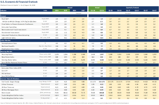
Sources and Notes
Sources and notes. Federal Reserve Board H.15 for Treasury yields and the three-factor term premium; Federal Reserve Bank of Cleveland Inflation Expectations model for the decomposition in Figure 2; the July 29 FOMC press conference transcript and the June and July minutes; Chair Warsh's July 14 testimony; the New York Fed Survey of Market Expectations; Federal Reserve Bank of Kansas City for the symposium program; ICE BofA MOVE index and Cboe for volatility; Reuters poll of bond strategists conducted August 6 to 11; U.S. Department of the Treasury for the August 19 buyback announcement; Mark Zandi, post of August 2, 2026, as carried by Benzinga, Yahoo Finance and Business Insider. The Cleveland Fed decomposition is a model estimate and its components do not sum exactly to the nominal yield; in August the sum lands within a basis point of the 10-year and in March it was 58 basis points below, and we cross-check the conclusion against TIPS, which are exactly additive and say the same thing. Term premium estimates differ materially by model and we have not mixed them. All figures are subject to revision. This report is for informational purposes only and does not constitute investment advice.
Mark P. Vitner
President & Chief Economist, Piedmont Crescent Capital
mark.vitner@piedmontcrescentcapital.com · 704-458-4000
Piedmont Special Reports are published by Piedmont Crescent Capital for informational purposes only and do not constitute investment, legal, or tax advice. Views expressed are those of the author as of the date of publication and are subject to change.
The Piedmont Perspective -- The Shock That Already Happened
The Shock That Already Happened
The Piedmont Perspective
The Argument in Brief
- The chart making the rounds is directionally right and analytically loose. The shift in factor shares is real, but the drawing exaggerates it and the two shares plotted do not sum to one.
- National income has six claimants, not two. In 2025, compensation took 61.7% and corporate profits 16.5%. The remaining 21.8% went to proprietors’ income, rental income, net interest and production taxes.
- The largest reallocation of the past forty years ran from lenders to owners. The profit share rose 8.4 percentage points between 1982 and 2025 while the net interest share fell 9.2 points, from 9.8% of national income to 0.6%. Capital’s combined claim is below where it stood in 1982.
- The timing is the strongest evidence for a labor supply shock. Essentially the whole decline in the labor share happened between 2000 and 2010, from 65.9% to 61.9%, bracketing China’s WTO accession in December 2001. The share has gone nowhere in the fifteen years since.
- The shock is reversing. China’s working-age population has fallen by roughly 60 million since 2015 and the U.S. labor force has contracted by roughly a million people over the past twelve months, against business fixed investment growing at a double-digit pace.
- The call, with a check date. We expect the compensation share of national income to be higher in 2027 than the 61.7% recorded for 2025, and we will check it against the annual national accounts revision each September.
A chart has been making the rounds showing the corporate profit share of national income at a postwar high and the compensation share near a postwar low. The two lines cross in the middle of the last decade and separate afterward, and the caption asks whether we should celebrate the triumph of capitalism or be fearful. Our answer is neither. The shift is real, the best explanation for it is a labor supply shock that has already run its course, and the chart being passed around is drawn in a way that makes the shift look larger and tidier than it is.
Start with the drawing, because everything after it depends on reading the chart correctly. The two lines sit on two different vertical axes. Corporate profits are measured on the left scale and employee compensation on the right, and neither line can be read against the other’s numbers. In the circulating version, the left axis runs from 8% to 18% and the right axis from 60% to 72%. Those are spans of ten and twelve percentage points across the same vertical distance, so a one-point move in the profit share is drawn about a fifth taller than a one-point move in the wage share. The apparent mirror image is partly a choice about where to put the tick marks. Figure 1 redraws the same series with both axes set to an identical twelve-point span, which is the right way to build a two-axis chart. The mirror image survives, which is why the chart deserves to be taken seriously, but its implications are a good deal less dramatic.
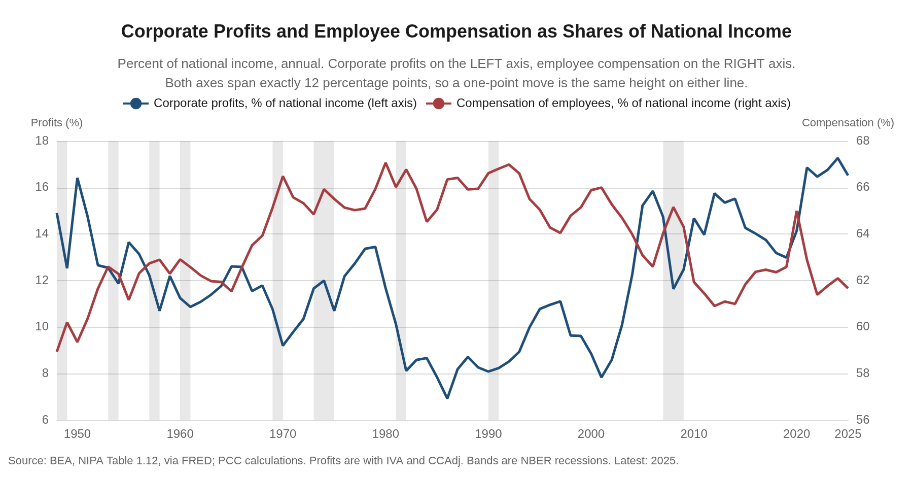
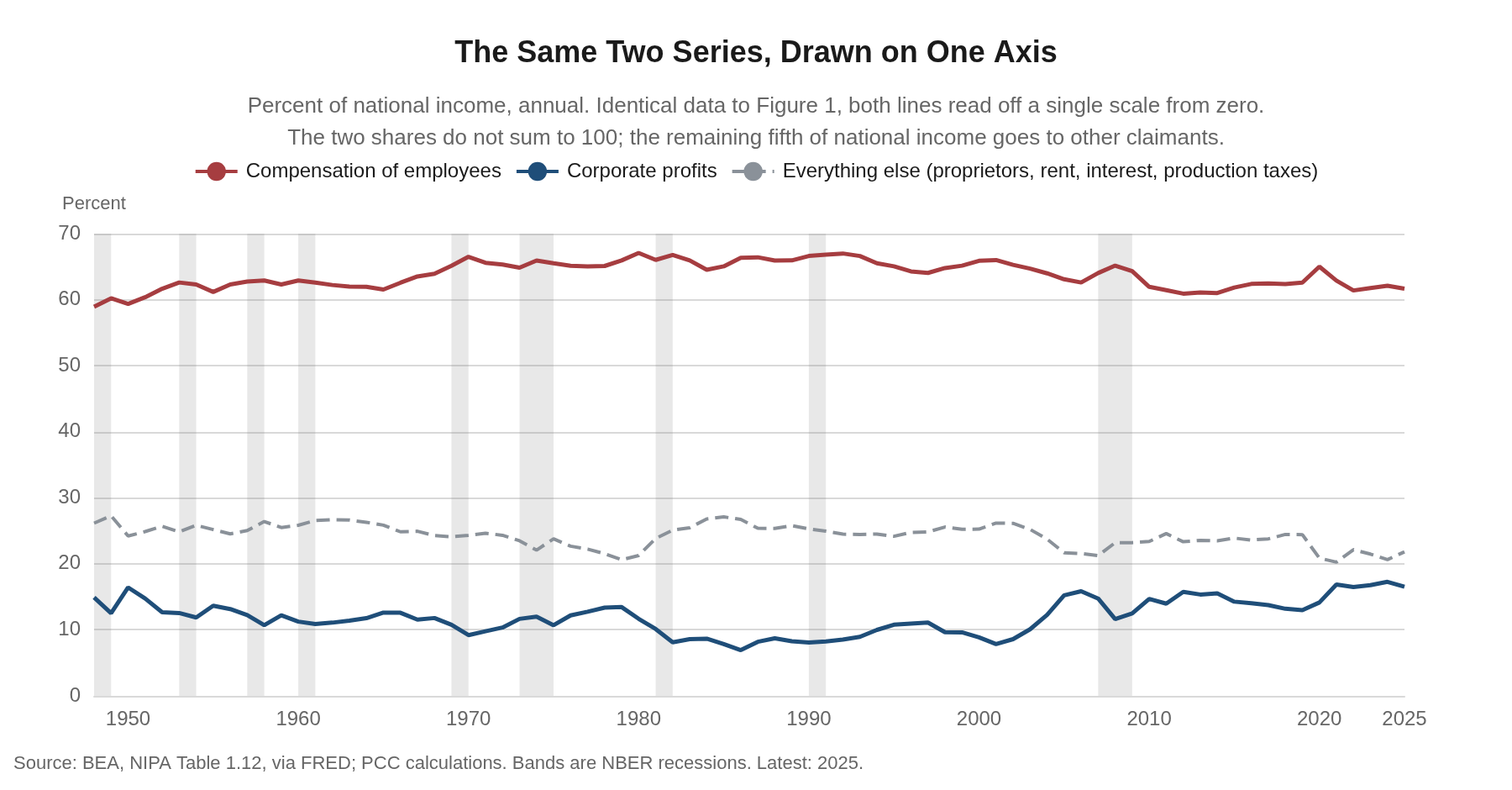
Figure 2 puts both series on a single scale starting at zero, and this is the version we show clients. The compensation share fell from 67.1% in 1980 to 61.7% in 2025. The corporate profit share rose from 8.1% in 1982 to 16.5% in 2025, and reached a postwar annual high of 17.3% in 2024. Through the first quarter of 2026, the most recent quarter for which the Bureau of Economic Analysis publishes profits, the two stood at 61.0% and 18.0%. Those are large moves, but they are not the near-perfect seesaw the two-axis version suggests.
The seesaw framing also invites an accounting error that we have made ourselves. Factor shares do sum to one, but there are more than two factors. National income has six claimants, not two. In 2025, compensation of employees took 61.7% and corporate profits took 16.5%. The remaining 21.8% went to proprietors’ income at 8.3%, rental income of persons at 4.4%, net interest at 0.6%, and taxes on production and imports less subsidies, business transfer payments and the surplus of government enterprises at 8.6% combined. A falling labor share does not mechanically become a rising profit share, and the difference has to go somewhere.
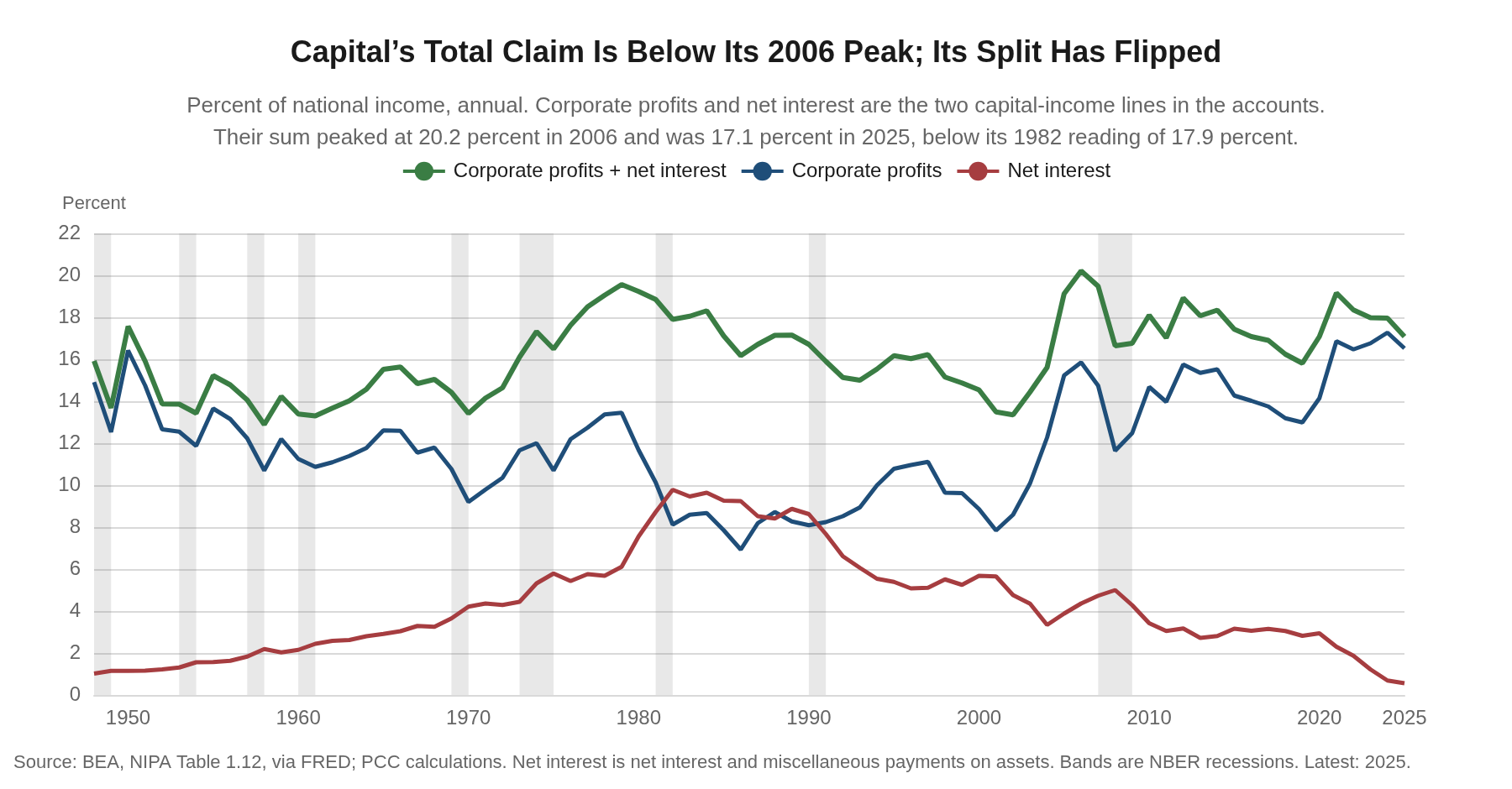
Most of it went to a reshuffling inside capital income rather than a transfer from workers to shareholders. Corporate profits and net interest are the two lines in the accounts that provide returns to capital, one to owners and one to lenders. Their sum was 17.9% of national income in 1982, peaked at 20.2% in 2006, and was 17.1% in 2025. Capital’s combined claim is below where it stood forty-three years ago and well below its 2006 peak. What changed is the split. The profit share rose 8.4 percentage points between 1982 and 2025, and the net interest share fell 9.2 points over the same stretch, from 9.8% of national income to 0.6%. The entire increase in what accrues to owners is more than accounted for by the decline in what business pays its lenders.
Nothing in that owes anything to a bargaining story about workers. Disinflation stripped the inflation premium out of nominal interest rates, and the 1982 figure reflects an interest bill priced off double-digit yields. Corporate balance sheets reduced leverage through the 1990s and again after 2009. Since 2022, high short rates have made the corporate sector a large receiver of interest income on its own cash, which nets against what it pays out. Whatever the mix, the dollars that used to leave the firm as interest now stay inside it as profit. That is a transfer from creditors to owners, and the household that owns a bond fund is on the losing end of it.
Rental income of persons is the other mover, up from 0.6% of national income in 1990 to 4.4% in 2025. Most of that line is imputed rent on owner-occupied housing, which is the accounts’ estimate of what homeowners would pay themselves in rent. Matthew Rognlie made this point in 2015 in a Brookings paper answering Piketty, finding that the rise in the net capital share was concentrated almost entirely in housing. That income accrues to roughly two-thirds of American households, not to a shareholder class.
What triggered the decline in the returns to labor was a labor supply shock in the textbook sense. The rise of China and, to a lesser extent, the other industrializing economies pushed the global supply curve for labor out and to the right while raising demand for labor by much less. Returns to labor fell across the developed world as a result, including in the U.S. Output is a function of capital and labor, and when the effective global supply of labor roughly doubles while the capital stock does not, the marginal product of labor falls relative to the marginal product of capital, and the split of income follows the marginal products.
The timing is the strongest evidence for it. Essentially the entire decline in the labor share happened between 2000 and 2010, from 65.9% to 61.9%. China joined the World Trade Organization in December 2001. In the fifteen years since 2010 the compensation share has gone nowhere, ending 2025 at 61.7%, a quarter of a point below where it started the decade. Whatever caused the fall stopped causing it around the time the import surge matured.
The academic literature is mixed on this point. Autor, Dorn, Katz, Patterson and Van Reenen, in the 2020 Quarterly Journal of Economics paper that gave us the superstar-firms hypothesis, included a China-shock variable in their industry regressions and found that Chinese import exposure had little explanatory power for the cross-industry variation in the fall of the labor share within manufacturing. If anything the coefficient ran the other way, with more exposure predicting a slightly higher labor share, though usually short of significance. Grossman and Oberfield, surveying the whole field for the Annual Review of Economics, concluded that after more than 12,000 research projects the profession still does not have a firm grip on why the labor share fell, and that the candidate explanations, taken together, account for several times the decline that actually occurred.
We do not think the null result refutes the mechanism, for the reason Grossman and Oberfield themselves raise against the cross-sectional literature. A regression across industries asks whether the industries hit hardest by imports lost more labor share than the industries hit least. That test holds the economy-wide wage fixed. A labor supply shock does not work that way. It works through the wage itself, which is set in a national labor market and falls, relative to the return on capital, in every industry at once. Differencing across industries subtracts out precisely the effect you are trying to measure. The industries with the lowest returns to labor were likely the least productive and the ones most exposed to China’s emergence. The industries that survived produced higher returns to labor, but for a much smaller workforce. The literature’s failure to find the China shock in the cross section is close to what the general equilibrium story predicts.
The aggregate figure is also a poor guide to any individual’s experience. Labor is not a homogeneous input. It combines physical effort and human capital, and the workers whose skills sit where the United States retains a comparative advantage have done well. The line to draw is not skilled against unskilled. It runs between work that can be performed somewhere else and work that cannot. A radiologist’s reading can cross a border and a lineman’s splice cannot, and the capital-led buildout now underway is bidding hard for electricians, pipefitters and substation crews who are in fixed supply. The aggregate share describes an average that fewer and fewer workers actually experience.
Part of the gap between the statistic and the paycheck is measurement, and it cuts the other way from what people assume. The compensation line on the chart includes employer contributions for health insurance, pensions and social insurance. Wages and salaries alone fell from 58.8% of national income in 1970 to 50.8% in 2025, a drop nearly twice as large as the one in total compensation, because supplements rose from 7.7% to 10.9% over the same period. About half of what left the paycheck between 1970 and 2010 went into benefits rather than out of labor’s hands. It is labor income in the accounts and it does not feel like income on payday, which is a fair description of an employer-paid health premium.
How the statisticians split proprietors’ income between labor and capital accounts for about a third of the apparent aggregate decline, by the estimate of Elsby, Hobijn and Sahin. The geography of the two lines differs as well, since 15.7% of the corporate profits in the numerator of that first line were earned outside the United States in 2025 while essentially all of the compensation in the second was paid inside it. The two lines are not measuring the same economy, which is one more reason not to read them as a zero-sum split.
If a labor supply shock caused the fall, then the mechanism should run in reverse when the supply shock reverses, and it is reversing now. China’s working-age population peaked in 2015 on the standard 15 to 64 measure and has fallen by roughly 60 million since. Here, the labor force has contracted by roughly a million people over the past twelve months, and Federal Reserve staff research puts trend labor force growth below 10,000 a month. Set that against business fixed investment growing at a double-digit pace and an economy at full employment, and the configuration is the mirror image of 2001. Capital is abundant and being deployed at scale, and labor is the scarce factor. When one input is scarce relative to the other, its return rises. That is the ordinary implication of a production function rather than a claim about fairness, since the marginal product of the scarce factor increases relative to the abundant one and the split of income follows. Firms that need electricians, process engineers and plant technicians are already bidding for them. The same arithmetic that pressed labor’s share down when global supply surged is the arithmetic that should press it back up as that supply tightens.
We expect the compensation share of national income to be higher in 2027 than the 61.7% recorded for 2025, and we will check it against the annual national accounts revision each September. We would be wrong if artificial intelligence turns out to be the next labor supply shock rather than a complement to scarce workers, which is the risk to this view we watch most closely. The more recent evidence does not yet support that reading. The ISM manufacturing employment index moved back into expansion in July for the first time in 33 months, and 60% of panelists reported that their companies are hiring against 40% still managing head counts. At the same time the cost of physical capital and of long-term finance has risen. Those are the conditions under which the return to scarce labor rises. We would also be wrong if the capital spending cycle breaks before the labor market tightens further, which is the mechanism by which a 30-year real yield near 3% eventually rations projects.
As to whether we should celebrate or be fearful, the question assumes a scoreboard. Factor shares are an accounting split of a growing pie, and a rising profit share funds the capital spending that raises output per worker, which is the only durable source of higher real wages. What is worth worrying about is whether the investment that a rising profit share finances actually shows up in productivity, because the alternative to a capital-led expansion, at a moment when the labor force is not growing at all, is no expansion.
The bottom line is that the chart is directionally right and analytically loose. Two axes with different spans exaggerate a real move, the two shares plotted do not sum to one, and the largest single reallocation over the past forty years ran from lenders to owners rather than from workers to owners. The labor supply shock explanation holds up better than the cross-sectional literature suggests, for reasons that literature acknowledges about itself. And it has already happened. The next decade poses the opposite problem, and businesses building capacity into a shrinking labor force should be planning for the factor shares to move back toward labor, not further away from it.
Mark P. Vitner
President & Chief Economist, Piedmont Crescent Capital
mark.vitner@piedmontcrescentcapital.com · 704-458-4000
Sources: U.S. Bureau of Economic Analysis, National Income and Product Accounts Table 1.12, retrieved from FRED; U.S. Bureau of Labor Statistics; Federal Reserve Bank of New York, “The Post-COVID Decline in the Labor Share,” June 2026; David Autor, David Dorn, Lawrence Katz, Christina Patterson and John Van Reenen, “The Fall of the Labor Share and the Rise of Superstar Firms,” Quarterly Journal of Economics, 2020; Gene Grossman and Ezra Oberfield, “The Elusive Explanation for the Declining Labor Share,” Annual Review of Economics; Michael Elsby, Bart Hobijn and Ayşegül Şahin, “The Decline of the U.S. Labor Share,” Brookings Papers on Economic Activity, 2013; Matthew Rognlie, “Deciphering the Fall and Rise in the Net Capital Share,” Brookings Papers on Economic Activity, 2015; and Piedmont Crescent Capital calculations. Shares are each component of national income divided by national income, annual data through 2025 and quarterly data through the first quarter of 2026. Corporate profits are stated with inventory valuation and capital consumption adjustments. This commentary is published by Piedmont Crescent Capital for informational purposes only and does not constitute investment, legal, or tax advice. Views expressed are those of the author as of the date of publication and are subject to change.

Seven Engines, and Not One of Them Is the Consumer | A View from the Piedmont
Seven Engines, and Not One of Them Is the Consumer
A View from the Piedmont — Weekly Commentary on Money, Credit, and Exchange Rates
Households cracked, firms surged, and the long end rose on a week the Fed odds fell.
Key Points
- The household data weakened while the business data strengthened. Retail sales fell 0.6% against consensus of plus 0.1% and the control group 0.5% against plus 0.3%. Michigan sentiment printed 51.0 against 55.2 in July and a consensus near 55. On the other side, NFIB optimism rose 2.4 points to an eleven-month high and hiring plans jumped 9 points to net 20%, the highest since October 2022.
- The wedge between them is energy, and it works as a tax rather than as an inflation problem. Gasoline is up 24.6% on the year and energy 14.7%, while core CPI printed 2.5%, the slowest since March 2021. Only eight percent of consumers expect their income to outpace inflation over the year ahead, against 18% in December 2024.
- Every growth program we track is a capital program. The seven are the AI buildout, electrification, reshoring, defense replenishment, aerospace and space, Peak 65 as a drag on labor supply and a driver of longevity and travel spending, and the pharmaceutical buildout, which is being driven by demographics, technology breakthroughs and onshoring initiatives. Seven engines pressing on physical bottlenecks, and the consumer is not one of them. That is why the economy can carry a 4.3% nowcast for the current quarter with consumer sentiment at 51.
- Atlanta Fed GDPNow shows exactly that split. The third quarter early estimate fell from 5.8% to 4.3% in eight days. Consumption in the build went from 4.1% to 2.5%. Gross private domestic investment went from 17.9% to 15.2% and is still running at fifteen. Our forecast has consumption at 2.1% and calls for a more modest 2.7% rise in real GDP. The risk is to the upside, and it materializes when inventories snap back. Inventories subtracted 0.67 percentage points from second quarter growth.
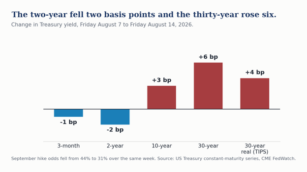
- The front end priced the hike further out and the long end rose into it. September priced down from 44% to 31%, the two-year fell 2 basis points, and the thirty-year real yield rose 4 basis points to exactly 3.00%. Of the 6 basis point rise in the thirty-year nominal, four were real and two were breakeven. That is a required-return move, not an inflation-expectations move.
- The thirty-year cleared at 5.216%, the highest auction yield since 2001. Demand arrived in normal size once it did. Indirect takedown was 66.8% against a 66.52% twelve-month average, once the yield repriced sixteen basis points cheaper than July.
- Dallas Fed researchers published an alternative trimmed mean, recalibrated on a 1967 sample with more symmetric trim points, reading 2.6% against the published 2.2%. Our one-sided HP trend reads 2.9% and core PCE reads 3.3%. Underlying inflation is still decelerating, with core PCE at 3.3% against a 2% target.
- Our call is unchanged. The next Fed move will likely be a hike, but no earlier than December and probably in January or later. We would stay cautious on duration.
Market Dashboard
Levels are official closes for Friday, August 14. Treasury yields are the published constant-maturity series.
| Indicator | Level | This Week |
|---|---|---|
| Fed funds target | 3.50-3.75% | Fifth consecutive hold. Three dissents to hike on July 29 |
| September hike odds | 31% | Down from 44% on August 7, on three soft prints |
| October, December, January hike odds | 47%, 64%, 67% | Cumulative. No cut priced at any meeting through January 2027 |
| 3-month bill | 3.86% | Down 1 bp |
| 2-year Treasury | 4.17% | Down 2 bp |
| 10-year Treasury | 4.68% | Up 3 bp |
| 30-year Treasury | 5.25% | Up 6 bp. Four of the six were real |
| 30-year TIPS real yield | 3.00% | Up 4 bp. It has not left 2.96 to 3.00 all month |
| 30-year breakeven | 2.25% | Up 2 bp. Still at target |
| 2s-30s | 108 bp | Twist steepener. The two-year fell and the thirty-year rose. 2s-10s widened to 51 bp |
| 30-year auction | 5.216% | Highest thirty-year auction yield since 2001 |
| S&P 500 | 7,785.76 | Up 0.36%, a third straight weekly gain. Record close Thursday at 7,798.99 |
| Nasdaq Composite | 26,729.16 | Up 0.14%. Memory and storage led everything |
| Russell 2000 | 3,068.42 | Up 1.12% to a record close |
| VIX | 14.25 | Down 0.65. Touched its lowest intraday reading since December |
| WTI crude | $82.40 | Up 5.4% on the week |
| Brent crude | $88.49 | Up 5.9%. The strait has been shut since February 28 |
| Gold | $4,432 | Up 0.6% |
| US dollar (DXY) | 99.64 | Unchanged on the week |
| Retail gasoline | $4.006 / gal | EIA survey August 10, down 7.3 cents, taken before the crude rally |
| Retail diesel | $5.257 / gal | Down 9.1 cents on the survey and up $1.55 on the year |
| 30-year fixed mortgage | 6.67% | Freddie Mac, week ended August 13 |
| Investment grade OAS | 79 bp | Up 1 bp through Thursday. Nineteen issuers priced Monday alone |
| High yield OAS | 271 bp | Up 1 bp. No credit event in this week’s long-end move |
This Past Week’s Central Thesis
For two weeks we have argued that the economy is stronger than the headline data look and that the Fed is more likely to tighten than ease. This week complicates that assessment. The complication is not a weaker economy dragged down by a weaker consumer, but a different economy from the one most forecasts describe.
The household data broke. Retail sales fell 0.6% against consensus of plus 0.1%, the largest monthly drop in more than a year, and the control group that feeds GDP fell 0.5% against plus 0.3%, its worst month since January 2025. Preliminary Michigan sentiment came in at 51.0 against 55.2 in July and a consensus near 55. Tom Barkin noted in Greenville on Thursday that the survey has now printed its three lowest monthly readings in more than seventy years.
The business data did the opposite and did so emphatically. NFIB small business optimism rose 2.4 points to 99.8, an eleven-month high and above its fifty-two year average. Plans to increase employment rose 9 points to a net 20%, the highest reading since October 2022. Job openings hard to fill rose to 36%, the highest since June 2025. Quality of labor went back to the top of the single most important problem list at 27%, up 8 points, while inflation fell 7 points to third place. Nineteen investment grade issuers priced on Monday alone, the most in seven months.
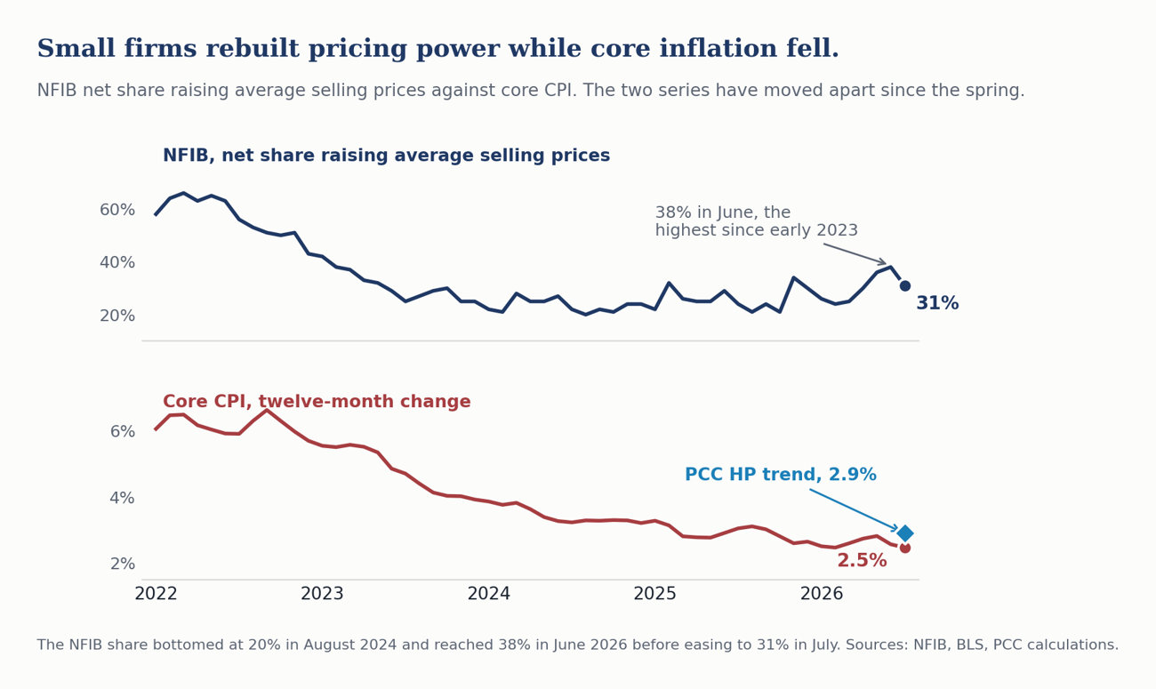
The price side of that survey has tracked this cycle better than the CPI has. The net share of small firms raising average selling prices bottomed at 20% in August 2024, climbed to 38% in June and eased to 31% in July. Core CPI over the same stretch fell from 3.3% to 2.5%. Those two series moved together on the way up in 2021 and on the way down through 2023, and they have been moving apart since the spring. Firms have been rebuilding pricing power for two years while the published index has been falling. Our HP trend at 2.9% sits between them, which is roughly where a measure that reflects what firms are actually doing ought to sit.
Both of those are true, and the wedge between them has a name. Gasoline is up 24.6% over the year, energy 14.7%, and retail diesel is a dollar and a half above where it was last August. Those are a tax on real income, and the tax lands on households rather than on firms. The Boston Fed published work in June finding that a 33% oil shock now raises PCE inflation about 1.5 percentage points against 2.2 historically, while the employment effect that ran negative 1.8 points in the 1970s is essentially nil today. Households absorb that shock through real income and tell the survey about it, while firms absorb it as an input cost and keep hiring.
Which brings us to the point we believe matters the most for anyone building a 2027 plan. Every growth program we have been tracking is a capital program. The seven are the artificial intelligence buildout, electrification, reshoring and the manufacturing reorientation, defense replenishment, the aerospace and space reboot, and Peak 65, which is simultaneously restraining labor force growth and driving a retiree economy in which free-spending retirees are buying longevity, from GLP-1s and joint replacements to functional and sports medicine, along with travel and leisure. This week we move pharmaceutical and biomanufacturing growth out of reshoring and into its own spot, driven by demographics, technology gains and onshoring. Seven engines, every one of them business or government capital spending pressing on a physical bottleneck. The consumer is not among them.
That is why the expansion carries a 4.3% nowcast against consumer sentiment at 51, and why we are less alarmed by one bad retail sales print than the coverage suggests we should be and less comfortable with the NFIB print than that number invites. An economy running on seven capital programs and a soft consumer is not fragile, however unfamiliar it looks against prior cycles.
Our positioning is unchanged. We continue to think the next Fed move is a hike rather than a cut, we look for it in January, December is certainly possible, and we stay cautious on duration.
This Week in Three Observations
1. The consumer supplied two thirds of the markdown in the nowcast.
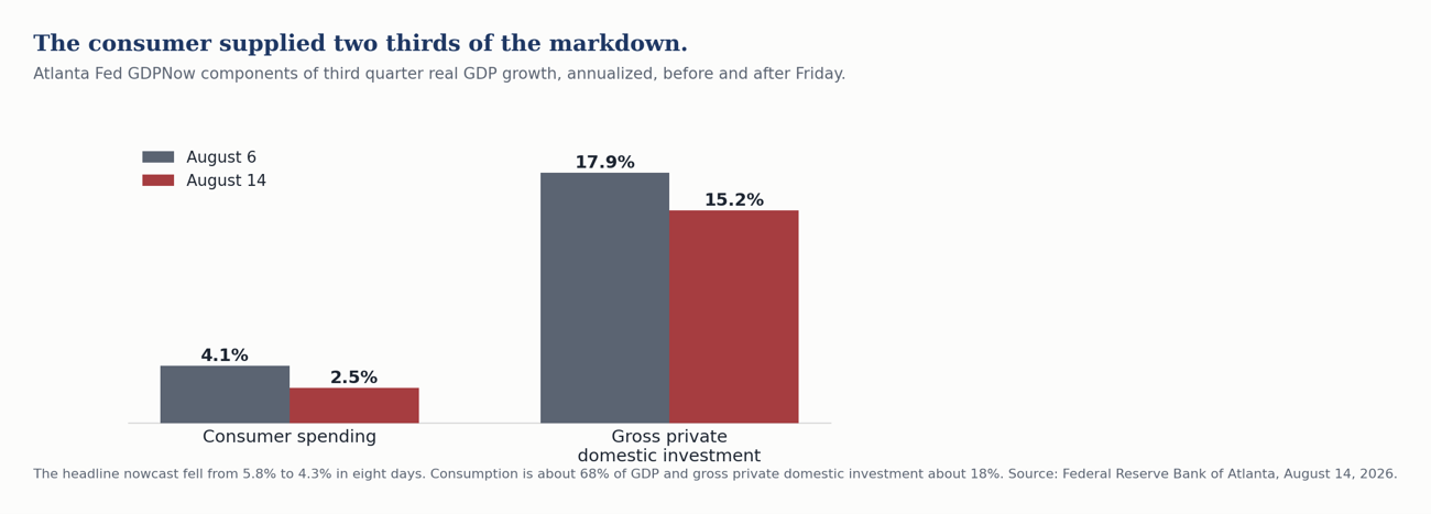
Atlanta Fed GDPNow cut its third quarter estimate from 5.8% on August 6 to 4.3% on Friday, a point and a half in eight days. The Atlanta Fed’s own commentary names the source. Consumption in the build fell from 4.1% to 2.5% and supplied about two thirds of the markdown. Gross private domestic investment fell from 17.9% to 15.2% and supplied most of the rest.
The Atlanta Fed’s estimate is still early. We are halfway through the third quarter and have partial data for only the first month of it. Last week we noted that trade-deficit arithmetic was inflating the Atlanta Fed’s 5.8% estimate, and this week’s markdown is not evidence for that argument. Net exports are not mentioned in the Atlanta Fed’s revision note at all. The distortion, if it is there, now sits inside a gross private domestic investment nowcast still running above fifteen percent, which we do not believe survives a full quarter.
Motor vehicles fell 1.8% after rising 1.9%, and nonstore retail fell 2.2%, which is the line that should get attention because online spending has been the reliable part of this cycle. Gasoline stations fell 0.9%, but that is a price effect from the early July dip rather than a volume effect, so the nominal drag overstates the weakness. Food services and drinking places rose 0.5%. Health and personal care rose 0.7%. Building materials rose 0.3%. Households stopped buying cars and stopped buying online, and the rest of the report held up.
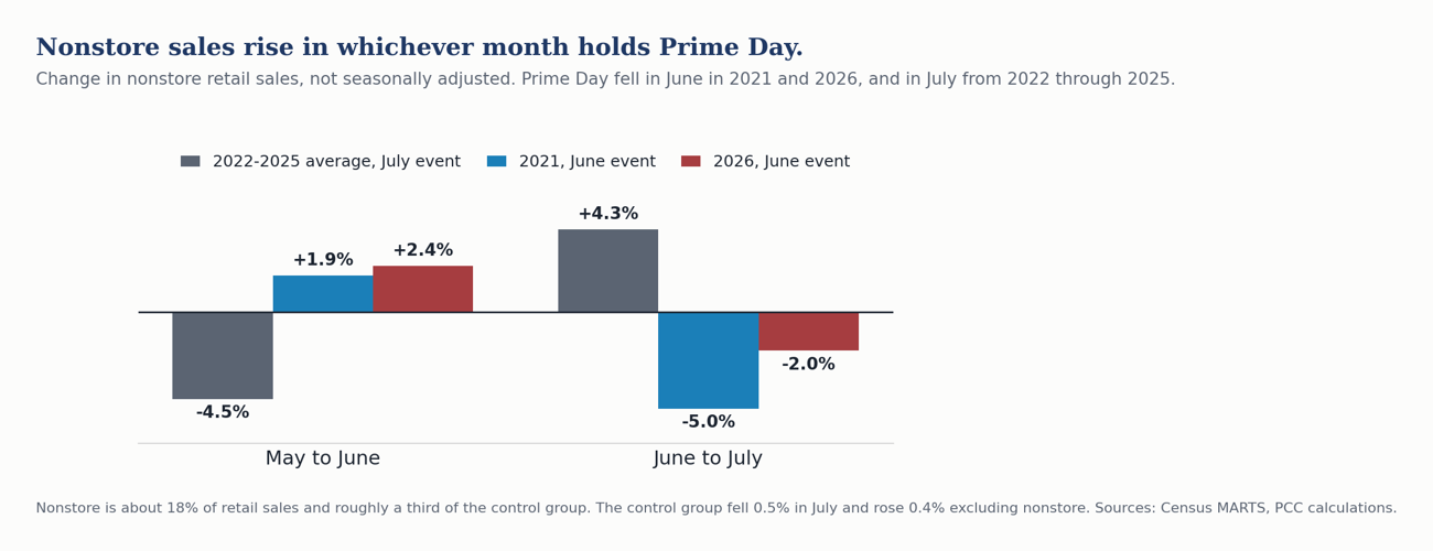
And the online line has a calendar explanation that the seasonal factors do not capture. Prime Day fell in July in every year from 2015 through 2025 except 2020 and 2021. In 2026 it moved to June 23 through 26. Census adjusts for trading days and for Easter, Labor Day and Thanksgiving. It publishes no promotional-event regressor, so an event that moves between months lands in the seasonally adjusted data as a swing rather than as a shift.
The evidence is at both ends of the move, and it is cleanest in the unadjusted data. In the four most recent years when the event fell in July, 2022 through 2025, unadjusted nonstore sales fell 4.5% from May to June and rose 4.3% from June to July. In 2021, when the event fell in June, they rose 1.9% and then fell 5.0%. In 2026 they rose 2.4% and then fell 2.0%. Nonstore is about 18% of retail sales and roughly a third of the control group, which is why a five-point swing there is worth close to a point on the headline.
Run the arithmetic and the July report reads differently. The control group fell 0.5%, and rose 0.4% excluding nonstore. Brick and mortar control spending went up. We would still call the quarter softer than the second, and we would not build a consumer break out of a month whose weakest line moved because the promotional calendar did.
2. Small firms went back to worrying about workers rather than prices.
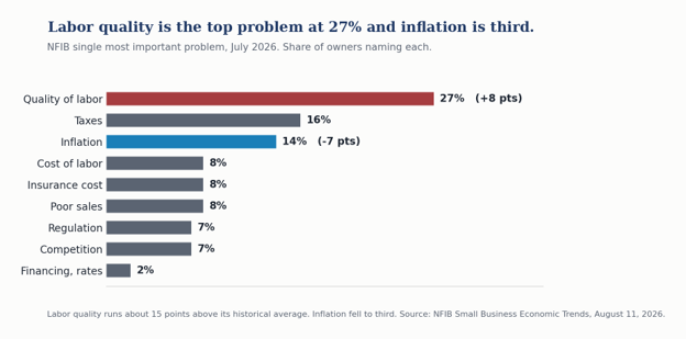
The NFIB report runs directly against the weak July payroll headline. Hiring plans at net 20% is the highest since October 2022. Openings hard to fill at 36% is the highest since June 2025. Capital outlay plans rose 5 points to 25%. Good time to expand rose 4 points.
The price side moved the other way. The net share raising average selling prices fell 7 points to 31%, and the share planning increases fell 4 points to 28%. Inflation dropped 7 points to third place on the single most important problem list, behind labor quality and taxes.
Read together, the small business sector is describing an economy with more labor demand and less pricing power than it had in June. That configuration is better for margins than for the inflation outlook, and worse still for anyone forecasting the labor market off the establishment survey alone.
3. Hike odds fell all week and the long end rose anyway.
Last week we wrote that the long end declined to participate in a bond-bullish surprise. This week is the cleaner version of the same test, because this time the front end actually moved.
The Fed strip repriced meaningfully easier. September hike odds fell from 44% to 31% across three soft prints. The three-month bill fell a basis point and the two-year fell two, which is exactly what a cycle-driven front end should do. And the thirty-year real yield rose four basis points anyway, to exactly 3.00%.
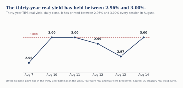
Of the six basis point rise in the nominal yield, four were real and two were breakeven. This was not the market marking up inflation expectations. It was the market raising the real return it requires to hold thirty-year money, in a week when the business cycle argued for the opposite. The thirty-year real yield has closed between 2.96% and 3.00% every session in August.
Thursday’s auction is where it happened. The Treasury sold $25 billion of new thirty-year bonds at 5.216%, the highest thirty-year auction yield since 2001. We would resist the version of this story now circulating, which is that indirect takedown collapsed. It did not. Indirects came in at 66.8% against a 66.52% twelve-month average and dealers took 11.5% against a 10.94% average. The 10.9 point drop now circulating is measured against a July 9 auction that was unusually strong. Demand showed up in normal size. It showed up only after the yield repriced sixteen basis points cheaper than July. That is a price story, not a failed auction.
Two supporting facts. The ten-year drew 76.7% indirect takedown against a 71.78% average, so foreign demand for intermediate duration is not the problem. And Wednesday’s Treasury statement put the July deficit at a record $432.2 billion, up 48% on the year, with the fiscal year to date at $1.799 trillion, already above all of fiscal 2025 with two months to run. Customs receipts were negative $8.55 billion after $33.38 billion of tariff refunds, the third consecutive month of outflows. The supply side of the term premium argument is not abstract.
Behind the Numbers
Core inflation printed its slowest since March 2021 while core PCE ran a full point higher. Headline CPI rose 0.1% in July and 3.4% on the year. Core rose 0.2% and 2.5%, both exactly in line.
Core PCE is running roughly eighty basis points above core CPI, a reversal of the usual gap. In June, the last month with both actuals, core PCE ran 3.3% against core CPI at 2.6%, a gap of about seventy basis points. The Cleveland Fed nowcasts July core PCE at 3.29% against a core CPI that printed 2.5%, which widens it to roughly eighty. PCE has historically run thirty to forty basis points below CPI, so this is a reversal rather than a widening of the usual relationship. Shelter carries about 35% of the CPI and roughly 16% of the PCE, PCE is chain weighted and allows substitution, and health care and financial services carry more weight in PCE. Whatever the cause, PCE is the target variable and it is the one running above three. Anyone leading with core CPI at a four-year low without reconciling the Fed’s own measure is writing something misleading.
The shelter line is being misread across the coverage. Shelter rose 0.1% on the month, which is being taken as rent disinflation. Owners’ equivalent rent rose 0.26% unrounded and rent of primary residence 0.26%, both essentially unchanged from their recent pace. The soft aggregate came from lodging away from home, which fell 2.8%. Owners’ equivalent rent and primary rent together carry about 96% of the shelter index and lodging carries under 4%, which leaves an unrounded shelter print of 0.14% and a published 0.1%. Lodging prices gave back the World Cup premium, and that giveback is what restrained the shelter aggregate.
Thursday’s PPI was soft on the headline and firm where it matters. Final demand was unchanged against consensus of plus 0.2%, and more than half the decline in final demand goods came from a 5.7% drop in gasoline. But final demand less food, energy and trade services rose 0.4%, and portfolio management rose 6.5%, the largest in more than a year. That component feeds directly into core PCE on August 26 and does not appear in the CPI at all. Trade services margins fell 0.14%, which says importers are still absorbing tariff costs rather than passing them through.
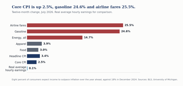
What a household actually faces looks nothing like a 2.5% core. Airline fares are up 25.5% over the year and gasoline 24.6%. Energy overall is up 14.7%. Real average hourly earnings are up one tenth of one percent. Michigan has one-year inflation expectations at 4.3% and, importantly, five-to-ten-year expectations at 3.3% for a third consecutive month. That last figure is the one the Committee will look at, and it did not break higher even with gasoline up a quarter on the year.
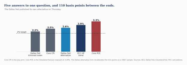
The Dallas Fed came partway to our position on Thursday. Its own researchers published an alternative trimmed mean PCE recalibrated on a 1967 to 2009 sample rather than 1977 to 2009, producing more symmetric trim points that capture surges better when the price change distribution is positively skewed. Their alternative reads 2.6% for the twelve months through June against their published measure at 2.2%. They also concede that the original measure was much slower to accelerate than core or headline in 2021, not reaching 3% until November while core and headline crossed in April, which is the asymmetry we described last week, conceded by the people who build the index.
Our one-sided HP trend reads 2.9%, above their alternative and well above their headline. Core PCE reads 3.3%. Five measures of the same thing span 110 basis points. We still feel it is best to view our HP filter alongside the Cleveland median and the Dallas trimmed mean rather than in place of them, and we will now add the Dallas alternative to that panel.
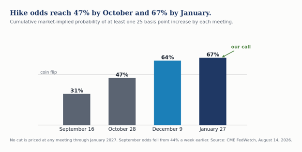
The Fed pricing moved the hike later without pricing it away. September fell to 31%. But cumulative odds of at least one increase reach 47% by October, 64% by December and 67% by January, and no cut is priced at any meeting through January 2027. The market has stopped arguing about direction and started arguing about date, and it has landed roughly where we have it.
Two Fed voices spoke and they were not saying the same thing. Beth Hammack told an interviewer on Monday that a single quarter point move probably does not do much and that it is likely some number of moves, and that at 3.50 to 3.75 policy is not meaningfully restricting activity. We would counter that the most interest rate sensitive parts of the economy, housing and light vehicle sales, are stuck in low gear and medium gear respectively. Barkin, in Greenville on Thursday, attributed the rise in inflation to tariffs, an oil price shock and a flood of AI spending, noted that unemployment at 4.1% is the fifty-eighth consecutive month at or below 4.5%, and declined to signal September at all. The Fed is failing on its inflation objective and has largely succeeded on its employment objective. Unfortunately the unemployment rate does not provide an adequate assessment of the strength of the labor market. Long-term unemployment is still elevated, which suggests a persistent skills mismatch.
The labor market did not deteriorate this week. Initial claims were 209,000 for the week ended August 8 and continuing claims fell to 1,777,000, with the insured unemployment rate at 1.2%. Nothing in the claims data corroborates the July payroll print.
And the benchmark revision is now two weeks out. The preliminary estimate publishes Friday, August 28, three weeks before the FOMC. Published work puts the QCEW data roughly 230,000 above the payroll survey through December 2025, the first nine months of the benchmark period. One estimate we have seen puts the revision at plus 340,000. The last two cycles conditioned everyone to expect a large negative, and the prior preliminary was negative 911,000. We would rather be early on this than consensus.
Bottom Line
The economy is running on seven capital programs and a soft but resilient consumer. That is not a fragile configuration, and it is not the configuration most forecasts are built on. One month of retail sales is not a break, and the Michigan survey has been a poor predictor of spending for four years. But this is the first week the hard data came in with the soft data, and the mechanism is an energy shock running through real income.
For the Fed, August 26 and August 28 matter more than September 16 does right now. Core PCE carries Thursday’s portfolio management jump, and the benchmark revision lands three weeks before the meeting. We look for no cut in 2026 and the first hike in January, with December certainly possible.
For portfolios, this was a cleaner week for duration caution than last week was. Hike odds fell thirteen points, the front end rallied, and the thirty-year real yield rose to exactly 3%. If a soft consumer and a dovish repricing cannot pull the long end down, we would not expect the September meeting to either. The thirty-year comes down when the interconnection queue shortens, not when the front end rallies.
CFO & Corporate Treasurers Corner
Six things that changed this week for anyone who funds a balance sheet or manages cash.
The long-end entry point got worse again, and the pattern is now three weeks old. The thirty-year rose 6 basis points and the thirty-year real yield 4, while the two-year fell 2 and September hike odds fell thirteen points. 2s-30s widened to 108 basis points. Anyone waiting for a soft patch to bring long money down has now watched the long end rise in each of the last two weeks, on exactly the soft patch that was supposed to bring it down. The curve is telling you the price of thirty-year money is set somewhere other than the business cycle.
But the issuance window is open, and it was busy. Nineteen investment grade issuers priced this past Monday, the most in seven months, against roughly $80 billion the prior week and $1.4 trillion year to date, running 9% ahead of 2020’s pace. Investment grade spreads finished at 79 basis points and high yield at 271, each a basis point wider on the week. The long-end repricing was a duration event that never touched credit or funding. If you have paper to bring, the constraint is the base rate and not the spread.
Your reinvestment assumption is fine this month and will not be next. The three-month bill closed at 3.86%, down a basis point. SOFR was unchanged at 3.62%, sitting on the target midpoint, and the ninety-ninth percentile compressed to 3.70%, its tightest of the month, straight through a $125 billion refunding. Money fund assets rose $18 billion to $7.93 trillion. Nothing here is under stress. But cumulative hike odds reach 47% by October, so a treasury forecast that assumes today’s front end through the fourth quarter is a one-sided bet.
Watch your fuel line, and do not be fooled by the survey date. Retail gasoline printed $4.006 and diesel $5.257 on the August 10 EIA survey, down 7.3 and 9.1 cents. Both surveys were taken before crude rallied more than five percent on the week. Diesel is a dollar and a half above last August. Data centers are also burning diesel, as energy demand has run up against a stressed grid this summer. The binding constraint is refining rather than crude, so a lower oil price will not by itself bring your fuel cost down. If you budget freight or fleet, assume the next survey reverses, with some relief later in the fall as temperatures cool.
Your consumer-facing revenue line and your labor line are pointing in opposite directions. Retail sales fell 0.6% and the control group 0.5%, though the control group rose 0.4% excluding nonstore, while small business hiring plans reached their highest since October 2022 and labor quality returned as the top problem. If you sell to households, plan for a softer second half than the GDP figures imply. If you hire, do not assume the July payroll print means the labor market loosened for you.
The tariff refunds are a balance sheet item, and someone is going to ask about them. July customs receipts were negative $8.55 billion after $33.38 billion in refunds, the third consecutive month of outflows, with roughly $100 billion of an initial $166 billion refunded through July. Companies are booking those refunds rather than passing them through, and the practice is drawing attention. Meanwhile the replacement authority took effect July 24, covering sixty economies and 99.4% of imports at 10 to 12.5%, and twenty-five states sued to block it on August 3. If your cost of goods assumes either the refund or the replacement is permanent, it needs a second scenario.
On the currency side, the dollar index closed at 99.64, unchanged on the week.
Piedmont Perspective
Seven Engines and No Driver
Something has changed in how this economy is put together, and July is the first month you can see it in the hard numbers instead of inferring it from the announcements.
For most of the postwar period, the American economy has been a consumption engine with an investment accelerator attached. Roughly seven dollars in ten went through the household, and the reliable way to forecast a recession was to forecast the consumer. Business investment amplified the cycle without setting it.
What we are looking at now is close to the inverse. Seven distinct capital programs are running at once, each of them pressing against a physical bottleneck rather than a financial one, and each of them largely indifferent to what a household does this quarter.
The artificial intelligence buildout is the largest and the most discussed. Electrification is the one that binds it, because a data center campus without an interconnection agreement is a land purchase. Reshoring and the manufacturing reorientation is running under a tariff structure that changed three times this year and is under litigation again. Defense replenishment has moved from supplemental appropriations to multiyear procurement, which changes the planning horizon for a supplier from months to a decade. The aerospace and space reboot is rebuilding a supply chain that was allowed to atrophy. Peak 65 removes people from the labor force on a schedule known years in advance. And this week we are adding the seventh, pharmaceutical and biomanufacturing onshoring, which now has a tariff schedule attached to it that runs to 2028.
Not one of those seven is a consumption program. They are all capital programs, and that is the whole difference. They respond to permitting, to interconnection queues, to skilled labor availability, to procurement calendars and to tariff schedules. They do not respond to consumer sentiment, and they respond to interest rates far less than a textbook would predict, because for most of them the binding constraint is not the cost of capital. It is transformers, turbines, electricians, environmental review and time.
That explains the week we just had better than any story about a weakening consumer does. Retail sales fell and sentiment collapsed while small business hiring plans reached their highest since October 2022 and gross private domestic investment in the GDP nowcast held above fifteen percent. Those are not contradictory readings of one economy but accurate readings of two.
It also explains why the long end will not come down. If the marginal dollar of demand for capital comes from programs that must be built regardless of the cycle, then a soft consumer does not free up capital. It does not even reduce the demand for it. The thirty-year real yield sat at 3.00% on Friday in a week when the front end rallied and hike odds fell thirteen points, and we would suggest the reason is sitting in the interconnection queue rather than in the business cycle.
Two risks to that argument.
A consumer weakening this fast eventually reaches the capital programs through demand. AI capacity is being built against expected revenue, and a household that stops buying online in July is a data point against that revenue. The Applied Materials margin guidance on Friday, which knocked five percent off the stock on an otherwise strong report, is the sort of thing that shows up first.
And politics can pause a capital program faster than economics can. County government across the South enacted more restrictions on data centers in the five days of this week than the states did all summer, and one Arkansas county imposed a moratorium running to 2031 with no project even proposed. None of it has stopped a project yet. It is a real constraint, however, and it does not appear in any forecast we have seen, including ours.
Neither risk changes the structure. For as long as these seven programs are running, the consumer is a passenger in this expansion rather than the driver, and reading the economy off the household data alone will produce the wrong answer in both directions.
The Week Ahead
Monday, Aug. 17. Empire State manufacturing for August, the first regional survey of the month and the first read on whether the ISM turn held.
Tuesday, Aug. 18. Housing starts and permits, industrial production and capacity utilization, and import and export prices, all for July. Manufacturing output is the one to watch against the ISM employment turn.
Wednesday, Aug. 19. Minutes of the July 28 and 29 FOMC meeting at 2:00 p.m. ET. The meeting produced three dissents in favor of an increase. The minutes will tell us how close September actually is, and whether the framework review came up.
Thursday, Aug. 20. Weekly jobless claims and the Philadelphia Fed manufacturing survey at 8:30 a.m. ET. Existing home sales for July and leading indicators at 10:00 a.m. ET.
Friday, Aug. 21. BLS State Employment and Unemployment for July at 10:00 a.m. ET, the first state-level look since the national print turned negative. Virginia is the one to watch, down 43,600 jobs on the year through June and the only state in our region losing jobs.
Wednesday, Aug. 26. July personal income and outlays, with the PCE deflator and core PCE. This carries Thursday’s 6.5% jump in portfolio management fees, which does not appear in the CPI at all. August 26 is the last major inflation print before the September meeting.
Friday, Aug. 28. The preliminary benchmark revision to the establishment survey, three weeks before the FOMC. Our call is that it comes in modest or positive against a market conditioned by two consecutive large negatives.
Sunday, Sept. 6. OPEC+ meets, having completed the rollback of the 1.65 million barrel a day voluntary cuts effective September.
US Economic and Financial Outlook
Our full forecast is below, updated this weekend. We look for real GDP growth of 2.5% this year and 2.6% next, with the current quarter at 2.7% and consumer spending at 2.1%. The year-end unemployment rate holds at 4.1% and payrolls average 70,000 a month in the third quarter and 85,000 in the fourth. The fed funds target holds its current 3.50 to 3.75% range through 2026 and steps to 3.75 to 4.00% in the first quarter of 2027, with a December move the principal risk to that call. We have marked housing starts down to 1.29 million in the third quarter.
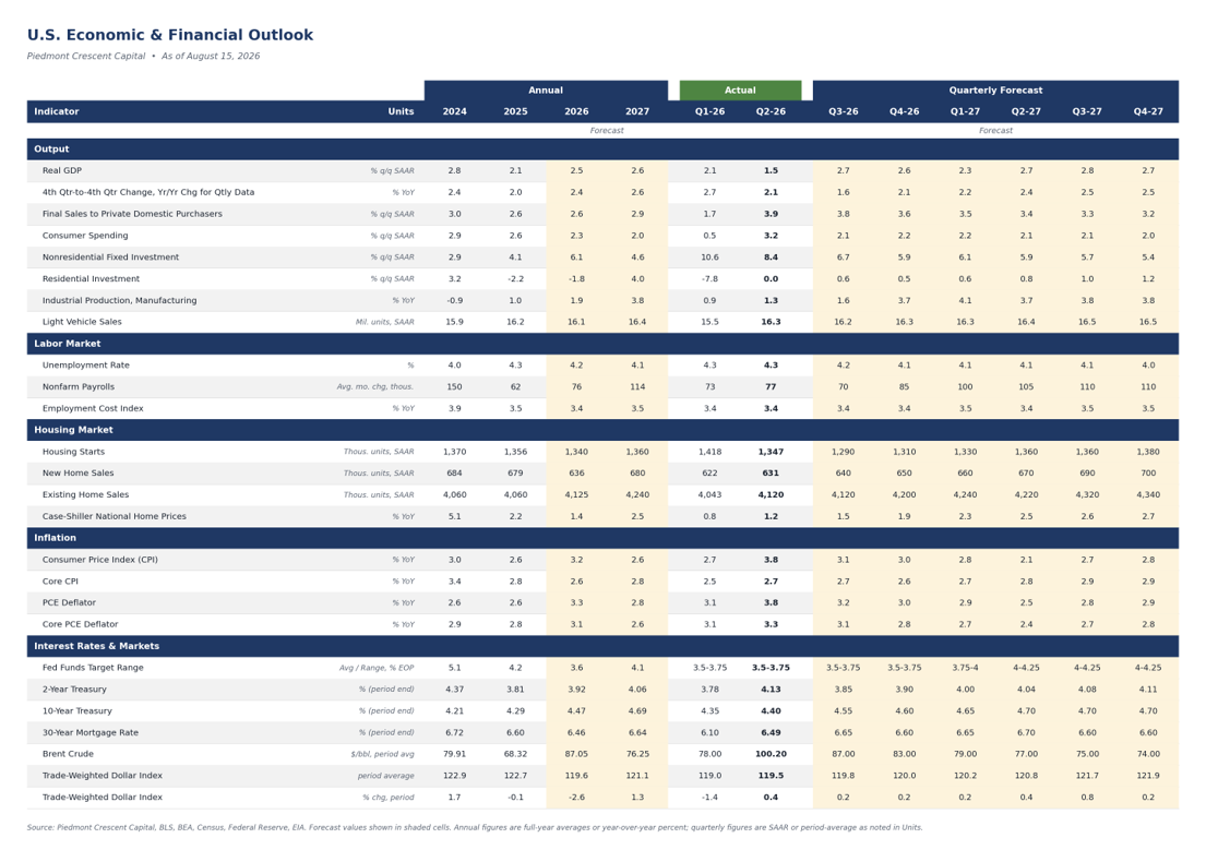
Sources and Notes
Sources: Bureau of Labor Statistics; Bureau of Economic Analysis; Census Bureau; US Treasury; Department of Labor; Federal Reserve Board and CME FedWatch; NFIB; University of Michigan Surveys of Consumers; Institute for Supply Management; Freddie Mac; Energy Information Administration; ICE BofA indices; the Atlanta, Boston, Cleveland, Dallas and Richmond Federal Reserve Banks; Goldman Sachs; Oxford Economics; BlackRock Investment Institute; Bank of America; PGIM; PIMCO; Apollo; KKR; Capital Economics; TD Economics; Federal Reserve Bank of Philadelphia Survey of Professional Forecasters.
Notes and corrections: All market levels are official Friday, August 14 closes unless stated. Crude, Brent and gold are vendor quotes rather than exchange settlements, and credit spreads are through Thursday, August 13. Correcting last week’s issue: September hike odds on August 7 were 44%, not the 40% we published, and the QCEW to CES gap through December 2025 is about 230,000, not 200,000. Treasury yields are the published constant-maturity series and the thirty-year breakeven is derived from the nominal and real curves. Retail fuel prices are the Energy Information Administration Monday survey dated August 10 and were collected before the week’s crude rally. Payroll and retail figures are seasonally adjusted. Copyright 2026 Piedmont Crescent Capital.
Mark P. Vitner
President & Chief Economist, Piedmont Crescent Capital
mark.vitner@piedmontcrescentcapital.com · 704-458-4000
A View from the Piedmont is published weekly by Piedmont Crescent Capital for informational purposes only and does not constitute investment, legal, or tax advice. Views expressed are those of the author as of the date of publication and are subject to change.
Retail Sales Report: June Borrowed From July, and July Paid It Back
Retail Sales Report: June Borrowed From July, and July Paid It Back
Retail sales fell 0.6% in July as online receipts gave back the Prime Day surge that landed in June this year, but the control group excluding nonstore retailers rose 0.4% and nine of thirteen categories held their ground or advanced.
Early Signals
- Retail sales fell 0.6% in July, and just two categories account for more than all of the drop. Retail and food services sales slipped to $763.6 billion, seven-tenths below a consensus that looked for a 0.1% gain. Nonstore retailers fell 2.2% and subtracted 0.41 percentage points from the headline, while motor vehicle & parts dealers fell 1.8% and subtracted another 0.33 percentage points. Everything else, taken together, added 0.16 percentage points.
- Amazon moved its summer event out of July, and the seasonal factors did not move with it. Prime Day ran June 23-26 this year, after falling in July in every year since 2015 except 2020 and 2021. Census adjusts these data for trading days and for moving holidays such as Easter, Labor Day and Thanksgiving, but it publishes no promotional-event regressor, so a July without the promotion reads as weakness that is not there.
- The control group fell 0.5%, but excluding nonstore retailers it rose 0.4%. Nonstore retailers now make up 32.9% of the control group, which is the series that feeds the goods side of consumption in the national accounts. Strip out the one category the calendar moved and core spending advanced at a perfectly ordinary pace.
- The three-month pace still describes a consumer who is spending. Control-group sales rose at a 5.6% annual rate over the three months through July and are up 4.5% over the past year, or 3.7% after deflating by goods prices. A single advance estimate typically carries a large margin of error and gets revised; the three-month pace is the better number to act on.
- Restaurants and apparel both advanced, which is not what retrenchment looks like. Food services & drinking places rose 0.5% and are up 5.0% over the year. Clothing & accessories stores rose 1.9%, the strongest gain of any category, as back-to-school promotions began in the second half of the month, which is a little earlier than usual.
- Gasoline station sales fell by less than pump prices did. Sales at gasoline stations declined 0.9% while the average retail price of regular gasoline fell 2.9% over the month, which implies households bought more gallons rather than fewer. The gap is a transfer into the rest of the consumer budget.
Key Takeaways
| Key Concept | Findings |
|---|---|
| Headline retail sales | Down 0.6% in July to $763.6 billion, seven-tenths below a consensus of +0.1%. Up 5.0% over the past twelve months. |
| Retail control group | Down 0.5% on the month but up 5.6% at an annual rate over three months and 4.5% over the year. Excluding nonstore retailers, up 0.4%. |
| Nonstore retailers | Down 2.2%, the calendar effect of Prime Day moving from July to late June. Down 2.0% in unadjusted terms against a June-to-July norm of roughly +4% in recent years. |
| Motor vehicles | Down 1.8% as light vehicle unit sales eased to a 16.3 million annual rate from 16.6 million in June, a normal model-year changeover pattern. |
| Gasoline stations | Down 0.9% while pump prices fell 2.9%, implying higher volumes. Still up 16.2% over the year on price. |
| Restaurants and bars | Up 0.5% and up 5.0% over the year, matching the gain in total sales. |
| Revisions | The May to June change was unrevised at 0.2%, but nonstore retailers were revised down 1.8% in June, which matters for the comparison this report turns on. |
| Real spending | Control group down 0.7% on the month after deflating, but up 3.7% over the year and up 0.2% in July excluding nonstore. |
The Overview
July’s retail sales report will be read as evidence that the consumer is finally slowing, and it is not that. Sales fell 0.6% on the month, seven-tenths below the consensus, and the shortfall came almost entirely from two categories that had specific and identifiable reasons to fall. Nonstore retailers gave back the surge that arrived in June when Amazon moved Prime Day forward by just over two weeks, and motor vehicle dealers gave back part of a June gain that reflected model-year incentives rather than a step up in demand.
Strip those two out and the month looks entirely ordinary. Nine of the thirteen major categories were flat or higher, apparel posted its best month of the year, and restaurant sales kept climbing. The control group, which excludes vehicles, gasoline, building materials and restaurants and is the piece that feeds consumption in the national accounts, fell 0.5% on the month but rose 0.4% once nonstore retailers are set aside. Over the three months through July that measure is growing at a 5.6% annual rate, which remains consistent with solid growth in consumer spending.
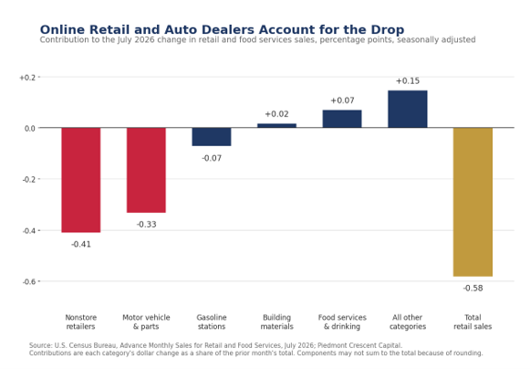
The Promotional Calendar Did the Damage
Amazon held Prime Day on June 23 through 26 this year. In every year from 2015 through 2025, with the exceptions of 2020 and 2021, it fell in July. Adobe Analytics put total United States online spending across the four days at $26.4 billion, up 9.3% from the comparable 2025 event, so the promotion itself was not weak. It simply landed in a different month.
The seasonal factors Census applies to these data are estimated on a history in which July carries the promotion and June does not. When the event moves, the adjustment penalizes the month it left and flatters the month it entered. June nonstore sales rose 0.9% on a seasonally adjusted basis and July gave back 2.2%. The unadjusted data, which is where a seasonal argument has to be made, show the effect at both ends of the move. Nonstore sales rose 2.4% from May to June, against an average decline of 4.5% over the four preceding years, all of which had a July Prime Day. They then fell 2.0% from June to July, against an average gain of 4.3% across those same four years. In 2021, the one earlier year the event fell in June, the two changes were a 1.9% gain and a 5.0% decline.
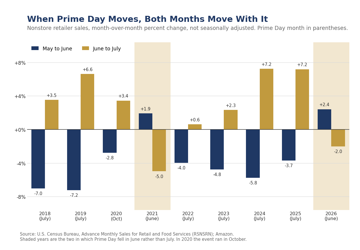
The promotion was not smaller this year. It was earlier, and the seasonal factors have not caught up with it.
The arithmetic is worth stating plainly, because it is the whole of the July surprise. Nonstore retailers are 17.9% of total retail and food services sales. A 2.2% decline in a category that size subtracts 0.41 percentage points from the headline by itself. Add the 0.33 percentage points that motor vehicles took out and the headline would have been up roughly 0.16% without them, which is about where the consensus had the month. Read that way, July landed close to expectations and the shortfall is the calendar.
Where the Rest of the Month’s Noise Came From
Motor vehicle & parts dealers fell 1.8% after a 2.4% gain in June. Light vehicle unit sales eased to a 16.3 million annual rate from 16.6 million, which is the ordinary pattern around model-year changeover, when incentives on outgoing models pull sales into one month and leave the next one thin. The twelve-month gain of 1.9% is among the weakest in the report, however, and the vehicle channel remains the clearest evidence that monetary policy remains tight for the most interest-sensitive parts of the economy.
Gasoline station sales require taking price changes into account before making any judgments. Sales fell 0.9% on the month while the average retail price of regular gasoline fell to $3.93 a gallon in July from $4.05 in June, a decline of 2.9%. Station receipts falling by less than prices implies households bought more gallons, not fewer, and the two-point gap is money that moved into other categories. Gasoline sales are still up 16.2% over the year, which is almost entirely a price comparison against a much lower base last summer.
The Control Group and What It Says
The control group excludes motor vehicle and parts dealers, gasoline stations, building material and garden equipment dealers, and food services and drinking places. The Bureau of Economic Analysis uses it as the primary monthly input to goods consumption, which is why it is the number to lead on when the headline is distorted, and July is such a month. The excluded categories are not missing from GDP, they are measured better elsewhere. Motor vehicles and gasoline still belong to goods consumption, but the Bureau takes them from unit sales and from Energy Information Administration data rather than from this survey. Food services and drinking places show up in services consumption, and the improvement-related share of building materials shows up in residential investment.
Control-group sales fell 0.5% in July to $416.2 billion. Excluding nonstore retailers, which are now 32.9% of the group, they rose 0.4%. Over the three months through July the control group grew at a 5.6% annual rate, and over the past twelve months it is up 4.5%, or 3.7% after deflating by the consumer price index for commodities less food and energy. Real growth of 3.7% in core goods spending is a strong reading by the standards of the past two years, and it is the number that survives the calendar.
Real core goods spending is growing 3.7% over the past year. One distorted month does not overturn that.
Goods, Services and the Restaurant Line
Food services & drinking places rose 0.5% in July and are up 5.0% over the past twelve months, matching the gain in total sales. Restaurants are the only services line in this report and they are the first thing households cut when they turn cautious, which makes the category a useful monthly read on discretionary appetite. Nothing in it suggests caution.
Clothing & accessories stores rose 1.9%, the strongest gain of any category in July, and sporting goods, hobby, musical instrument & book stores were unchanged after a run of gains that leaves them up 10.1% over the year. Miscellaneous store retailers rose 0.5% and are up 10.7%. These are the discretionary categories, and they are not behaving like categories under pressure. Health & personal care stores rose 0.7%, and food & beverage stores were flat.
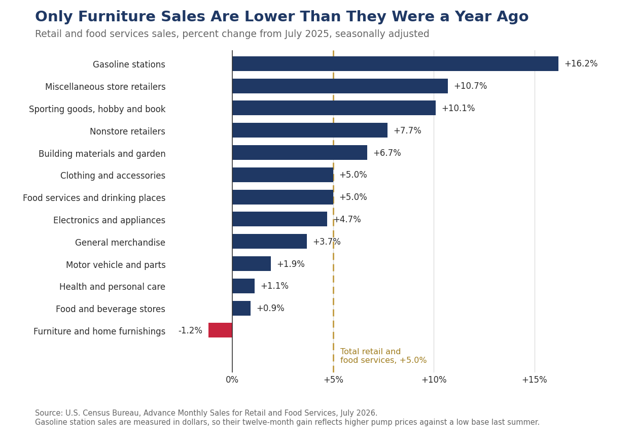
July Is a Transitional Month
It is worth saying every year that July carries less information about the consumer than the months on either side of it. The summer selling season is over by the Fourth, the back-to-school season has barely begun, and most of the back-to-school dollars land in August, concentrated in the weeks that carry state sales tax holidays. Apparel and general merchandise spend much of the month clearing spring and summer inventory at markdown, which lowers the dollar value of a given unit volume, so a soft July in those categories can be a margin story rather than a demand story. That apparel rose 1.9% in spite of that pattern is the more interesting fact in this report.
From this year, July has also lost the promotional anchor it carried for a decade. That is a permanent change to the shape of the month if Amazon keeps the June date, and the seasonal factors will take two or three years to absorb it. Until they do, the adjusted July and June figures should be read as a pair rather than separately.
What This Means for Third Quarter Consumer Spending
July is the first month of the quarter, so it sets the base and does little else. The control group in July sits a shade below the second quarter average, which on a mechanical carryover basis would put third quarter nominal core spending fractionally lower than the second quarter if August and September were both flat.
That carryover understates the quarter, however, and for a reason specific to this year. June sits inside the second quarter base and was inflated by the promotion, while July is the starting point for the third quarter and was deflated by its absence. The comparison is penalized at both ends. Reading the two months as a pair rather than separately is the better description of the underlying pace, and it is what we would do with any month whose seasonal factors are known to be misaligned.
We should be careful not to claim more than the calendar can carry, however. Taken together, June and July online sales came in about 2% below the trend that ran from January through May, so the promotional shift explains the shape of the two months but not the whole of the deceleration. Part of the remainder is a base effect rather than a change in behavior. The twelve-month gain in nonstore sales slowed to 7.7% in July from 12.4% in June, but July 2025 was itself a Prime Day month, and a four-day one, so this year’s comparison runs against an inflated base. We would put the underlying pace of online spending in the high single digits and would want the August figure before making any changes to our outlook, which calls for real consumer spending to rise at a 2.1% pace. Our forecasts tend to be conservative.
Our working assumption is that nonstore sales return to trend in August and that back-to-school spending lands where it usually does. Control-group growth of 0.5% to 0.6% in each of August and September would put third quarter core spending up between 1.75% and 2.2% at an annual rate over the second quarter in nominal terms, or roughly 1% to 1.5% in real terms. We are comfortable with real personal consumption growth in the low 2s for the quarter once services are added, and services have been the steadier half of consumption all year.
Our Call · A Calendar Artifact, Not a Turn
July’s decline belongs to the calendar rather than to the consumer. Online retail and auto dealers, each with an identifiable reason to fall, more than account for the drop, and nine of the eleven remaining categories were flat or higher. The measure that matters for the national accounts is growing at a 5.6% annual rate over three months and 3.7% in real terms over the past year. We would not extrapolate this month.
The consumer keeps spending because incomes keep growing and the balance sheet is in reasonable shape. Payroll growth has been modest, but the constraint there is the supply of workers rather than the demand for them, and aggregate wage income is still rising faster than prices. Goods prices are up less than 1% over the past year, which means nominal spending gains are translating into real volume in a way they did not in 2022 or 2023. Restaurant and apparel spending, the two lines households cut first, are among the strongest in this report.
We expect the August advance report, which lands in mid-September, to show nonstore retailers up 1.5% or more and the control group up at least 0.4%. That is the falsifiable form of this call. A softer August in both would mean the July weakness was real and we were wrong about the calendar. We also expect this report to be used as an argument for a September rate cut, and we do not think it supports one. Our view is unchanged: no cut in 2026, and the next move is more likely a hike in the first half of 2027.
Bottom Line
Retail sales fell in July because Amazon moved Prime Day into June and auto dealers gave back a model-year gain, not because households stopped spending. Core goods spending excluding online sales rose 0.4%, restaurants and apparel advanced, and the three-month pace of the control group is running at 5.6% annualized. The consumer entered the third quarter in the same shape in which the second quarter ended.
What We Are Watching
- Nonstore retailers in the August report. A gain of 1.5% or better confirms that July was a give-back. Anything under 0.5% and we would revisit this call. The report lands in mid-September.
- Back-to-school spending in August apparel and general merchandise. With the promotional calendar shifted, the back-to-school signal now sits almost entirely in August. A weak apparel print there would carry more information than a weak one in July.
- The preliminary revision to July. The full Monthly Retail Trade Survey replaces the advance subsample on September 16, alongside the August advance report. Census puts the average absolute revision at two-tenths of a percentage point.
Appendix: Retail Sales Detail
| Category | Jul m/m | 12-mo |
|---|---|---|
| Retail and food services, total | −0.6% | +5.0% |
| Retail trade | −0.8% | +5.0% |
| Total excluding motor vehicle & parts | −0.3% | +5.8% |
| Total excluding gasoline stations | −0.6% | +4.2% |
| Total excluding motor vehicle & parts and gasoline | −0.2% | +4.8% |
| Control group (PCC calculation) | −0.5% | +4.5% |
| Motor vehicle and parts dealers | −1.8% | +1.9% |
| Furniture and home furnishings stores | +0.3% | −1.2% |
| Electronics and appliance stores | −0.5% | +4.7% |
| Building material and garden equipment dealers | +0.3% | +6.7% |
| Food and beverage stores | 0.0% | +0.9% |
| Health and personal care stores | +0.7% | +1.1% |
| Gasoline stations | −0.9% | +16.2% |
| Clothing and accessories stores | +1.9% | +5.0% |
| Sporting goods, hobby, musical instrument and book stores | 0.0% | +10.1% |
| General merchandise stores | +0.3% | +3.7% |
| Miscellaneous store retailers | +0.5% | +10.7% |
| Nonstore retailers | −2.2% | +7.7% |
| Food services and drinking places | +0.5% | +5.0% |
Computation notes. The control group excludes motor vehicle and parts dealers, gasoline stations, building material and garden equipment and supplies dealers, and food services and drinking places, and is calculated by Piedmont Crescent Capital from the published category levels. Three-month annualized rates are the compound annual rate of change of the latest three-month average over the prior three-month average on seasonally adjusted levels. Real figures deflate by the consumer price index for commodities less food and energy commodities. Gasoline prices are the weekly average retail price of all grades of regular gasoline, averaged over the weeks in each month. The advance report is drawn from a subsample of about 4,800 firms and is replaced by the full Monthly Retail Trade Survey about a month later. Census puts the average absolute revision to the advance estimate at two-tenths of a percentage point, which is a meaningful share of a typical monthly change.
Mark P. Vitner – Chief Economist, Piedmont Crescent Capital
mark.vitner@piedmontcrescentcapital.com · (704) 458-4000
Sources: U.S. Census Bureau, Advance Monthly Sales for Retail and Food Services, July 2026; U.S. Bureau of Labor Statistics, Consumer Price Index, July 2026; U.S. Energy Information Administration, Weekly Retail Gasoline Prices; Adobe Analytics, 2026 Prime Day insights; Bureau of Economic Analysis; Federal Reserve Bank of St. Louis (FRED). Control-group and contribution calculations by Piedmont Crescent Capital.
Disclaimer: This report is provided for informational purposes only and does not constitute investment, legal, tax, or accounting advice, nor an offer or solicitation to buy or sell any security. Information is drawn from sources believed to be reliable, but its accuracy and completeness are not guaranteed. Views expressed are those of the author as of the date of publication and are subject to change without notice. Past performance is not indicative of future results.
The Map Has Flipped: Dispersion, Regulation and a New Municipal Math
Residential Construction Outlook · Summer 2026
The Map Has Flipped
Dispersion, Regulation and a New Municipal Math
The House View
- National home price numbers are the least informative metric on housing right now. Case-Shiller national appreciation has spent twelve straight months between 0% and 2%, the longest such run since 1992-93. That apparent calm is an artifact of averaging two markets moving in opposite directions.
- Dispersion is ordinary in size and unprecedented in composition. The spread between the 80th and 20th percentile of the twenty Case-Shiller metros is 4.2 percentage points against a 2000-2026 average of 8.0. But on our scoring of every May cross-section since 1988, this is the first year in which Midwest and Northeast metros hold the entire top five while Sun Belt metros hold three of the bottom five.
- Our July 31 forecast puts total housing starts at 1.340 million in 2026 and 1.360 million in 2027. What the total conceals is the mix. Single-family starts fall to 890,000 this year from 941,000 in 2025 and recover only to 940,000 in 2027, while multifamily rises to 450,000 before easing to 420,000. On rates we have the thirty-year mortgage finishing 2027 at 6.64%. That follows from a firmer real economy. New home sales are forecast at 636,000 in 2026.
- Mortgage lock-in releases in 2029, not 2027. The share of outstanding mortgages below 5% is running off at roughly 1.1 percentage points a quarter. That reaches 50% in 2029. End-2027 gets to about 59%. Policy could in principle speed this up, but nothing currently on the table will. Roughly 23% of outstanding mortgages, the FHA, VA and USDA book, are already assumable, and that produced about 6,000 assumptions in 2023. FHFA has said since November 2025 that it is evaluating portability and has shipped nothing. The MOVE Act (H.R. 10028), introduced August 3, would direct the GSEs to buy portable mortgages, and it is still new with no score. The fifty-year mortgage has been shelved and was never a mobility fix in any case.
- Builders will cut starts before they cut base prices. The committed share of a builder's budget does not fall when demand does, so the adjustment runs through volume, incentives and margin.
- Regulation is the structural constraint; input costs are the cycle. The regulatory share of a new home's price has risen through two booms and two corrections. This year's 5.8% increase in construction input costs is largely a trade-policy event and could reverse.
- Watch the municipal ledger. Whether new growth pays for its own infrastructure is becoming a jurisdiction-by-jurisdiction question, and it is already showing up in impact fees and infrastructure-finance legislation from Arizona to Texas to Tennessee to San Francisco. The likely beneficiary is infill, though the Opportunity Zone program is tilting the other way.
1. The Bottom Line
The residential construction market is cooling at two different speeds. Existing home sales fell to a 4.06 million annual rate in July, up 0.7% from a year earlier but still more than 20% below the 5.27 million pace of mid-2019, while new home sales of 628,000 in June were 5.6% below their year-ago level. Affordability is holding demand back in both markets, and only part of the steeper affordability hurdle is cyclical. The rest is a cost problem on the supply side, and three pieces of it stand out. Regulatory compliance now accounts for 26.4% of a new home's price, or $131,734, more than 40% above the 2021 figure. Input costs for single-family construction have risen about 20% over the same period and 5.8% in the past year alone, with 5.2 points of that gain landing in the first six months of 2026. And 17 consecutive quarters of tightening acquisition, development and construction credit have made builders more selective about where they are building going forward, favoring higher-margin developments versus starter homes. Regulation has grown roughly twice as fast as the materials and labor that actually go into the house, which is why we treat it as the structural constraint and the rest as the cycle.
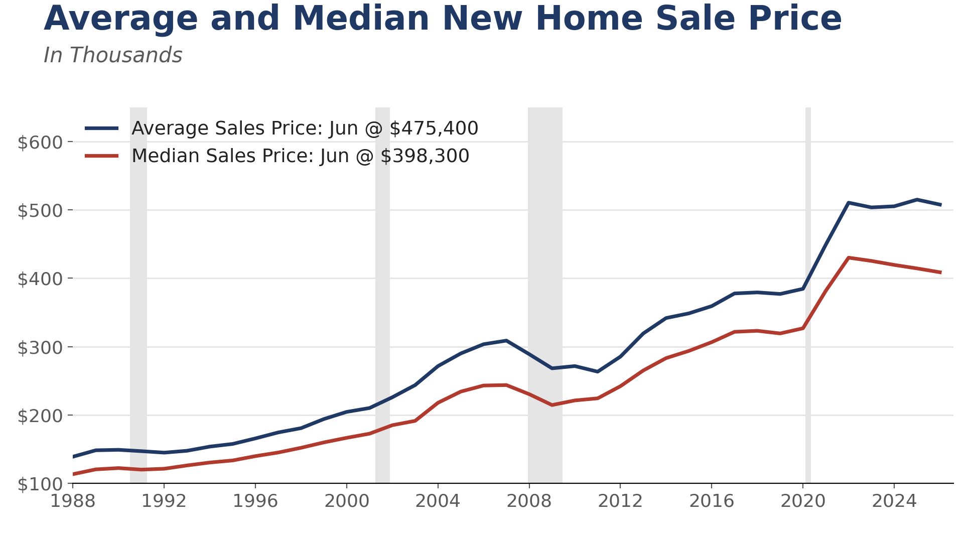
Underneath the national picture, a shifting migration wave is reshaping where housing demand holds up best, though the shift is not the one usually described. The great arbitrage out of the high-cost Northeast and West Coast into Texas, Florida and the Mountain West has faded, mostly because those destinations stopped being cheap. Florida is the clearest case. Net domestic migration into the state peaked at 310,892 in the year ended July 2022 and fell to just 22,517 in the year ended July 2025, a decline of 93%. Georgia has not followed it down, however. Georgia drew 27,300 net domestic migrants over the same twelve months, more than Florida did, and the figure was up from 25,321 a year earlier but down from the 94,836 the state drew just after the pandemic. International migration is still adding to Georgia's total, but the shift that matters is where the new residents are settling.
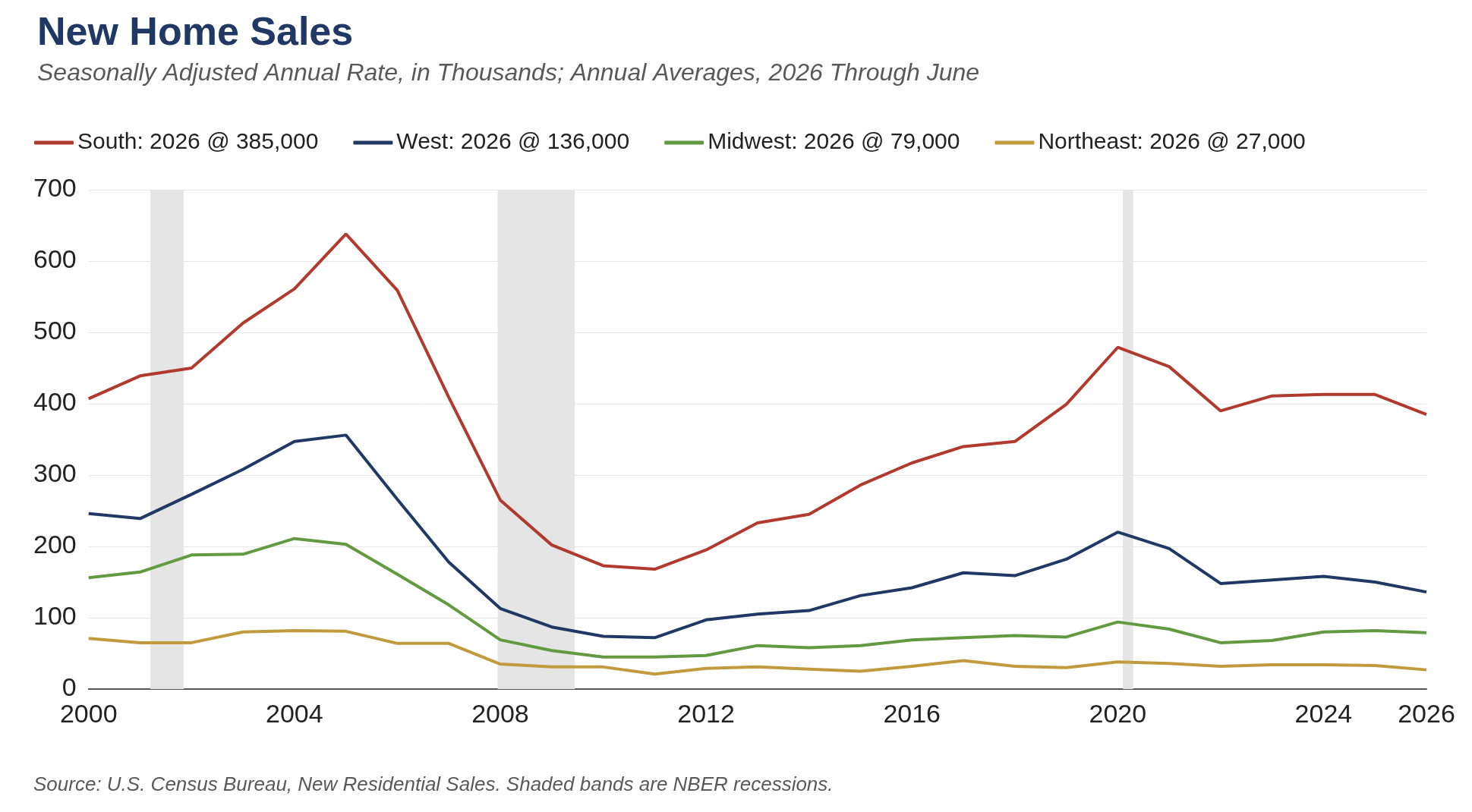
The redistribution runs from the core to the fringe and from the large metros to the smaller ones. All five of metro Atlanta's core counties, Fulton, Gwinnett, Cobb, DeKalb and Clayton, now post negative net domestic migration, while the exurban ring is among the fastest-growing territory in the country. Jackson County grew 5.3% in the year ended July 2025 and Dawson County 4.2%, ranking fourth and ninth nationally, and Barrow, Cherokee, Paulding, Forsyth and Hall all outpaced the metro Atlanta area as a whole. Affordability is the reason. A median mortgage payment took 25% of median income in metro Atlanta in 2019 and takes 41% today, and the deterioration in the suburbs and exurbs was larger than in any other metro above five million people. Growth is moving to smaller metros as well, most notably Savannah, which is growing 1.6% a year, and Knoxville and Chattanooga, where 86% of Chattanooga's population gain since 2020 has come from domestic migration despite a natural decrease. Some of those new residents come from metro Atlanta.
Nashville is the case where the two halves of the story separate. Affordability there is more stretched than in Atlanta, with a median home price near $480,000 in July 2025, up 62% from 2019, and 46% of a median household's income required to carry it against a 30% benchmark. Growth has not yet responded. Davidson County added 9,281 people in the year ended July 2025, the largest gain of any Tennessee county, and did so while international migration into the county fell 58%. Tennessee's statewide domestic migration has declined for three straight years, from 58,206 in 2023 to 42,389 in 2025, so the slowdown is real at the state level even where the core county is still gaining.
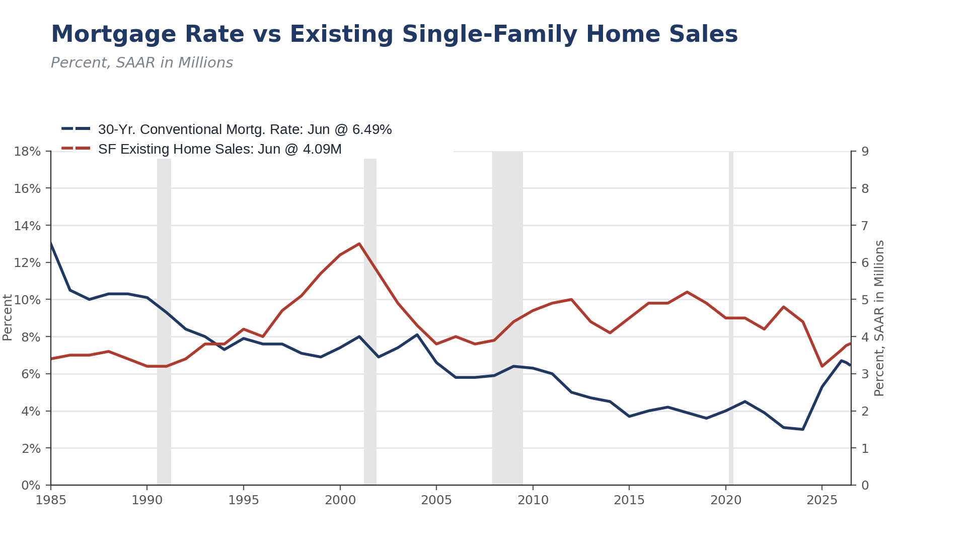
The Carolinas are riding a broad-based capital-investment cycle and remain the top destination for people moving within the U.S. North Carolina led the nation in net domestic migration for the year ended July 2025 at 84,064, up from 82,288, and South Carolina was the fastest-growing state in the country at 1.5%. Popular Carolinas destinations are still more affordable than the typical large metro, though the margin has narrowed sharply. House prices have outrun incomes by roughly three to one since 2019, with the FHFA index up 82% in Charleston, 78% in Charlotte, 76% in Greenville and 69% in Raleigh against 61% nationally, while median household incomes in the core counties rose 26% to 31%. Raleigh, Columbia and Greenville still price below the national ratio of home value to income, Charlotte has converged to it and Charleston has surpassed it.
A newer question is starting to shape how far that wave can run, which is whether the housing itself pays for the roads, sewer lines and schools it requires. Our survey of cost-of-community-services literature says residential development generally does not. Kotchen and Schulte's 2009 meta-analysis of 125 such studies, published in the International Regional Science Review, puts the mean ratio of local expenditure to revenue at 1.18 for residential land, meaning local government spends $1.18 servicing a residential parcel for every $1.00 of revenue it collects from it, against 0.44 for commercial and industrial and 0.50 for farm and open space, and the gap is driven overwhelmingly by schools rather than by pipes and pavement. That literature compares land uses rather than densities, so it does not by itself establish that the fringe is worse than infill, and at least one careful study finds per-capita service costs rising with density rather than falling. How local governments are behaving is not in dispute. Horry County adopted an impact fee schedule effective July 21, 2026 that charges $1,615 on a 1,500 square foot house, 54 Georgia jurisdictions are authorized to charge impact fees and 44 actually do, at an average single-family fee of $2,440, with Cherokee and Forsyth counties collecting more than $8 million a year each. North Carolina counties lack the authority to charge school impact fees and reach instead for adequate public facilities ordinances, which slow the fringe rather than price it.
Population growth is also picking up in parts of the South that grew slowly for years, though the list is shorter than it looks and the strongest single signal is a construction signal rather than a population one. Alabama drew 23,400 net domestic migrants in the year ended July 2025 and Arkansas 14,500, and Arkansas was one of only five Southern states where the figure rose from the prior year. Baton Rouge is the standout. It ranked first among all 360 metro areas in construction employment growth over the twelve months ended June 2026, at 22% and 10,200 jobs, in a period when fewer than half of all metros added construction jobs at all. Permits in East Baton Rouge Parish have risen 142% in two years. Some of that is petrochemical and industrial rather than residential, so we would not read it as a pure housing signal. Gulfport-Biloxi is a different case, since its construction payrolls were flat over the same twelve months, though it posted the strongest population growth of the three at 0.9% and permits up 8.4%. Memphis is the weakest on fundamentals, with population down 0.3% and construction employment up only 3%, but permits rose 17.4% in the first half, which is a genuine turn against a soft demographic backdrop. Huntsville and Daphne, Alabama, and Fayetteville-Springdale-Rogers, Arkansas carry none of those qualifications.
2. Dispersion: Ordinary in Size, Unprecedented in Composition
The most quoted number in housing is also the least useful one at the moment. The S&P Cotality Case-Shiller national index rose 1.1% in the year through May, and it has now spent twelve consecutive months inside a 0% to 2% band. We ran the full index history back to 1987 to see how unusual that is. Only two comparable episodes exist, an eleven-month stretch from May 1995 to March 1996 and a twenty-month stretch from January 1992 to August 1993, and the period between them never cleared 2.9%. Nothing in 2006-07 or 2011-12 qualifies, because those were fast transits through zero on the way to deep negatives. This is the first sustained sub-2% national stretch in thirty years.
That calm disappears at the metro level, however. Seven of the twenty Case-Shiller metros are outright negative over the past year. Chicago is up 6.9%, New York 4.2%, Cleveland 3.1% and Detroit 3.0% on its April reading, while Las Vegas is down 1.9%, Seattle 1.8%, Denver 1.8%, Tampa 1.6% and Phoenix 1.3%, with Dallas and Portland also below zero. The national index is a weighted average of two markets moving in opposite directions, and it is the only place in housing where those markets look like stability.
Dispersion on the usual measure is not wide. The spread between the 80th and 20th percentile of the twenty metros is 4.2 percentage points, against an average of 8.0 points across the same May cross-section every year since 2000, and it ranks seventh-narrowest of twenty-seven readings. The widest were 2005 at 19.4 points and 2008 at 17.5. Dispersion is the wrong statistic on which to build a case that the housing market is fracturing. Street work on the same question has found that cumulative inventory growth since the fourth quarter of 2019 explains 73% of the variation in recent price performance across the largest metros. We agree on both counts, and would put the causal chain one step further back, because inventory did not appear on its own.
What is not ordinary is which markets now sit at each end. We scored every May cross-section from 1988 through 2026, ranking the twenty metros and comparing the average rank of the Sun Belt group against the Midwest and Northeast group. May 2026 produces the widest gap in the thirty-nine-year record, and it is the only year in which Midwest and Northeast metros hold four or more of the top five positions while Sun Belt metros hold three or more of the bottom five. Chicago, New York, Cleveland, Detroit and Boston are now the five fastest-appreciating markets in the country. In May 2019 and again in May 2022, Sun Belt metros held all five top slots and none of the bottom five. The reversal took about three years and first became visible in the May 2025 cross-section, which ranks second in the same record, so this is a regime that has held across two consecutive cross-sections rather than a one-month artifact.
The nearest historical analogues fail in instructive ways. The 1988 to 1992 period had Midwest and Northeast metros ranking well, but that was the coasts collapsing rather than the Sun Belt underperforming. The late 1990s had Sun Belt metros at the bottom, but the top was the West Coast and Cleveland was near the bottom as well. In 2008 and 2009 the Sun Belt occupied the very bottom, but the whole table was negative and the Midwest was only relatively less bad. What is new is the joint condition, a Midwest and Northeast sweep of the top with the Sun Belt in the bottom, while the national rate is still positive.
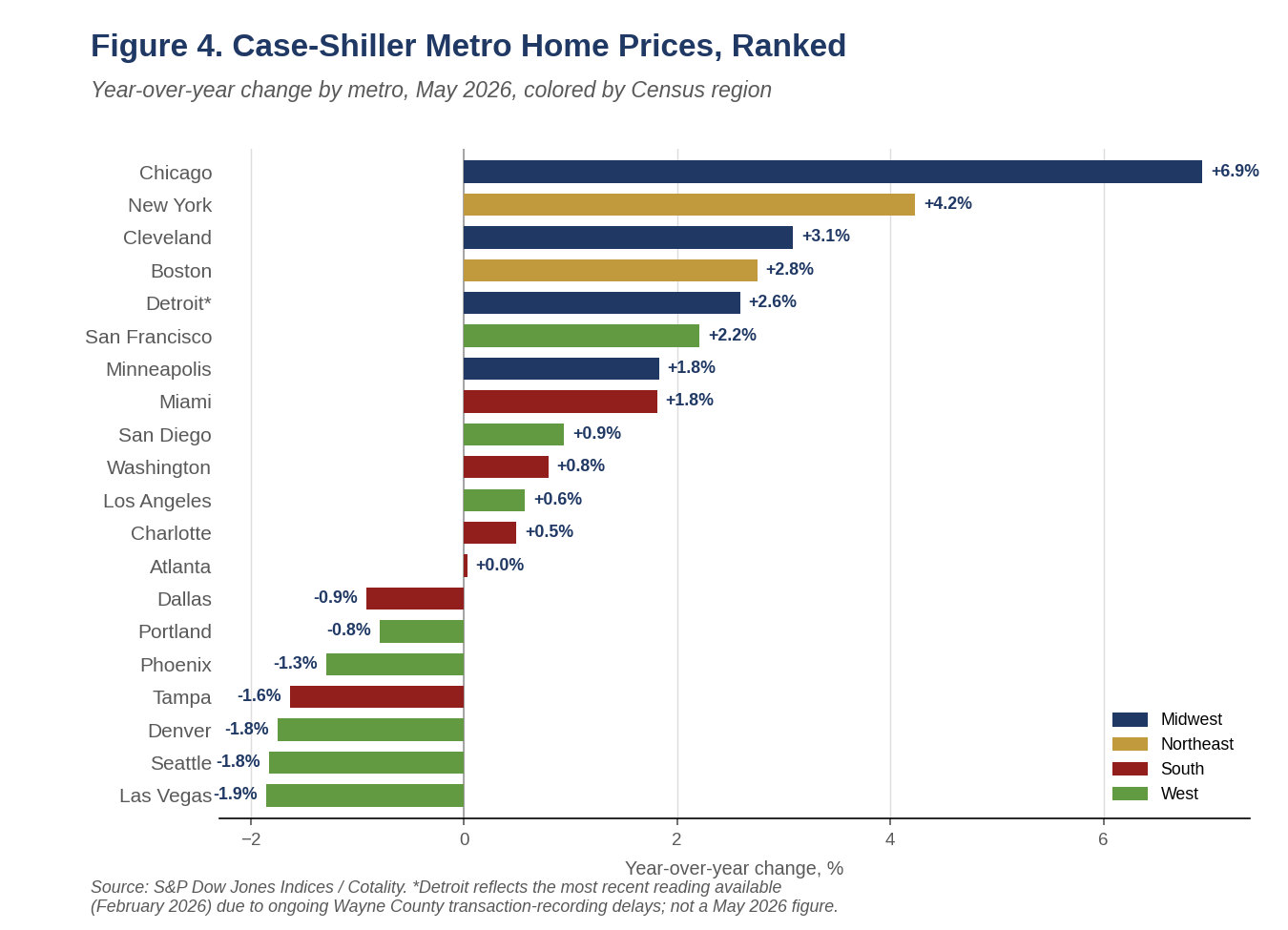
This is a supply story rather than a demand story. The metros now falling are the ones that permitted and built most aggressively after 2020. The metros now leading are the structurally supply-constrained legacy markets that were left behind in the pandemic boom. The leaders are not simply the cheapest markets mean-reverting, however. Miami is up 82% since January 2020 and Charlotte 72%, the two largest cumulative gains in the index, and both are still positive, while Portland at 38% and Minneapolis at 42% are among the smallest and are flat to negative. The correlation between cumulative gain since 2020 and current momentum is only 0.30. Appreciation is tracking how tight a market is rather than how much room it has left to catch up.
For a construction outlook the composition matters far more than the national rate. The dispersion is the migration wave and the supply response showing up in prices with a lag, and it puts the near-term risk in residential construction squarely in the markets that carried the last cycle.
Key Finding: The Fiscal Math Is Shifting
Residential development costs local governments about $1.16 in services for every $1.00 it returns in property tax revenue, and infill development saves roughly $21,000 per home in infrastructure costs against building at the metro fringe, which favors more apartment and townhome development. Where growth gets built is becoming as important as how much gets built.
3. What's Holding Back Construction
Builders have little room to fix this on their own, because most of what they spend is committed before a house is framed. NAHB's June 2026 cost-of-regulations study puts the regulatory share of a new single-family home's price at 26.4%, or $131,734 on an average sales price of $499,500 as of January, split between $84,939 incurred during construction and $46,795 during land development. That total is more than 40% above the $93,870 the same study measured in 2021. NAHB sets the increase against aggregate U.S. disposable income, which rose 18.3% over the same five years, and concludes that regulatory cost is climbing more than twice as fast as consumers' ability to pay. We would put it more carefully. Roughly two-thirds of the dollar increase is arithmetic, since the average new home price those percentages are applied to rose 26.7% over the same period. The genuine intensification is the share itself, which went from 23.8% to 26.4%, and all of that increase sits on the construction side.
The drivers are worth naming, because they are not the ones usually blamed. Changes to building codes over the past decade are the single largest item at $40,288 per home, up 67% since 2021 and accounting for two full percentage points of the 2.6-point rise in the regulatory share. Fees paid by the builder after the lot is purchased come next at $20,154, up 65%. Architectural design standards beyond the ordinary add $16,117, and land dedicated to the government or otherwise left unbuilt adds $13,593. The fastest-growing item in percentage terms is the pure cost of delay, up more than 70% on both sides of the project, which reflects seven months of average delay during land development and another six weeks during construction. Regulation on the development side actually fell as a share of price, from 10.5% to 9.4%, so the story is codes and fees on the vertical build rather than entitlement friction at the front end. The component estimates rest on 54 developer responses and 337 builder responses, so they are best read as directional.
Materials have not settled either. Net input costs for single-family residential construction rose 5.8% over the year ended in June, and 5.2 points of that gain landed in the first six months of 2026 alone. The broader construction materials index, which carries heavier nonresidential weights, is up 9.0%, though a soft June 2025 base flatters that comparison. Measured against 2021, residential input costs are up about 20%, or roughly half the increase in regulatory cost over the same five years. Where the pressure sits matters more than the headline. Steel mill products are up 16.9% over the year and copper wire and cable 22.3%, while general millwork is up 3.0%, concrete products 3.2% and gypsum products are down 0.7%. The acceleration is narrow rather than broad, concentrated in the metals and lumber complex where trade policy has bitten hardest, and that concentration matters, because a builder can value-engineer around a finish material and cannot value-engineer around the structural frame or the wire in the walls.
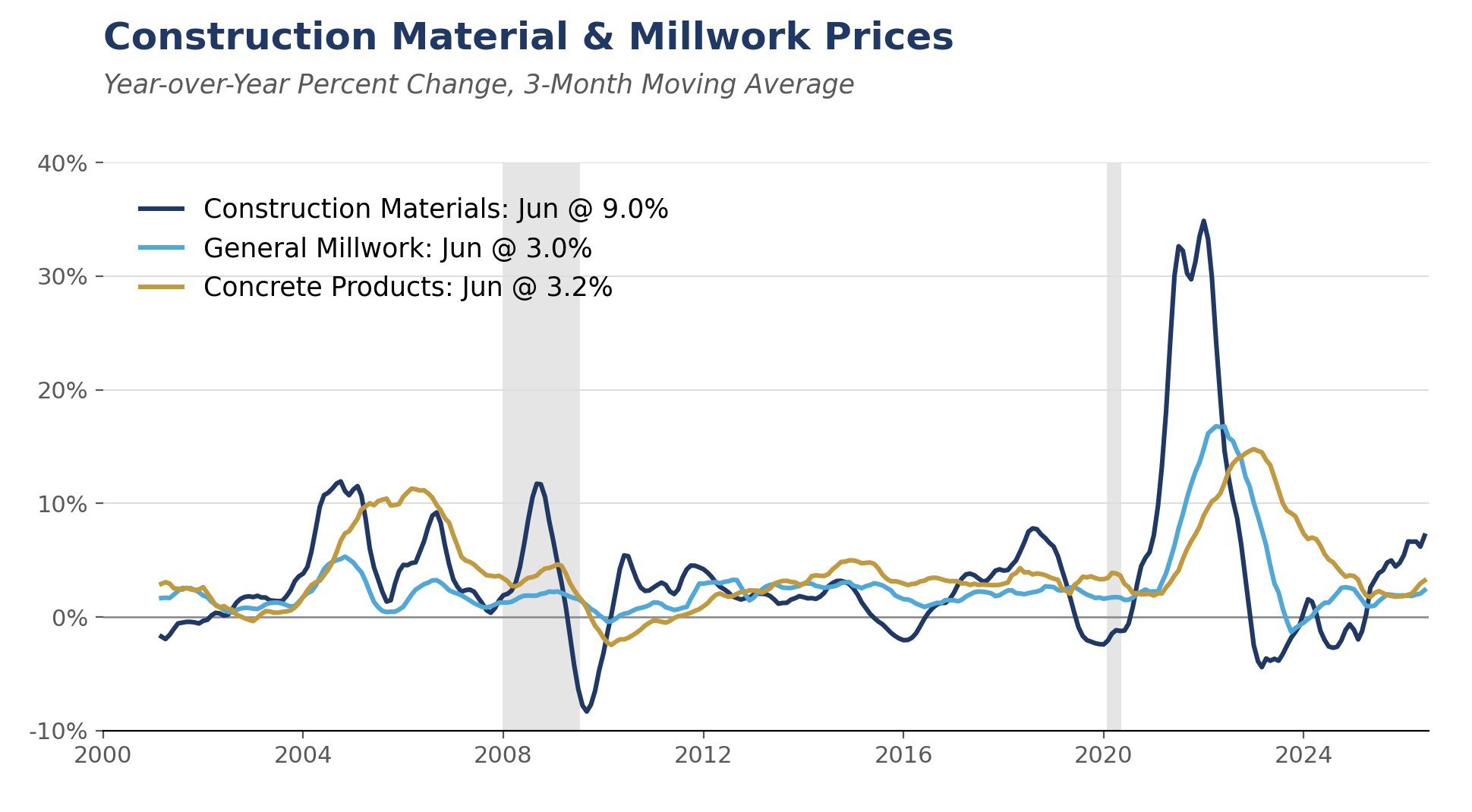
Labor and credit round out the constraints. Associated Builders and Contractors estimates the industry needs 349,000 net new workers in 2026 and 456,000 in 2027 just to keep pace, with more than half of the 2026 figure needed simply to replace retiring workers rather than to support growth. Federal Reserve and NAHB surveys have now shown 17 consecutive quarters of net tightening in acquisition, development and construction lending standards. That squeeze falls hardest on smaller private builders, who lack the balance sheet to carry land and finished inventory through a slow patch, and it has concentrated production among the large publics. Combined with a land and development cost that does not scale down with the size of the house, it pushed the product mix up-market for most of this decade.
Acquisition, development and construction credit is the channel through which tight money actually reaches the housing stock. An AD&C facility is a short-term, floating-rate bank loan that funds land purchase, horizontal development and vertical construction, drawn in stages against inspections and repaid at closing. For private builders it is almost always personally guaranteed. The book has never recovered from the last cycle. FDIC data put one-to-four family residential construction and land development loans at $91.1 billion at the end of 2025, some 55% below the $204 billion peak of early 2008 in nominal terms and far below it in real terms. Because the interagency concentration guidance measures construction exposure against a bank's own capital, the constraint binds first at community and regional banks, which is where small private builders bank. The guidance is supervisory rather than a hard cap, but examiners treat the thresholds as though they were limits, and the practical effect is the same.
The pricing detail in NAHB's first-quarter survey shows exactly how this shapes what gets built. Effective rates ran 9.36% on land acquisition, 10.15% on land development, 11.22% on speculative single-family construction and 11.68% on pre-sold construction. The revealing movement is in points rather than rates. Points on land acquisition fell to 0.50% from 0.70% while points on speculative construction nearly doubled to 0.62% from 0.34%. Lenders are pricing away from unsold inventory risk specifically. Sixty percent of builders reporting tighter conditions cited reduced loan amounts and 53% cited personal guarantees. A builder facing an eleven-percent construction loan, a lower advance rate and a personal guarantee will underwrite the project with the thickest margin and the most reliable absorption, and that is rarely the entry-level subdivision on the edge of the metro. We would state this as a well-founded inference rather than a measured effect, since no study isolates AD&C tightness as a causal driver of price-point mix, but the supporting facts all point the same way.
The result is that we have both too much housing inventory and too little. New homes for sale represented a 9.3-month supply in June, and months' supply has run at or above nine months for most of the past year and a half. It was last this elevated in the second half of 2022, and before that in 2010, though the crisis peak was higher still at 12.2 months in January 2009, so this is elevated rather than extreme. Builders are carrying 118,000 finished, unsold homes. The homes on the market, however, are not the homes buyers need. New homes priced under $300,000 accounted for 40% of sales in 2020, fell to 14% by 2022 and have recovered only to 18% in 2025, while NAHB's affordability work finds that more than half of U.S. households cannot afford a $300,000 home. Realtor.com counts roughly 300,000 fewer listings below $350,000 than in June 2019, with affordable homes down to 37.6% of active inventory from 55.1%.
Builders have started to move back down-market, but not far enough. The median new home sold for $398,300 in June, about 10% below the $440,600 median existing home, a reversal of the premium new construction normally carries. What remains of the gap is being papered over with financing rather than with price. Lennar spent $54,947 per home on incentives in the second quarter, 12.9% of the gross price, against $12,074 in the third quarter of 2022, and gross margins have absorbed the difference.
Regulation is the structural cost problem; materials are cyclical. Input costs are cyclical and policy-driven, and a change in trade policy could reverse a good part of this year's increase inside of a year. The regulatory share has risen through two housing booms and two corrections, and nothing in the 2026 study suggests it retreats.
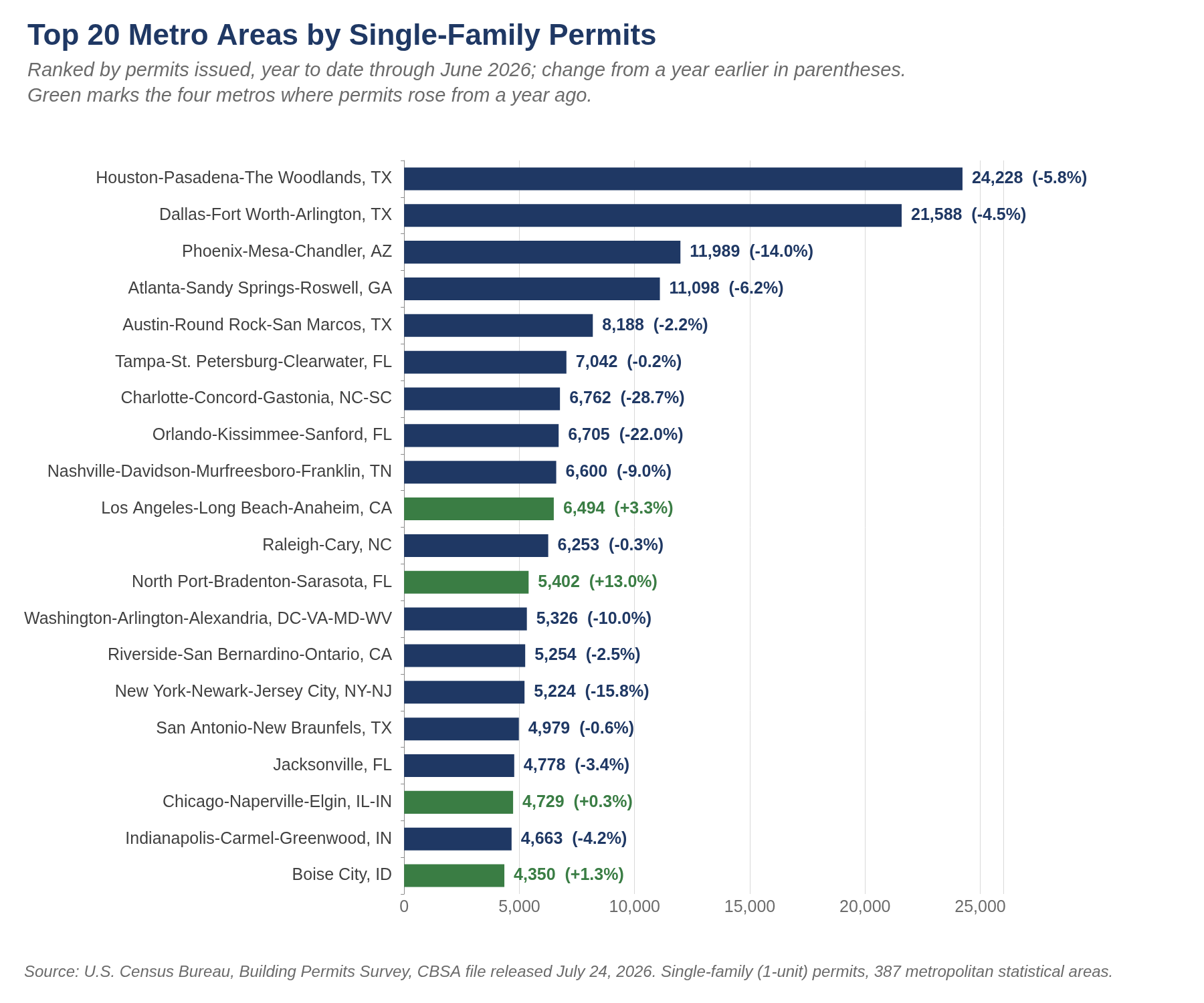
4. The Shifting Migration Wave
The five-state frame
The regional framework rests on where each state sits in the migration cycle rather than on its current growth rate. Florida shows what happens after a wave crests, and its cost structure is now the binding problem rather than its migration rate. The average homeowners insurance premium reached $8,292, or 2.8 times the national average, and Citizens Property Insurance's policy count has fallen from a peak of 1.41 million in October 2023 to 278,246 at the end of June 2026, an all-time low, as private carriers re-entered the market. Rising insurance cost is itself a supply factor, since it pushes second-home and investment owners to list, and that is part of why Tampa sits where it does in Figure 4, and part of what is happening in the Miami condominium market. The Carolinas show what the same wave looks like while cresting, with North Carolina first in the nation at 84,064 net domestic migrants for the twelve months ended July 2025 and South Carolina third at 66,622, with Texas between them at 67,299.
Georgia and Alabama sit earlier in the same cycle, still awaiting the population lift their capital investment implies. Georgia's case centers on Rivian's $6.6 billion, DOE-backed electric vehicle plant near Social Circle and the existing Hyundai Metaplant and SK Battery complex near Savannah; Alabama had a record 2025 with 234 announced projects representing $14.6 billion in investment, anchored by Eli Lilly's $6 billion Huntsville facility. U-Haul's index is worth a glance for confirmation even though it lags. The company publishes only an annual reading, released each January, and the 2025 edition put Texas first among states, Florida second and North Carolina third, with Dallas-Fort Worth the top metro and Ocala the top city in the country. The Ocala result arrived a year before the Census data confirmed it. Texas does not fit the framework neatly. The state reclaimed U-Haul's number-one growth-state ranking in 2025 for the seventh time in ten years and claimed 182 of the South's 336 capital-project announcements in the first half of 2026 alone, even as its per-capita migration has cooled from roughly +222,000 in 2022 to +67,299 in the year ended July 2025. Texas is building a second wave on a base that is already the largest in the South, which is why the capital-project count tells you more there than the migration rate does.
Dallas: the same pattern, at a larger scale
Dallas-Fort Worth is running the same core-to-fringe redistribution as Atlanta, and the core side of it is larger than anything in the Southeast. Dallas County lost 46,200 net domestic migrants in the year ended July 2025, equal to 1.7% of its population in a single year, and finished the year down 2,616 people overall, the ninth largest numeric decline of any county in the country. Only a 52% drop in international migration tipped it into outright loss. Tarrant County was also negative at minus 7,000. The metro nevertheless added 123,557 people, second only to Houston, because the ring absorbed what the core shed. Metro net domestic migration was still positive at 18,197, though that is down 82% from the 2022 peak of 98,989 and down 42% in a year.
The growth is going north in volume and east in rate. Collin County added 42,966 people, the second largest numeric county gain in the nation, and Denton added 23,120. Together they are 53% of the metro's entire growth, and their combined net domestic migration of roughly 35,700 is nearly double the metro's total, which means the northern corridor is doing more than all of the region's net in-migration by itself. On growth rate, however, the leader is east. Kaufman County grew 5.67%, the third fastest county in the United States, ahead of Ellis at 3.62% and Hunt at 3.46%, all of which beat Collin's 3.43%. Denton at 2.21% was the second slowest county in the entire ring. The ring is tilted north and east rather than marching simply northward.
Six of the nation's fifteen fastest-growing cities are Dallas-Fort Worth suburbs. Celina, in northern Collin County, grew 24.6% to 64,427 and is the fastest-growing city in America, up 277% since the 2020 census, and it has passed Frisco as the metro's largest new-home market by permits. Princeton, Melissa and Anna follow, with Forney in Kaufman County and Greenville in Hunt County also in the top fifteen. Prosper, by contrast, is approaching buildout, and Plano, Irving, Garland and Arlington all lost residents. Fort Worth is the exception, adding 19,512 people, the most of any Texas city, and passing Jacksonville to become the nation's tenth largest city.
Affordability explains the redistribution here as it does in Atlanta, and the Texas version has a distinctive cause. The DFW median listing price rose from $359,100 in June 2019 to $439,990 in June 2026. On our estimates the median mortgage payment moved from roughly 29% of median household income to about 45%, a deterioration of some sixteen points, almost exactly matching Atlanta's move from 25% to 41%. But DFW sits about four points higher at both ends, because Texas property taxes near 2% of value and sharply higher homeowners insurance add roughly $850 a month to the carrying cost of a median home. Dallas has a carrying-cost problem as much as a price problem, and that is why the affordability frontier keeps moving outward.
The supply picture is consistent with a market that overbuilt and is now correcting. Active listings reached 29,628 in June, 23.9% above the June 2019 level, one of the few large metros where for-sale inventory now exceeds pre-pandemic norms. Single-family permits fell 8.3% in the first half and multifamily permits 11.9%. Apartment vacancy is around 12%, asking rents are down roughly 2% over the year, and landlords are offering six to eight weeks free. The price data is already turning, however. Case-Shiller Dallas was down 0.92% over the year through May, but the index bottomed in February and has risen three straight months, so the year-over-year figure should cross back above zero before long. Dallas is flat and correcting rather than falling.
The forward story sits north of the metro, in Grayson County and the Sherman-Denison area. Announced capital investment there approaches $38 billion, led by Texas Instruments at $30 billion for four 300-millimeter fabs with a $1.6 billion CHIPS award, GlobiTech and GlobalWafers at $5 billion for the first new US silicon wafer plant in two decades, and Coherent at more than $3 billion. Sherman has permitted over 4,000 homes since the TI announcement. Grayson County's population grew only 1.8%, slower than every ring county, but 89% of that growth came from net domestic migration, the purest job-led relocation signal in the region. This is the Georgia and Alabama pattern playing out inside a Texas metro, with capital arriving well ahead of population.
Florida: the state is not one market
Florida's headline collapse in domestic migration conceals four metro stories that point in different directions. Jacksonville is the only unambiguous winner, though the win belongs to the suburbs rather than to the core. The metro added 26,153 people in 2025, up 1.49%, and the consolidated city of Jacksonville added 8,319 to reach 1,017,689, the twelfth largest numeric gain of any city in the country. St. Johns County grew 3.90% to 346,328, the fastest rate of any county in Florida, on the strength of three unincorporated master-planned communities west and northwest of St. Augustine: SilverLeaf, which was the seventh best-selling community in the nation last year, along with RiverTown and Nocatee. Duval County itself grew only 0.78% and, like Hillsborough and Miami-Dade, gained on international migration while losing domestic migrants, so Jacksonville's result is a St. Johns, Clay and Nassau story rather than a core-county one. Single-family permits in the metro fell 3.2% in the first half against a 6.0% drop statewide. For-sale inventory has returned to its 2019 level, second only to Miami as the smallest overhang in Florida and set against 26.8% above 2019 in Tampa, 37.6% in Orlando and 65.6% in Lakeland. The growth is unusually family-heavy for Florida, with children 21.6% of St. Johns County's population against 18.9% statewide and a median household income of $109,839, though at 22.5% the county's over-65 share is no lower than the state's, so this is a family market and a retiree market at once.
Orlando looks strong on the headline and is the most fragile underneath it. The metro added 37,690 people, the tenth largest numeric gain in the country, but its net domestic migration was negative at minus 1,785 and international migration (Census includes Puerto Rico) supplied 82% of all growth. Growth also decelerated sharply, from 56,331 in 2024 to 37,690 in 2025. A metro whose expansion rests entirely on the one component most exposed to federal enforcement is not as solid as its rank suggests, and its inventory sits 41% above 2019 with permits down 17%.
Tampa is losing ground. Pinellas County shed 11,834 residents, the second largest numeric county decline in the country behind Los Angeles, and both Pinellas and Hillsborough have flipped to net domestic outmigration after gaining in the early 2020s. Case-Shiller Tampa is down 1.6% over the year and inventory is 40% above 2019. Some of the Pinellas loss is storm-related and should not be extrapolated in full, but the direction is not in doubt.
Miami is the paradox in the state and worth understanding precisely, because population and price are moving opposite ways. Miami-Dade lost 10,115 residents, the third largest county decline in the country, on net domestic outmigration of roughly 73,000, and the metro fell from sixth to eighth by population. Yet Case-Shiller Miami is up 1.8% over the year, Miami is the only major Florida metro with for-sale inventory below pre-pandemic levels, single-family months' supply is 4.9 at a $695,000 median that is up 3.7%, and permits are up 1%, the only region in the state with permit growth. Very little gets built, and cash demand substitutes for the domestic buyers who left.
The exception inside Miami is the condominium market, and it is severe. Condos carry 12.3 months of supply against 4.9 for single-family in the same county, with a median of $431,000 down 3.2%. Broward condos are down 2.8% at a $250,000 median and have fallen for more than twelve consecutive months. The binding problem is financing rather than inventory. Very few buildings in the tri-county stock carry FHA project approval, which removes leveraged entry-level buyers almost entirely, and it shows up in how the market clears. Cash took 49.7% of Miami-Dade condo resales in May against a national all-cash share of about a quarter. Add the reserve-funding requirement that bit with budgets for fiscal years beginning on or after January 1, 2025, and association fee increases near $500 a month, and this is a repricing and a financing freeze in older buildings rather than a 2008-style inventory avalanche. Condo listings are actually down 11.5% over the year and sales are up 12%.
The strongest growth in Florida is inland, and the reason is affordability rather than demographics. Ocala is now the fastest-growing metro in the United States at 3.4%, Lakeland-Winter Haven is fourth at 2.7% and Punta Gorda fifth, giving Florida three of the nation's five fastest-growing metros. Polk County has ranked in the national top five for domestic migration five years running. About 59% of the people moving into Polk and Pasco came from other Florida counties, which makes this an intra-state affordability migration rather than an arrival from the North. The insurance differential is the mechanism, with inland counties paying a fraction of coastal premiums.
We would resist the retiree framing that usually accompanies this. The Villages, the purest retiree market in America, has decelerated hardest, from 7.4% growth in 2022 to 2.3% in the year ended July 2025, and it has lost the fastest-growing-metro title it held for most of a decade to Ocala. Sumter County permits are down 9% and the resale median is off 6.3%. Collier County, meaning Naples, went from 3.6% growth to 0.1%. Meanwhile the fastest-growing county in the state is St. Johns, a family suburb, and the fifth fastest-growing metro in the country is Punta Gorda, which is coastal and hurricane-exposed, but is an affordable alternative to other parts of Southwest Florida. The University of Florida's own read of the 2025 data attributes the pattern to affordability and construction availability rather than to retiree demographics. Inland Florida is winning, but it is winning working families relocating from higher priced housing markets within the state.
One more caution for anyone underwriting Florida land. Lakeland has the fourth fastest population growth in the nation and the largest for-sale inventory overhang in the state at 69% above the pre-pandemic average. Demand is real there and supply simply overshot it. That is a builder-cycle problem rather than a demand problem, and it is the mirror image of Miami, where population is falling and inventory is the tightest in the state.
Pulling the regional work together, the framework argues for a targeted approach rather than a regional bet. Remain committed to the Carolinas, which combine the nation's strongest migration with affordability that has eroded but not broken. Position early in the Georgia, Alabama and North Texas corridors, where capital has arrived well ahead of population. Underwrite Texas on scale rather than per-capita migration, favoring the eastern and northern rings over the core counties while recognizing that DFW's carrying costs are pushing its affordability frontier outward faster than Atlanta's. In Florida, separate the state from its metros: Jacksonville and inland Ocala-Lakeland-Polk are working, Orlando's growth depends on a policy-sensitive component, Tampa is correcting, and Miami is simultaneously tight in single-family homes and distressed in condominiums. Above all, check inventory against 2019 before population growth. Lakeland has the nation's fourth-fastest growth yet also its largest inventory overhang.
5. The Municipal Ledger
A narrower, more mechanical question sits beneath the migration story: does a new subdivision generate enough property tax revenue to cover the roads, sewer lines, schools and emergency services it requires. The American Farmland Trust has tracked this ratio across more than 100 municipalities nationwide and finds residential development typically costs local governments about $1.16 in services for every $1.00 it returns in property tax revenue. A 2009 peer-reviewed meta-analysis of 125 cost-of-community-services studies by economists Matthew Kotchen and Stacey Schulte confirms the pattern holds broadly, with residential land use averaging a 1.18 ratio against 0.44 for commercial and industrial land.
The location premium inside that ratio is large. A 2026 study from the World Resources Institute and ECOnorthwest, commissioned by the Pew Charitable Trusts and covering ten states, found that infill and location-efficient development costs local governments about $21,000 less per home in upfront infrastructure spending than development at the metro fringe, generates 13% more property tax revenue per acre, and pays back its infrastructure costs in roughly nine years against thirteen for fringe development. How much of that gap a city can actually recover depends on tools that vary by state; North Carolina, for instance, caps water and sewer system development fees at a jurisdiction's calculated cost of service.
The trend over the past decade adds pressure of its own. National property tax collections totaled $845 billion on a trailing four-quarter basis through the first quarter of 2026, up 69% from $500.4 billion in 2014, while public construction spending grew faster still, up nearly 99% to a $544 billion annual rate in June 2026. Whether a new subdivision pays for itself is increasingly a city-by-city question, not a national given.
This is not a Southern story, and the research behind it was not built on Southern data. The Pew work covers Arizona, Florida, Maryland, Minnesota, Montana, New Hampshire, North Carolina, Pennsylvania, Texas and Washington, and it puts ongoing maintenance at $309 a year per home in established areas against $620 on the fringe. The policy response is national too. Arizona enacted State Affordability Infrastructure Districts this year, letting developers finance infrastructure and even impact fees through tax-exempt bonds, with local jurisdictions given a thirty-day objection rather than an approval, after finding that Arizona's existing tool had raised $347 million since 2019 against $11.7 billion in Colorado and $8.9 billion in Texas. Texas moved the other way, with a September 2025 law giving developers half the seats on impact-fee advisory committees, requiring a two-thirds council vote and freezing fees for three years. Facing a $15.5 billion local infrastructure backlog, Nashville's council took up developer fees in November 2025 but needs state authorization to proceed. San Francisco has proposed halving transfer taxes on large transactions to unlock roughly 50,000 entitled but unbuilt units.
If the fiscal logic favors infill, the obvious question is whether the Opportunity Zone program helps. Our answer is that it is about to help less. The 2025 tax law made Opportunity Zones permanent with decennial redesignation, replaced the decaying benefit with a standard five-year deferral and 10% basis step-up, and tightened eligibility to tracts below 70% of area median income. The program has been a genuine housing vehicle, with qualified funds raising $43.6 billion since 2017, nearly 47% of it strictly residential, financing more than 200,000 homes across 238 cities. But the new rules create Qualified Rural Opportunity Funds carrying a 30% step-up, triple the standard benefit, with the substantial-improvement threshold halved. That is a deliberate thumb on the scale away from urban infill, and the designation map shrinks about 20%, from 7,826 tracts to roughly 6,300, when the new map takes effect in January 2027. Fund-raising has already stalled at $851 million in the first quarter as investors wait for the new rules. Investors looking to the program as an infill instrument should read the rural tilt carefully.
6. Forecast
Our July 31 forecast puts total housing starts at 1.340 million in 2026 and 1.360 million in 2027. The composition matters more than the total. Single-family starts fall to 890,000 this year from 941,000 in 2025 and recover only to 940,000 in 2027, while multifamily rises to 450,000 and then eases to 420,000. New home sales are forecast at 636,000 in 2026 and 680,000 in 2027. Existing home sales are forecast at 4.14 million in 2026 and 4.25 million in 2027, reflecting our view that the mortgage stock will not reprice enough to release locked-in supply on a faster timetable.
On price we carry 1.2% for 2026 and 2.2% for 2027. The higher 2027 figure reflects our expectation that the supply overhang in the South begins to clear while the mortgage stock still has not repriced enough to release existing supply. Our larger point is the one in Section 2: a national appreciation forecast is close to uninformative in a market split this way, and we would rather be judged on the composition call than on the average.
On rates we have the thirty-year mortgage finishing 2026 at 6.46% and 2027 at 6.64%, with the ten-year Treasury at 4.47% and 4.69% respectively. The reasoning is that we carry stronger growth, with real GDP at 2.5% in both years, payroll gains recovering from 88,000 a month in 2026 to 114,000 in 2027, and unemployment easing to 4.0% by the end of 2027. A real economy that firm does not deliver a lower long rate, particularly with the term premium where it is. That is also why we can carry a production forecast that holds its level alongside a rising long rate without contradiction. Builders respond to absorption, and absorption follows employment.
| Indicator | Units | 2024A | 2025A | 2026F | 2027F | 2028F |
|---|---|---|---|---|---|---|
| Production | ||||||
| Total Housing Starts | Thous. units, SAAR | 1,370 | 1,356 | 1,340 | 1,360 | 1,440 |
| Single-Family Starts | Thous. units, SAAR | 1,015 | 941 | 890 | 940 | 990 |
| Multifamily Starts | Thous. units, SAAR | 355 | 415 | 450 | 420 | 450 |
| Total Building Permits | Thous. units, SAAR | 1,474 | 1,431 | 1,395 | 1,450 | 1,500 |
| Residential Investment | % chg, annual | 3.2 | -2.2 | -1.8 | 4.0 | 4.0 |
| Construction Employment | Thous., annual avg | 8,205 | 8,263 | 8,336 | 8,410 | 8,500 |
| Sales | ||||||
| New Home Sales | Thous. units, SAAR | 684 | 679 | 636 | 680 | 685 |
| Existing Home Sales | Thous. units, SAAR | 4,060 | 4,060 | 4,137 | 4,250 | 4,300 |
| Prices | ||||||
| Case-Shiller National Home Prices | % YoY | 5.1 | 2.2 | 1.2 | 2.2 | 3.0 |
| Median New Home Price | $ Thous. | 419.5 | 414.4 | 411.5 | 423.8 | 438.0 |
| Median Existing Single-Family Price | $ Thous. | 412.5 | 419.3 | 427.9 | 439.0 | 451.3 |
| Inventory & Ownership | ||||||
| New Homes, Months' Supply | Months, annual avg | 8.3 | 8.8 | 9.2 | 8.9 | 8.7 |
| Existing Homes, Months' Supply | Months, annual avg | 3.6 | 4.0 | 4.3 | 4.4 | 4.4 |
| Homeownership Rate | %, annual avg | 65.6 | 65.3 | 65.2 | 65.4 | 65.6 |
| Finance | ||||||
| 30-Year Mortgage Rate | %, period end | 6.72 | 6.60 | 6.46 | 6.64 | 6.64 |
| 10-Year Treasury | %, period end | 4.21 | 4.29 | 4.47 | 4.69 | 4.69 |
Table 1. Piedmont Crescent Capital U.S. housing forecast as of July 31, 2026. Starts, permits and sales are annual averages of monthly seasonally adjusted annual rates. Multifamily is total starts less single-family and therefore includes 2-to-4 unit structures. Actuals from the U.S. Census Bureau, Bureau of Labor Statistics, National Association of Realtors, S&P Cotality Case-Shiller and Freddie Mac.
7. What Would Change Our Mind
We would revisit the volume call if the thirty-year mortgage rate held below 6% for a full quarter, which nobody on the published forecast distribution expects before 2028. We would revisit the cost call if the Section 232 metals and lumber duties were rolled back, since essentially all of this year's input-cost acceleration traces to trade policy and could reverse inside a year. We would revisit the composition call in Section 2 if two or more Sun Belt metros re-entered the top five of the Case-Shiller table, or if Southern rental absorption stalled while deliveries kept falling, either of which would suggest the regional split is being driven by demand rather than supply. We would revisit the lock-in timing if mortgage portability moved from evaluation to rulemaking, though we note that FHFA has been evaluating since November 2025 without shipping anything and the MOVE Act is still new and unscored. And we would revisit the rate call, which is our least comfortable position, if payroll growth failed to recover toward the 114,000 monthly pace we carry for 2027, since our rate path rests on a firmer real economy and the two have to travel together.
8. Implications
Builders and land. The operating question through 2027 is inventory turns rather than price. With months' supply at 9.3 and 118,000 finished unsold homes on the books, the carrying cost of spec is the binding constraint, and our forecast has single-family starts cut to 890,000 this year from 941,000 in 2025, well before base prices give. Land positions taken in 2021 and 2022 in the outer Sun Belt are the exposure to watch, since those are the markets where prices are falling and impact fees are rising at the same time.
Building products. Mix matters more than the headline. Metals and lumber exposure carries policy risk in both directions, since the same tariff structure that produced a 16.9% increase in steel mill products and 22.3% in copper wire and cable could unwind. Gypsum, millwork, concrete and roofing are running between minus 0.7% and plus 3.2%, so pricing power is concentrated rather than general.
Rental and multifamily. The Southern supply wave is receding rather than building. Market-rate apartment completions have fallen from 162,600 in the third quarter of 2024, the peak of the wave, to 77,700 in the second quarter of this year on RealPage's count, and CoStar puts first-quarter starts near 55,000, the fewest since 2011. Absorption has moved ahead of deliveries quarter to quarter, more than 187,000 units against those 77,700 in the second quarter, though on a trailing-year basis supply still runs ahead of demand. Austin posted a 1.3% quarterly rent increase in the second quarter, its first since the fall of 2022. We expect the weakest Southern rental markets to bottom over 2026 and 2027, with the metros that stopped starting units earliest recovering first.
Municipal credit. The ledger in Section 5 is the part of this report with the longest tail. Fast-growing fringe jurisdictions in the Carolinas, Georgia and Tennessee are adding service obligations faster than they are adding the base to pay for them, and the policy response has already begun. We would not look for a near-term credit event here. The revaluation of which growth is worth having runs over budget cycles rather than quarters.
Mortgage credit. The underwriting picture is mixed in a way worth watching. Serious delinquency transitions are steady at 2.97% for auto loans and 7.10% for credit cards, negative equity is negligible at roughly 2% of mortgaged properties, and foreclosure remains near record lows at 0.64%. The stress is concentrated rather than general, with subprime auto ABS sixty-day delinquency hitting a thirty-two-year high in January while prime auto sat at 0.42%. The metric we would watch is debt-to-income drift in agency purchase originations. Industry data put roughly a third of new GSE purchase loans at a DTI above 43%, against about 13% in 2013. That is affordability being solved with leverage rather than with price, and it is how this cycle stores up trouble without showing it in the delinquency data first.
9. Risks to the View
Risks run in both directions. A meaningful decline in interest rates would ease builder credit conditions and buyer affordability at once, potentially unlocking pent-up demand faster than supply-side constraints can accommodate it, though that scenario would also widen the price and cost pressures already visible in materials and regulatory compliance. A further tightening of AD&C credit combined with a slowdown in the regional capital-project cycle propping up Carolinas, Georgia, Alabama and Texas demand alike would meaningfully worsen the base case; either alone would be manageable, but together they would fall hardest on the states still waiting for their capital investment to convert into realized housing demand. The path forward runs through the same three constraints rather than around them. Regulatory costs have proven the least likely to retreat, materials inflation has re-accelerated rather than cooled, and credit conditions remain tight enough to keep incentives, not price cuts, as the primary tool builders have left. A full recovery in volume will likely wait on some combination of easier credit and a materials cost pause, neither of which appears imminent as of this writing.
Acknowledgment
This report owes a great deal to Nicholas Shaffer, our summer intern, whose work on it went well beyond what we had any right to expect. He built the county migration and permit datasets from the ground up, chased the cost-of-community-services literature back to its primary sources, rebuilt several of the exhibits more than once as the data was revised, and caught errors that would otherwise have made it into print. The regional detail in Sections 4 and 5 is largely his research. We are grateful for the effort and glad to say so here.
Mark P. Vitner
Chief Economist, Piedmont Crescent Capital
Residential Construction Outlook · Summer 2026
July CPI Report Comes In As Expected: Overall CPI +0.1%, Core +0.2%
The Trend Slips Again, the Paycheck Slips Back
Core prices rose 0.2% in July and the 12-month rate eased to 2.5%, pulling our HP-filtered estimate of underlying inflation down to 2.51%, the lowest reading since March 2021, while real hourly earnings fell back below year-ago levels.
Early Signals
- The trend keeps grinding lower. Our one-sided HP-filter estimate of underlying core inflation eased to 2.51% in July from 2.55% in June and 2.80% in May, the lowest reading since March 2021 and the third consecutive monthly decline.
- Energy set the headline again, in both directions. The all items index rose 0.1% in July after falling 0.4% in June, as the energy index declined 1.5% and gasoline fell 2.9%. The 12-month rate slipped to 3.4% from 3.5%, although energy is still up 14.7% from a year ago.
- The two channels that carry monetary policy are in low gear. Shelter rose 0.1% for a second consecutive month, new vehicle prices rose 0.1% and are up just 0.5% over the year, and motor vehicle insurance fell 0.3% and is down 4.5%.
- Paychecks gave back June’s reprieve. Real average hourly earnings fell 0.1% in July and are down 0.2% over the past 12 months, undoing the 0.8% gain that a falling price level handed workers in June.
Key Takeaways
| Key Concept | Findings |
|---|---|
| Headline CPI | Rose 0.1% in July after falling 0.4% in June. The 12-month rate eased to 3.4% from 3.5%, matching the consensus forecast. |
| Energy | Down 1.5% on the month as gasoline fell 2.9%, but still up 14.7% over the year with gasoline up 24.6%. |
| Core CPI | Rose 0.2% after being unchanged in June, easing the annual rate to 2.5% from 2.6%. Core goods are up just 0.8% over the year. |
| HP-Filtered Trend | Our one-sided estimate of trend core inflation eased to 2.51% from 2.55%, the lowest since March 2021. Core CPI has risen at a 1.6% annual rate over the past three months. |
| Shelter | Up 0.1% for a second straight month and up 3.2% over the year, with owners’ equivalent rent and rent of primary residence both up 0.3%. |
| Light Vehicles | New vehicles up 0.1% (+0.5% over the year), used vehicles up 0.4% (−1.9%), and motor vehicle insurance down 0.3% (−4.5%). |
| Real Earnings | Real average hourly earnings fell 0.1% in July and are down 0.2% over the year. Real weekly earnings were unchanged. |
| Policy Signal | Nothing here forces the Committee’s hand in either direction. The report supports holding the funds rate at 3.50% to 3.75%. |
The Overview
The July inflation report arrived almost exactly where the consensus expected it, and that is the most useful thing about it. The Consumer Price Index rose 0.1% and the 12-month rate eased to 3.4% from 3.5%, while the core index rose 0.2% and its annual rate slipped to 2.5% from 2.6%. Shelter accounted for roughly two-thirds of the monthly increase in the all items index, and the energy index fell 1.5%, subtracting about a tenth of a percentage point from the all items index.
A report that lands on consensus rarely moves markets, but it does something more valuable for anyone trying to read the trend. Two months ago we cautioned against treating the spring’s four handle as evidence that inflation was reigniting, and last month we cautioned against treating June’s negative print as the arrival of the final mile. July is the month in which the noise on both sides cancels, and what is left underneath is a core index rising at a 1.6% annual rate over the past three months and 2.4% over the past six. Our filtered estimate of the underlying trend fell for a third consecutive month, to 2.51%, and the Cleveland and Dallas Fed measures point the same way from different directions.
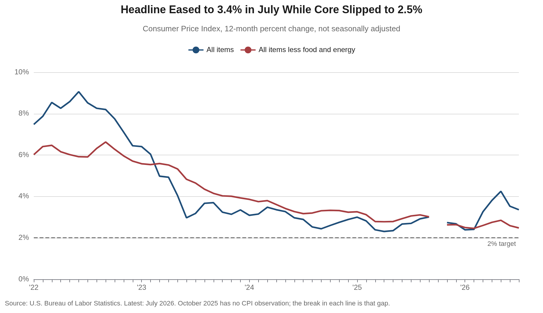
Energy Keeps Setting the Headline
The energy index fell 1.5% in July after a 5.7% decline in June, as gasoline prices dropped 2.9% and fuel oil fell 1.7%. Natural gas rose 0.7% and electricity edged up 0.1%, so the reversal was narrower than June’s, when nearly every energy component fell together. The year-over-year arithmetic still carries the spring shock: energy is up 14.7% over the past 12 months and gasoline is up 24.6%, which is why a household’s sense of inflation is running well ahead of the 2.5% core rate that the Committee spends its time on.
Food was quiet. The food index rose 0.1% in July as groceries fell 0.1% and food away from home rose 0.3%. Three of the six major grocery store food groups declined, with meats, poultry, fish and eggs down 0.7% and fruits and vegetables down 0.1% as the index for lettuce fell 16.4%, its largest one-month decline on record. Beef prices, however, are still up 9.4% over the year, and food away from home is up 3.4%, so the relief in the aisles is narrower than the headline food number suggests.
Core Inflation: The Quiet Continues, With One Exception
The core index rose 0.2% in July after being unchanged in June, lowering the annual rate to 2.5% from 2.6%. The internals divide cleanly. Core goods, which carry an 18.8% weight, rose 0.2% on the month and are up only 0.8% over the year, with new vehicles up 0.5%, used vehicles down 1.9%, and medical care commodities down 2.7%. Core services rose 0.2% and are up 3.0%, held down by a shelter component that has now posted two consecutive 0.1% months.
The exception sits in core services outside of shelter, which rose 0.4% in July by our calculation from the published category effects, the firmest monthly reading since the spring. Medical care services rose 0.6% as hospital services gained 0.5%, public transportation rose 1.7% as airline fares climbed 2.2%, and motor vehicle maintenance and repair rose 0.6%. Two of those three, however, are categories where a single month rarely survives contact with the next one, and on a 12-month basis medical care services are up 2.7% and transportation services 2.9%. We would want to see this repeat in August and September before we called it a change in the services trend.
The Underlying Trend: Our HP-Filter Read
Our HP-filtered estimate of trend core inflation stands at 2.51% as of July, down from 2.55% in June, 2.80% in May and 2.89% at the turn of the year. The trend has fallen in each of the past three months and now sits at its lowest level since March 2021. A year ago it stood at 3.39%; two years ago it stood at 4.33%. The descent has been slow and almost unbroken, which is what a trend estimate is supposed to look like when the shocks moving the monthly prints are genuinely temporary.
The four measures we track disagree mainly about what to throw away. Core CPI drops food and energy by rule, in the months when those categories are noise and in the months when they carry signal. The Cleveland Fed’s median CPI and 16% trimmed-mean CPI, and the Dallas Fed’s trimmed mean PCE, discard whichever categories are extreme in a given month, a judgment made across the cross-section and made fresh every month. Ours throws out no category at all and works across time, letting the accumulated monthly record decide how much of the latest print is trend. Four different roads have arrived in the same neighborhood, all of them below 3%: our estimate at 2.51% in July, the Cleveland median at 2.71% and the 16% trimmed mean at 2.63% in June, and the Dallas trimmed mean PCE at 2.23% in June, its lowest reading since July 2021.
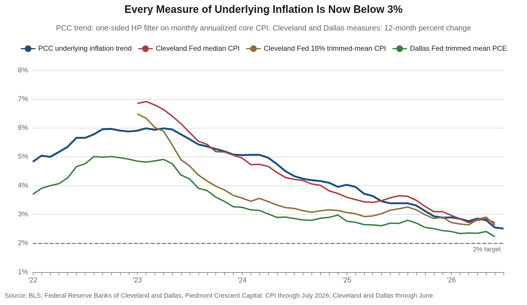
The standard objection to a filtered trend is that the estimate is least precise at the endpoint, which is exactly where a reader most wants to rely on it. This month we add a cross-check that answers the objection with data rather than a caveat. Core CPI has risen at a 1.6% annual rate over the past three months, a 2.4% rate over the past six and a 2.5% rate over the past 12. The filter’s 2.51% sits inside that range and closest to the longest window, which is the behavior you would want from a trend estimate and not the behavior you would see if the filter were manufacturing the result. When the raw compounding and the filtered estimate land on the same number from four different windows, the endpoint problem is not doing much work.
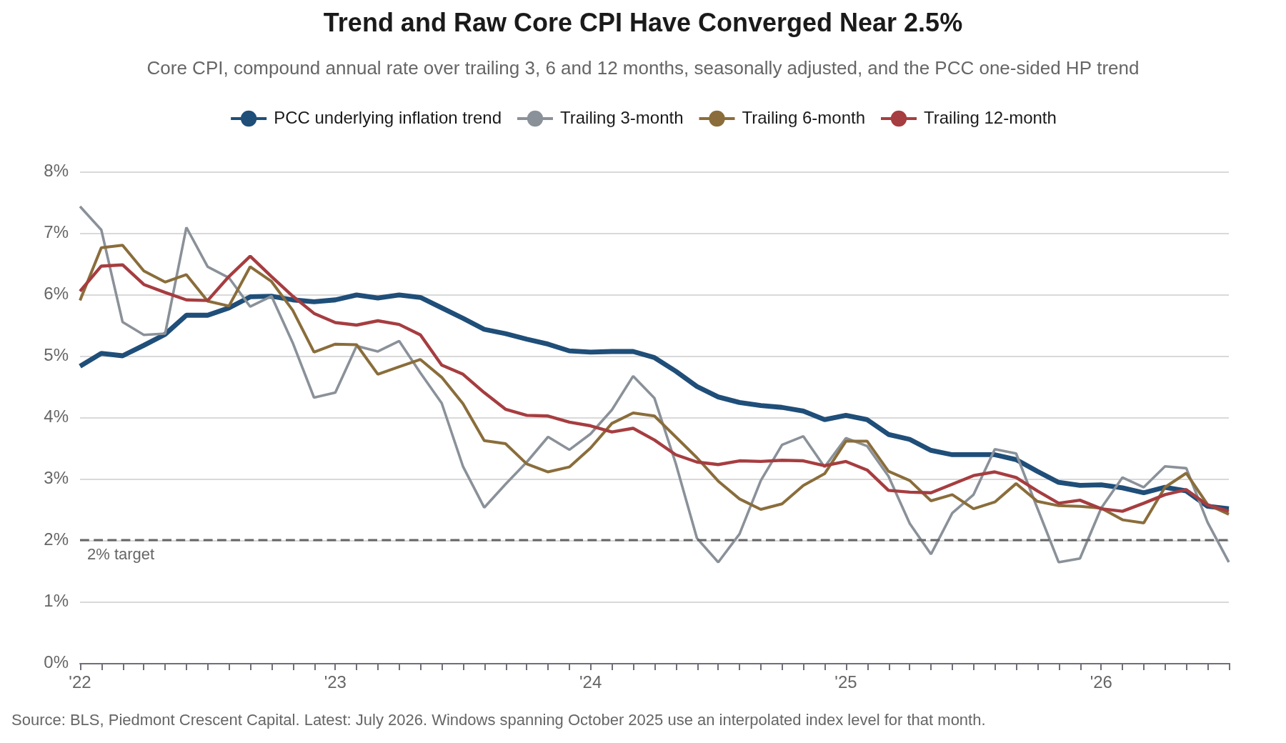
Methodology note. We apply a one-sided Hodrick-Prescott filter to monthly annualized inflation with the standard monthly smoothing parameter (λ = 129,600), computed on seasonally adjusted CPIAUCSL and CPILFESL from a 2000 sample start. The one-sided implementation uses only data available through the current month, so the estimate is real-time and does not revise as future data arrive. October 2025 has no CPI observation because of the 2025 lapse in appropriations; we interpolate the index level geometrically between September and November, which moves the trend estimate by less than a basis point. The Cleveland Fed measures are shown here as 12-month percent changes of the published index instead of 12-month averages of the monthly annualized rates, which puts them on the same footing as the Dallas Fed series and changes the June readings by about a basis point.
Shelter and Light Vehicles: The Transmission Channels Are in Low Gear
Monetary policy reaches consumer prices mainly through two interest-sensitive channels, housing and light vehicles, and both are visibly cold in this report. Shelter rose 0.1% in July, matching June, and is up 3.2% over the past 12 months. Owners’ equivalent rent, which alone carries a 25.8% weight, rose 0.3%, rent of primary residence also rose 0.3%, and lodging away from home fell 2.8% as the last of the World Cup premium came out of room rates. Because shelter carries better than a third of the index, a category running near 3% and decelerating is the single most powerful argument that the core rate’s descent has further to run.
The vehicle channel tells the same story with different numbers. New vehicle prices rose 0.1% in July and are up 0.5% over the past year, which is close to flat in a category that accounts for 3.8% of the index. Used vehicles rose 0.4% on the month but are down 1.9% over the year. Motor vehicle insurance has subtracted from the core in every month this year, and it fell another 0.3% in July after a 2.0% June decline, leaving it down 4.5% over 12 months. A sector that is not moving units at these financing rates does not generate sustained price pressure, and the insurance line is the lagged echo of the vehicle price surge now rolling out of the data.
Technology Prices: The Memory Shock Arrives
We flagged technology goods for special attention in the June report, where the pass-through from soaring memory-chip costs was visible only as slower deflation. In July it arrived as prices. Information technology commodities rose 1.4% on the month, and computers, peripherals and smart home assistants rose 3.5% and are now up 3.9% over the past 12 months, against a 0.8% decline over the year as of June. Education and communication commodities rose 1.3%. Televisions rose 1.7% and video and audio products rose 1.2% and are up 2.4% over the year.
This is a category built to fall as quality improves, and a positive 12-month print in computers is genuinely unusual. The tech aisle has stopped subtracting from core goods prices and started adding to them, and it did so in the same month that core goods overall rose 0.2%. The offsetting piece is that the category is small, roughly 0.3% of the index for computers and 0.7% for information technology commodities together, so the arithmetic contribution is a basis point or two. What matters is the direction: one of the few reliable sources of core goods deflation appears to have turned, and it turned in the same stretch in which tariff effects have been washing out of the rest of the goods basket.
Real Earnings: The Reprieve Lasted One Month
The companion release undid June’s good news. Real average hourly earnings fell 0.1% in July, a 0.1% nominal wage gain overtaken by the 0.1% rise in consumer prices, and are down 0.2% over the past 12 months after turning positive in June for the first time in a year. Real average weekly earnings were unchanged on the month and are up 0.1% over the year, helped by a 0.3% increase in the average workweek. For production and nonsupervisory workers, real hourly pay was unchanged in July and is down 0.1% over 12 months.
Nominal average hourly earnings are up 3.15% over the past year against a 3.4% rise in consumer prices, which is the arithmetic of the squeeze in one line. The paycheck problem we have tracked all year is not resolved, and June looks in hindsight like what it was, a month in which a 0.4% decline in the price level flattered a 0.3% wage gain. Wage growth running below the headline rate is not, however, the profile of a wage-price spiral, and it is one more reason to doubt that the underlying trend has any upward momentum left in it.
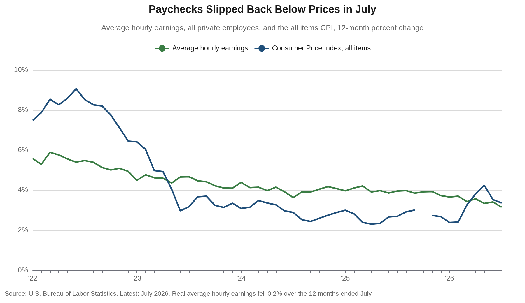
What Households and Markets Expect
Households eased off a little. The New York Fed’s July Survey of Consumer Expectations put the median one-year inflation expectation at 3.6%, down a tenth from June, with the three-year measure unchanged at 3.3% and the five-year measure unchanged at 3.0%. Median expected household income growth held at 3.0% and expected spending growth slipped to 4.9%. The credit detail was the softer part of the survey, with the perceived probability of missing a debt payment in the next three months up 1.2 percentage points to 12.0%.
Markets are more settled than households. The five-year, five-year forward inflation compensation measure stood at 2.31% on August 11, close to the level consistent with the 2% PCE objective once the CPI-PCE wedge is accounted for. That gap between a household survey at 3.6% and a market measure at 2.31% is not new, and it is the reason we weight the market series more heavily. Households extrapolate from the price level they see at the pump and the register, which is up 14.7% on energy over the past year, while the forward market prices the policy stance. The Committee should take more comfort from the second than discomfort from the first, though a three-year household expectation at 3.3% is not a number anyone at the Fed will describe as anchored.
Our Call · Hold in September
The underlying trend is moderating, and July added to the case. Our filtered estimate fell to 2.51%, its third consecutive decline and the lowest since March 2021, and the raw compounding agrees: core CPI has risen at a 1.6% annual rate over three months, 2.4% over six and 2.5% over 12. The Cleveland measures sit at 2.71% and 2.63% and the Dallas trimmed mean PCE at 2.23%, its lowest since July 2021. Four measures built on different principles are converging near two and a half percent, and the one clear exception in this report, core services outside of shelter, is concentrated in medical care and air travel and has not yet repeated.
Monetary policy is already tight, and the two channels that carry it are stuck in low gear. The funds rate at 3.50% to 3.75% against a core rate of 2.5% is a positive real rate, and policy works on prices with long and variable lags that have not finished running. The evidence that the stance is biting sits in this report: shelter up 0.1% for a second month and 3.2% over the year, new vehicle prices up 0.5% over 12 months, motor vehicle insurance down 4.5%, and core goods up 0.8%. Housing and light vehicles are where a restrictive funds rate shows up first, and neither is generating price pressure.
We expect the Committee to hold in September, and we think it should. Three colleagues dissented in July in favor of a quarter-point increase, and they are right about the record: inflation has run above target for 64 consecutive months and averaged 4.0% over that stretch. They are early, however, on the question in front of them. Adding restraint on top of restraint that has not finished arriving, through channels that are already cold, is how a committee discovers 18 months later that it went too far. Nor does anything here argue for a cut, with the unemployment rate at 4.1% and July’s soft payroll print better explained by an unusually long summer than by a turn in the cycle. We hold our no-cut base case for 2026 and now see the hike tail as smaller than it looked on July 31. The test we would fail on is straightforward: two or three more months of core services outside of shelter running near 0.4%, with shelter no longer decelerating, would tell us the stance is not as restrictive as we think.
Appendix: Trend Inflation Estimates
| Measure | Latest | Prior month |
|---|---|---|
| PCC HP-filter trend, core CPI (one-sided, λ=129,600) | 2.51% (Jul) | 2.55% (Jun) |
| PCC HP-filter trend, headline CPI | 2.78% (Jul) | 2.96% (Jun) |
| Core CPI, compound annual rate over three months | 1.64% (Jul) | 2.29% (Jun) |
| Core CPI, compound annual rate over six months | 2.42% (Jul) | 2.58% (Jun) |
| Cleveland Fed median CPI (12-month percent change) | 2.71% (Jun) | 2.85% (May) |
| Cleveland Fed 16% trimmed-mean CPI (12-month percent change) | 2.63% (Jun) | 2.91% (May) |
| Dallas Fed trimmed mean PCE (12-month rate) | 2.23% (Jun) | 2.41% (May) |
| Core CPI, official 12-month | 2.5% (Jul) | 2.6% (Jun) |
Computation notes. HP-filter estimates were computed on seasonally adjusted FRED series (CPIAUCSL, CPILFESL) through July 2026, sample from 2000, one-sided recursive expanding-window implementation, λ = 129,600, applied to monthly annualized inflation. The July index levels were derived from the seasonally adjusted category effects published in Table 6 of the BLS release, which give the all items change as 0.075% and the core change as 0.216% before rounding. Cleveland Fed values are 12-month percent changes of the published median and 16% trimmed-mean indexes through June 2026; the Cleveland Fed’s July readings are released later on CPI day and are not reflected here. Dallas Fed trimmed mean PCE is the published 12-month rate through June 2026.
Mark P. Vitner – Chief Economist, Piedmont Crescent Capital
mark.vitner@piedmontcrescentcapital.com · (704) 458-4000
Sources: U.S. Bureau of Labor Statistics, Consumer Price Index and Real Earnings, July 2026; Federal Reserve Bank of Cleveland, median and 16% trimmed-mean CPI; Federal Reserve Bank of Dallas, trimmed mean PCE; Federal Reserve Bank of New York, Survey of Consumer Expectations, July 2026; Federal Reserve Bank of St. Louis (FRED). Trend estimates and chart calculations by Piedmont Crescent Capital.
Disclaimer: This report is provided for informational purposes only and does not constitute investment, legal, tax, or accounting advice, nor an offer or solicitation to buy or sell any security. Information is drawn from sources believed to be reliable, but its accuracy and completeness are not guaranteed. Views expressed are those of the author as of the date of publication and are subject to change without notice. Past performance is not indicative of future results.
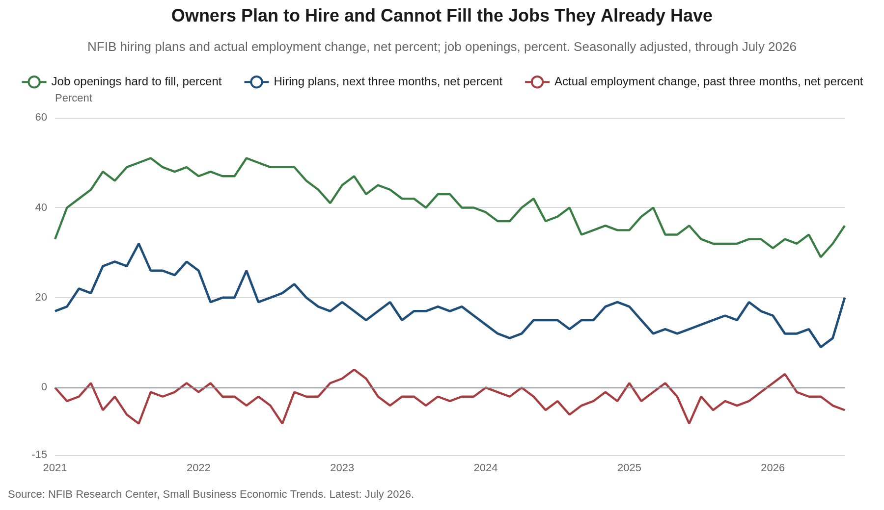
July NFIB Small Business Optimism: Main Street Wants to Hire Again
Main Street Wants to Hire Again
Hiring plans post their best reading since 2022 and selling-price increases finally break. The small-business survey argues that July’s payroll decline measured the calendar, not the demand for workers.
Early Signal
- Optimism rose 2.4 points to 99.8, the highest reading since August 2025 and the first month above the 52-year average of 98.0 since February. Eight of the ten components improved.
- Hiring plans jumped nine points to a net 20%, the highest since October 2022 and nine points above the survey’s long-run average. Two months ago they sat at a net 9%, the lowest since May 2020.
- Job openings owners could not fill rose four points to 36%, the most since June 2025, with skilled-worker openings up four points to 31%. The Employment Index rose 1.9 points to 102.1, its first increase after four consecutive declines.
- The binding labor constraint flipped back to scarcity. Labor quality returned as the single most important problem at 27%, up eight points and 15 points above its 12% historical average. In May, labor cost held that spot at a record 14% while labor quality had fallen to 13%.
- Selling-price increases broke. The net percent of owners raising average selling prices fell seven points to 31% after four consecutive monthly increases, price plans fell four points to a net 28%, and inflation as the top problem fell seven points to 14%, its first decline this year.
- Capital spending plans rose five points to 25%, the highest since December 2024. In May they were 16%, the weakest reading since March 2009.
- The realized side of the business did not move. A net 4% of owners reported lower nominal sales, unchanged from June, a net 16% reported lower earnings, and a net 5% actually reduced employment, the weakest reading of the year. The Uncertainty Index rose two points to 91 against a norm near 68.
The Headline and the Internals Agree for Once
In May we wrote that the Small Business Optimism Index was doing a good job of hiding the action beneath it. July gives the reader no such trouble. The index rose 2.4 points to 99.8, eight of its ten components improved, and hiring plans contributed most to the gain. The two components that fell, real sales expectations and inventory satisfaction, gave up two points each. This is the first reading above the 52-year average of 98.0 since February and the highest since August 2025.
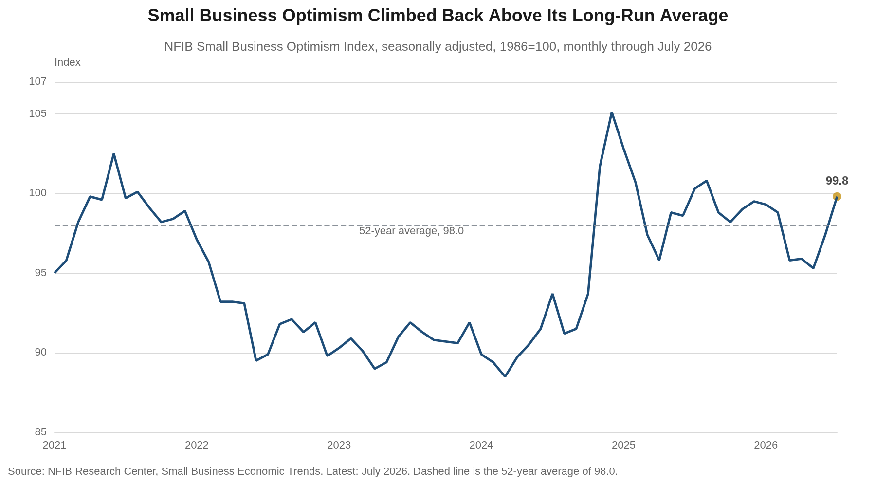
The index had been stuck between 95 and 98 since March, and 99.8 clears the top of that band. Which components moved matters more than the level. NFIB splits the ten into five hard measures, which describe what owners are doing or have committed to do, and five soft measures, which describe how they feel. The five hard components contributed 26 of the 29 points of total component change in July. The five soft components contributed three. Hiring plans, job openings, inventory plans, earnings and capital spending plans all rose. Owners are not simply feeling better about the economy in the abstract.
Hiring Plans Snap Back
A seasonally adjusted net 20% of owners plan to add jobs over the next three months, up nine points from June and the highest reading since October 2022. Hiring plans now sit nine points above their long-run average of a net 11%. Job openings owners could not fill rose four points to 36%, the most since June 2025, with openings for skilled workers up four points to 31% and unskilled openings up two to 14%. The Employment Index rose 1.9 points to 102.1, its first increase after four straight declines, and stands above both the 2025 average of 101.2 and the historical average of 100.0.
In May these same series stood at recession-grade levels, with hiring plans at a net 9% and openings at 29%, both the lowest since May 2020. We argued then that the readings described a labor market that had frozen instead of one that was shrinking, and that a freeze argues for patience. The thaw arrived faster than we expected.
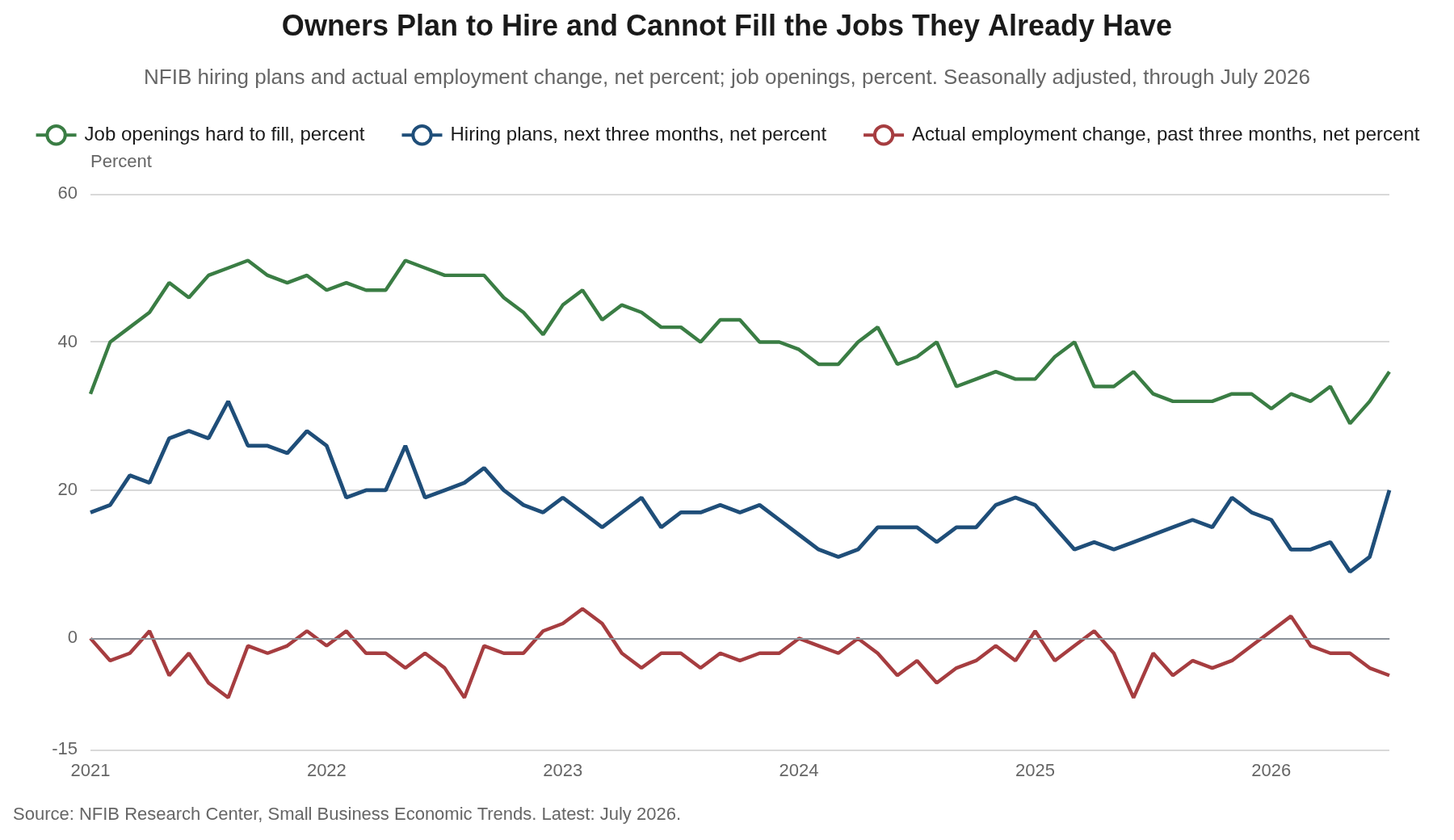
A net 5% of owners reduced employment over the past three months, the weakest realized reading of the year, in the same month a net 20% said they intend to add. Actual hiring activity slipped as well, with 61% of owners hiring or trying to hire, down a point. Intentions have failed to convert in this survey before. July is harder to dismiss, however, because the intention shows up twice, in the jobs owners plan to create and in the 36% of openings they have already posted and cannot fill.
The Constraint Flipped Back to Scarcity
Labor quality returned to the top of the single most important problem list at 27%, up eight points from June and 15 points above its historical average of 12%. Labor cost held at 8%. Taxes fell three points to 16%, the lowest reading since November 2025, and now hold second place on their own after sharing that spot with labor quality in June. In May, labor cost and labor quality had traded places, with cost at a record 14% and quality at 13%. The complaint has swung 14 points back toward scarcity in two months.
The hiring detail carries the same message. Fifty-one percent of all owners, and 85% of those trying to hire, reported few or no qualified applicants for their open positions, unchanged from June. Within that group, the share reporting few qualified applicants rose five points to 32% while the share reporting none fell five points to 19%. Owners are seeing more applicants and not more skills.
This is the small-business version of the supply-side argument we made in Friday’s employment report. The labor force is 1.3 million smaller than a year ago while the adult population is 1.5 million larger, participation among workers 55 and over is at its lowest since March 2005, and immigration has slowed sharply. A firm looking to add a skilled worker meets that shortage whether or not the aggregate payroll figure is rising, and no setting of the funds rate changes the size of the labor force.
A Third Read on July Labor Demand
Three surveys measured labor demand in July and two of them turned up. The ISM Employment Index crossed 50 for the first time in 33 months, reaching 52.8. NFIB hiring plans posted their best reading in nearly four years and job openings their best in more than a year. The establishment survey, taken in the same month, reported payrolls down 23,000.
We wrote on Friday that the payroll decline sat almost entirely in local government education and leisure & hospitality, that the two subtracted a combined 89,600 jobs against an overall drop of 23,000, and that the school calendar and the World Cup explained most of both. Set those two aside and payrolls rose roughly 67,000. The NFIB survey cannot settle the establishment survey’s arithmetic, but it does speak to the premise behind it. If the demand for workers had turned down in July, small firms would be the first to say so, and they said the opposite.
We hold our view that a strong employment report is coming in August or September, and this survey supports it. The mechanics are unchanged from what we laid out on Friday. An early Memorial Day and the World Cup pulled summer hiring forward into May, which left fewer seasonal workers to add in June and July and leaves fewer to release as the season ends. Labor Day falls on September 7, the latest date the calendar permits, which holds summer staff on payrolls through the September survey week. The August report arrives September 4.
The Price Signal Broke
The net percent of owners raising average selling prices fell seven points to 31% in July. Four consecutive monthly increases had carried the series from a net 24% in February to a net 38% in June, and July is the first break in that run. Unadjusted, 40% reported higher average prices, down seven points, and 8% reported lower prices, up one. Plans followed the same way, with a net 28% intending to raise prices over the next three months, down four points. Reports of inflation as the single most important problem fell seven points to 14%, the first decline this year, dropping inflation to third on the list behind labor quality and taxes.
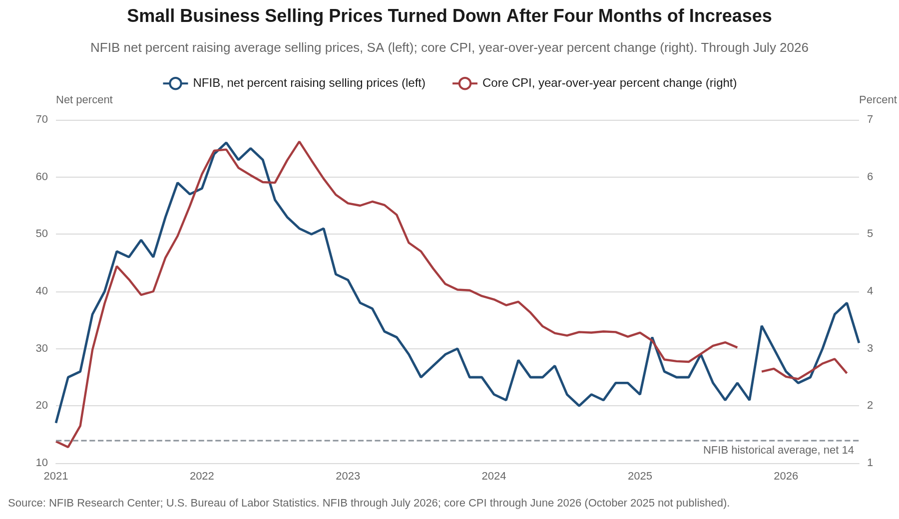
In the May survey we flagged the climb in this series as the confirming signature of cost-push inflation, with owners lifting prices to defend margins against energy and wage costs instead of in response to strong demand. July is the first evidence that the impulse is fading, and it counts for something, because the NFIB selling-price series has led realized core inflation at the major turning points of this cycle. It surged months ahead of the 2021 to 2022 spike in core CPI and rolled over months ahead of the disinflation that followed. The series is a better guide to goods and margin pressure than to the whole index, however, since it carries no shelter component and overstated how fast disinflation would run in 2024.
Two cautions. One month does not undo four, and at a net 31% the reading is more than double its historical average of 14 and well above where it sat through most of 2024 and 2025. The improvement is also not evenly sourced. Sixty-three percent of owners reported supply chain disruption of some kind, down five points, and 36% reported no impact at all, up six. That pattern fits an easing energy premium better than it fits resolved cost pressure, and an energy premium can return on a headline.
Investment Intentions Recover
Plans to make a capital outlay over the next three to six months rose five points to 25%, the highest reading since December 2024. In May the same series printed 16%, the weakest since March 2009. Realized spending improved alongside it. Fifty-four percent of owners made a capital outlay over the past six months, up three points, with 37% spending on equipment, up four, and 14% improving or expanding facilities, also up four.
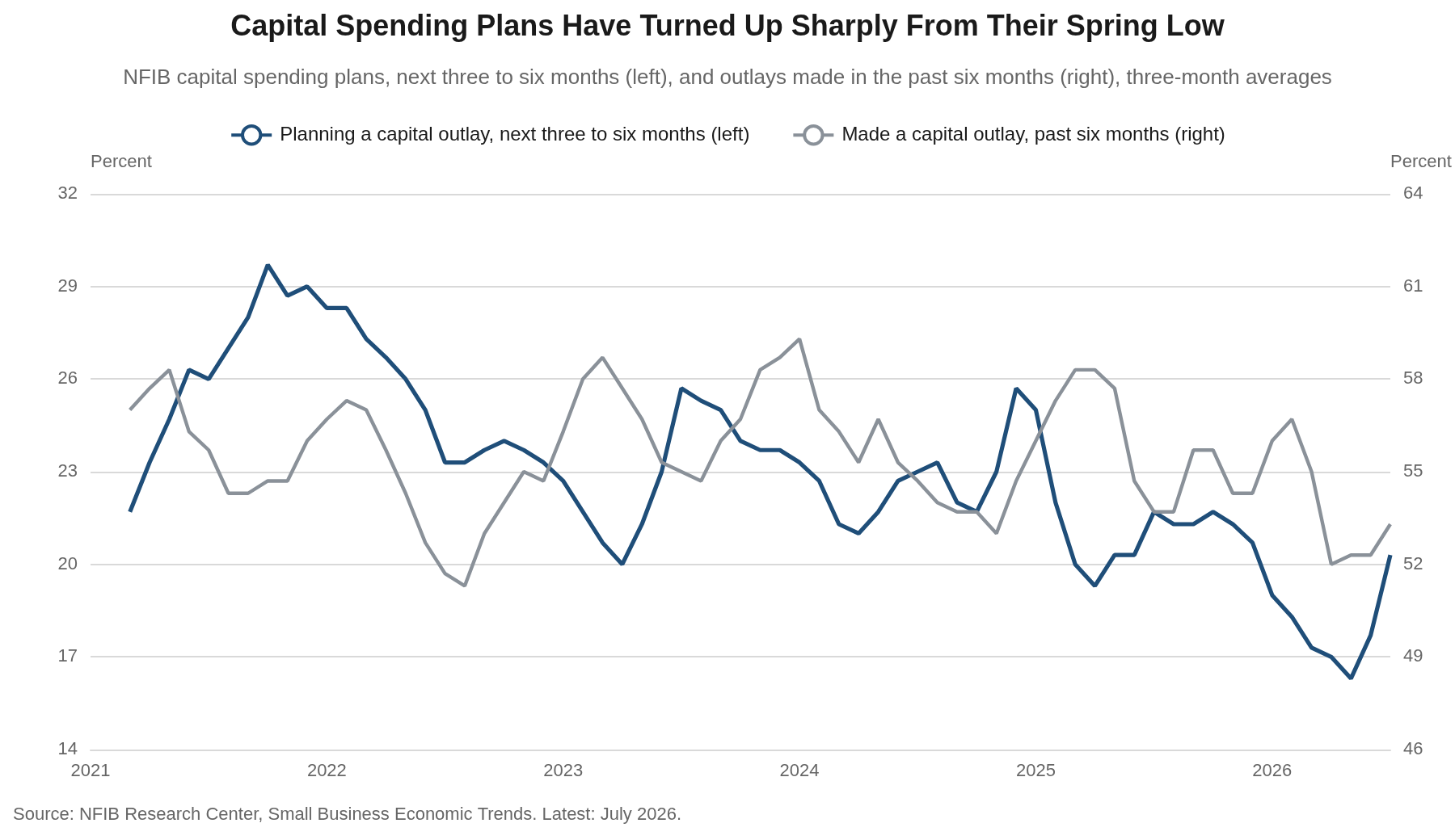
The composition is what makes the move credible, since equipment and facilities are the categories that require a view on demand a year out, and both rose. Vehicles held at 25% and purchases of new buildings or land eased a point to 4%, so this is not a rate-sensitive property story. It reads as the small-firm end of the capital goods cycle we described in the July ISM report, where new orders, backlogs and factory hiring all turned in the same month. NFIB’s own commentary draws the same line, tying the improvement to spillover from investment in chips and the structures built to house them.
What the Survey Does Not Say
None of the improvement has reached the income statement. A net 4% of owners reported lower nominal sales over the past three months, unchanged from June, and expectations for real sales over the next quarter fell two points to a net 7%. A net 16% reported lower earnings, an improvement of four points from a weak base. Only 12% called it a good time to expand, and the Uncertainty Index rose two points to 91, far above its norm near 68. Owners are planning to hire and invest against flat sales and shrinking earnings, so the July readings rest on a view of demand over the next two quarters.
Credit did not help either, with a net 5% of owners finding their most recent loan harder to get than previous attempts, up two points, and the average rate paid on short-maturity loans rising half a point to 7.9%, giving back June’s decline to the lowest level since October 2022. Twenty-seven percent of owners borrow regularly, up five points and still below the historical average of 34%. Financing and interest rates rank as the top problem for only 2% of owners, so the level of rates is not yet a constraint on the plans described above. It would become one if those plans convert.
What It Means for the Fed
After the May survey we described the Federal Reserve as boxed in, with a labor market soft enough to argue for patience and price data that refused to cooperate. July loosens one side of that box and tightens the other. The price data finally cooperated, with actual and planned increases both down and inflation falling out of the top two problems. Labor demand, the softness that made a cut arguable, turned up.
The FOMC voted 9 to 3 at its late-July meeting to hold, with all three dissents favoring a quarter-point increase, and futures pricing after Friday’s payroll report put the odds of a September hike at 44% and October at 58%. This survey argues against a cut at either meeting and does not add urgency to a hike. The committee got a piece of the evidence it wanted that the spring energy shock was not turning into a wage-price problem, with actual and planned price increases both down, and it got the opposite of the labor softening that would have made a cut arguable. We look for a hold in September unless the August employment report breaks against this survey.
Our Call · No Cut in 2026
The July survey supports the hold and takes the growth scare off the table. The two series that had made a cut arguable, hiring plans and job openings, reversed hard in July, and the two that had made a hike arguable, selling prices and price plans, both came down. That combination supports holding instead of moving in either direction, which is where we have been all year. We continue to carry no rate cut in our 2026 path and still believe the next move is more likely a hike than a cut, arriving in the first half of 2027 as rising manufacturing output flows through to the broader economy.
Two things would break the call. A net 31% of owners are still raising selling prices, more than double the historical average of 14, and the energy premium behind that can return with the next headline out of the Middle East. Running the other way, hiring plans have outrun realized employment in this survey before. If the net 20% has not converted by the October survey, we will read July as a mood swing.
Bottom Line
July’s NFIB survey is the cleanest month Main Street has had in more than a year. Optimism rose above its long-run average, hiring plans posted their best reading since 2022, job openings and capital spending plans both turned up, and the price series that had been climbing since February came down for the first time. The report also lands two business days after a payroll print that showed employment falling, and it argues that the payroll print measured the calendar and not the demand for workers. None of that has happened yet, however. Sales are flat, a net 16% of owners reported lower earnings, a net 5% cut staff last quarter and the Uncertainty Index sits 23 points above its norm. The August employment report on September 4 is the first place these intentions can show up.
What We Are Watching
| Series | The test |
|---|---|
| Hiring plans and job openings | A net 20% and a 36% that hold into August and September would separate a turn from a one-month spike. |
| Actual employment change | The net 5% reduction is where the intentions either convert or do not. |
| Selling prices and price plans | Whether the July declines extend, or whether the reading stabilizes above a net 30% and keeps core inflation from settling. |
| Capital spending plans | Whether 25% holds, which would confirm that the capital goods cycle reaches firms of every size. |
| August and September payrolls | Due September 4 and in early October, for the calendar reversal we have been describing since the July payroll release. |
Mark P. Vitner – Chief Economist, Piedmont Crescent Capital
mark.vitner@piedmontcrescentcapital.com · (704) 458-4000
Sources: NFIB Research Center, Small Business Economic Trends, July 2026 (released August 11, 2026); U.S. Bureau of Labor Statistics, The Employment Situation, July 2026, and Consumer Price Index; Institute for Supply Management, Manufacturing PMI, July 2026; CME Group. Historical series and chart calculations by Piedmont Crescent Capital.
Disclaimer: This report is provided for informational purposes only and does not constitute investment, legal, tax, or accounting advice, nor an offer or solicitation to buy or sell any security. Information is drawn from sources believed to be reliable, but its accuracy and completeness are not guaranteed. Views expressed are those of the author as of the date of publication and are subject to change without notice. Past performance is not indicative of future results.
The Month the Labor Force Left | A View from the Piedmont
The Month the Labor Force Left
A View from the Piedmont — Weekly Economic and Financial Commentary
Payrolls turn negative, the rate falls anyway, and the long end declines to care.
Key Points
- Nonfarm payrolls fell 23,000 in July against a median forecast of plus 80,000, landing 41,000 below the bottom of the published range. Nobody had this.
- The revisions were as large as the miss. May was cut 66,000 and June 37,000, a combined 103,000. May has been revised down twice and has surrendered 109,000 jobs since its first print. The trailing twelve-month average is plus 34,000 a month.
- The unemployment rate fell anyway, to 4.1%, because the civilian labor force contracted 264,000 while household employment fell only 87,000. The count of unemployed fell 177,000 and none of it came from hiring.
- We read July as a calendar artifact rather than a cycle turn. Memorial Day fell May 25, the earliest the calendar allows, and the World Cup pulled restaurant and bar hiring forward. Leisure and hospitality fell 43,000 in June and another 40,000 in July. A sector that never staffed to its seasonal peak has fewer people to shed in August and September, and Labor Day falls September 7, the latest possible, which keeps the summer workforce on payrolls through the September survey week. We expect a surprisingly strong print in September.
- Beneath the surface the most cyclical part of the economy is turning up. The ISM manufacturing employment index reached 52.8 in July, the first expansion in 33 months and the highest since August 2022, in the same month national payrolls went negative.
- The market moved the hike later, not away. September settled at 60% hold against 40% hike, but cumulative hike odds reach 55% by October and 75% by December. No cut is priced at any 2026 meeting. We look for the first hike in January and would not rule out December. We stay cautious on duration.
- The long end declined to participate. The thirty-year fell three basis points and the thirty-year real yield two, against six on the two-year, on a print more than 100,000 below consensus.
- The measurement problem is the live risk. Dallas Fed trimmed mean PCE ran 2.2% against core PCE at 3.3%, a 110 basis point gap. Chair Warsh has cited the trimmed mean as an example of the alternative measures the Fed should look into. His perceived affinity for the gauge has added to the market’s unease, particularly after the Dallas Fed noted in April that the measure turns downwardly biased when skewness flips from negative to positive.
Market Dashboard
Levels are official closes for Friday, August 7. Treasury yields are the published constant-maturity series.
| Indicator | Level | This Week |
|---|---|---|
| Fed funds target | 3.50-3.75% | Fifth consecutive hold; three dissents to hike on July 29 |
| September hike odds | 40% | Down from 54% Thursday. Hold at 60% |
| October, December hike odds | 55%, 75% | Cumulative. The market still expects a hike this year |
| 3-month bill | 3.87% | Down 3 bp Friday but up 4 bp on the week |
| 2-year Treasury | 4.19% | Down 6 bp on the day, 9 bp on the week |
| 10-year Treasury | 4.65% | Down 4 bp on the day, 10 bp on the week |
| 30-year Treasury | 5.19% | Down 3 bp Friday. The 20-year closed above it at 5.20% |
| 30-year TIPS real yield | 2.96% | Down 2 bp Friday. The week’s most important number |
| 30-year breakeven | 2.23% | At target. The long end is not an inflation story |
| 2s-30s | 100 bp | Bull steepener. 2s-10s widened to 46 bp |
| S&P 500 | 7,757.64 | A record close, up 3.6% on the week |
| Nasdaq Composite | 26,690.62 | Up 5.2%; duration and rate-sensitives led |
| Russell 2000 | 3,034.49 | Up 1.1% Friday |
| VIX | 14.90 | Closed under 15 |
| WTI crude | $78.18 | NYMEX September 2026, CLU26. Up 1.2% Friday, down 7% on the week |
| Brent crude | $83.55 | ICE Brent, October 2026. Down 7.1% on the week |
| Gold | $4,403.90 | COMEX December 2026, GCZ26. Up 7.2% on the week |
| US dollar (DXY) | 99.60 | Near a two-month low |
| Retail gasoline | $4.079 / gal | EIA survey August 3, down 1.7 cents |
| Retail diesel | $5.348 / gal | Up 3.5 cents even as crude fell 7% on the week |
| 30-year fixed mortgage | 6.69% | Freddie Mac, week ended August 6, before the rally |
This Past Week’s Central Thesis
Two things happened Friday that are usually mutually exclusive, and the market spent the day trading one of them.
The first is that the labor market printed its weakest month of this expansion, with the two prior months revised down by as much as the miss itself. The second is that the unemployment rate improved. Those are not in tension once you accept that the labor force is now the more volatile term in the ratio, which is the argument we lay out in this week’s Piedmont Perspective.
The market largely traded the weaker employment figures. The two-year fell six basis points, September hike odds fell by roughly a quarter, equities had their best week since April and gold rose 7.2%. What the market did not trade was the second fact, and the clearest evidence sits at the long end, where the thirty-year moved three basis points and the thirty-year real yield two. If the long end were pricing growth, it would have rallied. If it were pricing inflation, it would have rallied. It did neither. What anchors the long real yield near 3% is not the business cycle. It is term premium and Treasury supply. Uncertainty about the Fed’s intentions is adding a few basis points on top of all this.
That is why our positioning is unchanged. We continue to think the next move is a hike rather than a cut. We look for it in January, and December is certainly possible. We stay cautious on duration. A weak labor market has not lowered the cost of long money, and this week is the cleanest demonstration we have had. As for Warsh, our read is that he wants Fed policy back to a normal tempo after fifteen years of crisis posture.
This Week in Three Observations
1. The July print is a calendar story, and the calendar is unusually loud this year.
The summer almost always produces one surprising employment report. The end of the school year and the seasonal hiring around it generate the largest swings on the calendar, and the factors that adjust for them assume a normal year. This year was not normal at either end. Memorial Day fell on May 25, the earliest date the calendar permits, which started the season a week early and pulled seasonal hiring forward into the May survey week. The World Cup added a second pull, lifting hiring in the eleven host markets and in bars and restaurants well beyond them, earlier in the summer than that hiring normally arrives. That is why May’s original plus 172,000 print looked strong and June and July did not. Leisure and hospitality fell 43,000 in June and another 40,000 in July.
The arithmetic runs the other way from here. Restaurants and bars did not hire as many people as they usually do, so they have fewer to let go as the season winds down. The seasonal factors expect a wave of end-of-summer layoffs that restaurants will not need to make. Labor Day compounds it. September 7 is the latest date the calendar permits, which leaves the summer workforce on payrolls through the September survey week rather than off it. Taken together, 2026 runs 105 days from Memorial Day to Labor Day against 98 in each of the prior two years, the longest span the calendar allows. The add-back is far larger in September than in August, so that is where we would look for it. We expect a surprisingly strong employment report in September, possibly in August as well. Our forecast carries an underlying run rate near 65,000 a month, well above the plus 34,000 trailing average, and adds roughly 40,000 in each of August and September as leisure and hospitality sorts itself out and state and local government hiring normalizes. That is the size of the surprise we are looking for, and we would position for it rather than extrapolate July.
The outsized role seasonal adjustment played in the July data was a theme in most of the commentary. Goldman, Oxford Economics, First Trust and Fifth Third all located the distortion in school-calendar government education, which is real, rather than in restaurants and bars, where most summer jobs are created. Sonu Varghese at Carson Group is the only analyst we found who named leisure and hospitality and the World Cup together, and he has the World Cup boost rolling off in July where we have it pulling hiring forward into May.
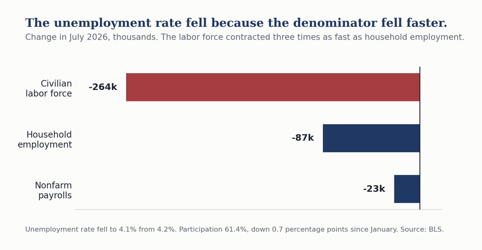
2. The unemployment rate has stopped being a summary statistic.
The civilian labor force contracted 264,000 in July. Household employment fell 87,000. Participation slipped to 61.4% and is down seven tenths of a point since January. The employment-population ratio is 58.9%. Payrolls went negative and the rate still fell, because the labor force shrank three times as fast as the pool holding jobs.
We have argued for a year that the breakeven payroll pace fell toward zero as immigration collapsed. The Reserve Banks bracket a wide range. Dallas puts breakeven near negative 3,000 a month for August through December of last year, St. Louis at 15,000 to 87,000 for 2026, Kansas City at 29,000, and Oxford Economics now at roughly 50,000 for the year and 34,000 in the second half. When the System cannot agree within an order of magnitude, nobody knows precisely, us included. July is that argument demonstrated inside a single month.
There is a genuine fight underneath this that no one is covering. We and Fifth Third read a shrinking labor force as evidence the market is still tightening. Goldman reads the identical participation series as evidence of more slack than the unemployment rate alone suggests. Same data, opposite conclusion, and nobody has adjudicated it. We think the employment-population ratio settles it over the next two quarters, and we intend to lead with that measure rather than the rate.
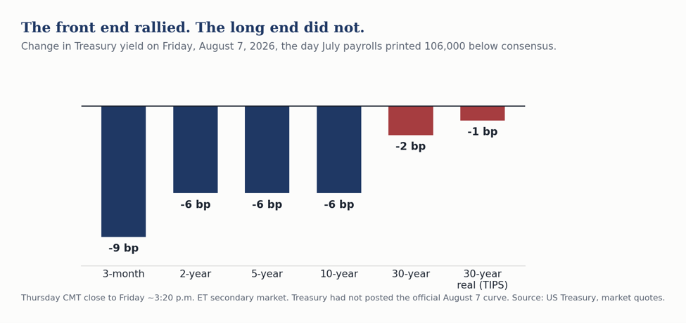
3. The long end declined to participate.
Decomposing Friday the way we always do, the thirty-year TIPS real yield went from 2.98% to 2.96%, putting the implied thirty-year breakeven at 2.23%, which is at target. The real yield moved two basis points. The breakeven moved one. 2s-30s sits at 100 basis points and 2s-10s widened to 46 basis points. The twenty-year closed at 5.20%, above the thirty-year at 5.19%, after both sat at 5.22% Thursday. A small inversion reopened at the very long end on a day the rest of the curve rallied.
So the long bond is neither a growth instrument nor an inflation-expectations instrument. On Friday’s evidence it is barely a macro instrument at all. What anchors the long real yield near 3% is term premium, Treasury supply and the cost of capital for the AI and electrification buildout, and a payroll report touches none of the three. Investors positioning the long end off employment data are trading the wrong variable, and the Fed has less leverage over the thirty-year than the commentary assumes.
Note what the bill actually did. It fell three basis points Friday but finished the week four basis points higher, while every coupon maturity fell eight to ten. The front end is pricing a Fed that has not finished, whatever Friday’s headline said. Policy lives at the front end now. No house in the research we read this weekend cited the thirty-year real yield, and Friday’s divergence between the long end and the two-year passed without a single published comment.
Behind the Numbers
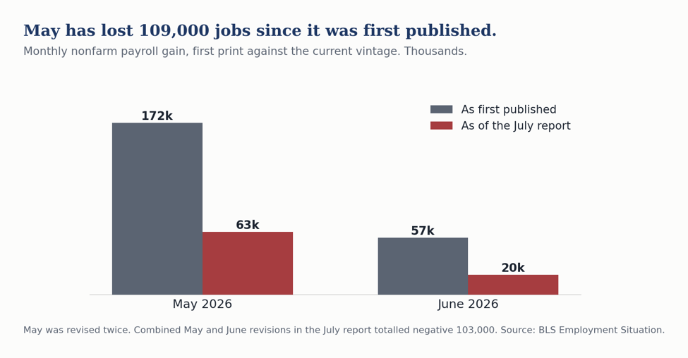
The revisions matter more than the print. May was cut from plus 129,000 to plus 63,000 and June from plus 57,000 to plus 20,000, a net 103,000. May has now been revised down twice and has surrendered 109,000 jobs since its first print of plus 172,000. Add the revisions to the miss and the market received roughly 206,000 fewer jobs Friday morning than it expected. The BLS puts the trailing twelve-month average at plus 34,000 a month. That is the number to carry, not the July print, which will itself be revised.
The industry detail is coherent rather than random. Local government education fell 50,000, which is largely a seasonal adjustment artifact. Retail trade fell 19,000 and financial activities 14,000. Health care added 22,000, below its own prior twelve-month average of plus 36,000. When the sector carrying this expansion prints under trend, the headline disappoints regardless of seasonal distortions. Challenger counted 33,429 announced job cuts in July, the lowest in two years, and initial claims were 199,000. This is not a firing cycle. It is hiring hesitancy.
The most cyclical part of the economy is turning up. The ISM manufacturing employment index reached 52.8 in July, up 3.1 points, the highest since August 2022 and the first month in expansion in 33 months. The headline index rose to 55.6 from 53.3, its highest in more than four years and above a 54.0 consensus, with production up 6.3 points to 58.5 and backlogs up 4.5 points to 55.0. ISM reads July as consistent with 2.8% annualized real GDP growth. Factories shed workers for the better part of three years and began adding them in the same month national payrolls fell 23,000.
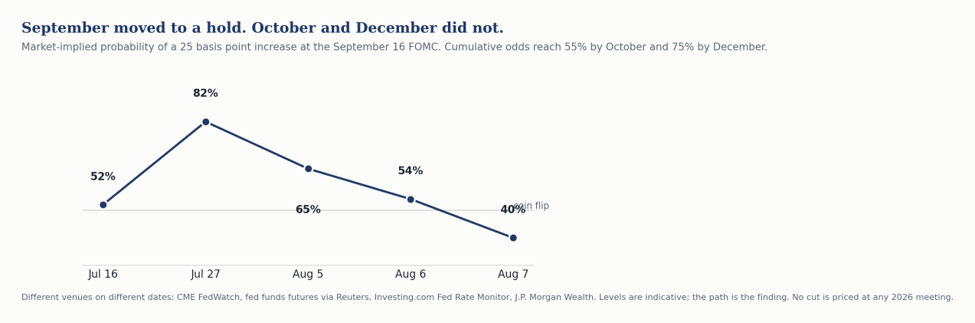
The Fed moved the hike to October and December. September hike odds ran about 52% on July 16, 82% on July 27, roughly 65% on August 5 and 54% Thursday evening. After Friday, CME FedWatch settled at 60% hold against 40% hike. But cumulative hike odds reach 55% by October and 75% by December, and there is still no cut priced at any 2026 meeting. Bank of America called the report “dovish on net” and did not move at all, keeping a call for 75 basis points of hikes this year starting in September.
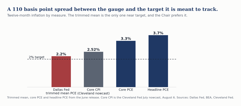
The measurement problem is now the live risk. Chair Warsh has scrapped forward guidance, calls conventional inflation measures “quite imperfect”, prefers alternative measures including trimmed averages, and has stood up five task forces, one on inflation frameworks reporting early in 2027. In the June release, Dallas Fed trimmed mean PCE ran 2.2% on the twelve-month against core PCE at 3.3% and headline at 3.7%. Read from the trimmed mean, inflation is nearly at target. Read from core, it is more than a point above. That 110 basis point gap is doing enormous work in the current debate. The Dallas Fed flagged the vulnerability itself on April 16, conceding that the twelve-month average of monthly skewness readings was roughly zero through February 2026, and that when skewness turns from negative to positive the trimmed mean can be misleading and downwardly biased. A trim discards the largest price increases in the distribution by construction. If the next inflation impulse arrives as a few very large increases in a narrow set of components, which is exactly the shape an electricity and data center capacity shock takes, the trimmed mean is structurally blind to it. Not lagging. Blind.
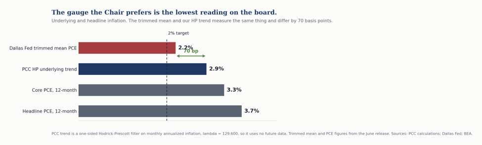
That is the case for the gauge we have run all year. Our HP filter works on the aggregate across time rather than on the cross-section within a month, so a price impulse concentrated in a handful of components moves it. Where a trim discards the right tail by construction, the filter cannot, because it never sorts components at all. The two are answering the same question with opposite machinery, and they no longer agree. The Dallas trimmed mean puts underlying inflation at 2.2%. Our latest one-sided HP run puts it at 2.9%. That is 70 basis points on the gauge the Chair has cited as a possible alternative inflation measure, and the trim is the mechanism producing the difference.
We would not oversell the instrument. The two measures are not rivals so much as tools for different problems. A trim is the better tool when the noise is idiosyncratic and passes, which is what it was built for and what it does well; a used-car spike or an airfare jump is exactly what you want discarded. A filter is the better tool when the signal is concentrated and persists. The risk in front of us is the second kind. Our filter has its own weakness at the end of the sample, where the trend estimate is least stable. We run it one-sided with the standard monthly smoothing parameter, so it uses no future data and reflects what was knowable in real time. We publish it alongside the Cleveland median and the Dallas trimmed mean rather than in place of them.
Bottom Line
The labor market is slowing but it is not breaking. July was distorted at both ends of the calendar and will look different in revision, as May and June already do. Manufacturing, the part of the economy that announces a genuine downturn first, turned up in the same month. The unemployment rate fell for a reason that has nothing to do with labor demand, and it will keep misleading anyone who reads it as a summary statistic.
For the Fed, Wednesday matters more than Friday did. Two inflation reports stand between here and September and the labor data have already had their say. We look for no cut in 2026 and we look for the first hike in January, with December certainly possible. For portfolios, the week changed nothing at the long end and should not change positioning there: a payroll report 103,000 below consensus moved the thirty-year real yield two basis points, and the case for waiting on long-dated funding is weaker today than it was Thursday.
CFO & Corporate Treasurers Corner
Six things that changed this week for anyone who funds a balance sheet or manages cash.
The wait to term out has not paid. The two-year fell six basis points Friday and the thirty-year three, leaving 2s-30s at 100 basis points. The three-month bill finished the week four basis points higher while every coupon maturity fell eight to ten. The front end responded to a labor market printing negative payrolls and the long end did not. Anyone who has been holding short-dated paper waiting for a better entry on ten- or thirty-year money has now watched the long end sit out a bond-bullish surprise. The curve is telling you that cheap long money is not coming from a soft labor market. If your capital plan needs thirty-year funding, the case for waiting is weaker today than it was Thursday.
Do not build a 2027 plan on a lower cost of funds. There is no cut priced at any 2026 meeting. Not one. Three weeks ago the live question was whether the Fed would hike in September, and even after Friday that probability sits near 40%. PGIM and Bank of America still carry three hikes this year, which seems extreme to us. If your 2027 budget assumes refinancing into a friendlier rate, it needs a second scenario, and the second scenario should be flat to higher rather than modestly lower.
The issuance window is open now and it narrows Wednesday. Equities had their best week since April, the VIX closed under 15, and the dollar softened. July CPI lands Wednesday, August 12. The Cleveland Fed nowcast has core CPI at 2.52% on the twelve month against core PCE of 3.3% in the June release, and a hot print reopens the September hike question that Friday’s payroll report had just closed. If you have paper to bring, Monday and Tuesday are a friendlier calendar than Thursday and Friday.
Your reinvestment assumption on cash is stale. The three-month bill is at 3.87%. Money fund yields follow the bill with a lag of weeks, not days, so the yield on your ladder today is not the yield on your next roll. If you are running a treasury forecast off current money fund yields, mark it down.
Labor cost budgeting got marginally easier. Average hourly earnings slowed to 3.2% over the year from 3.5%. Second quarter unit labor costs rose 1.3% against productivity of 1.4%. For the first time in several quarters, productivity is carrying compensation rather than the other way around. That is margin relief.
Power deserves a forecast now, not an assumption. This is the item most 2027 budgets get wrong. Ask your team what delivered electricity costs look like in 2027 and 2028 under the tariff structures being written this month. Virginia’s commission ordered a large-load transmission tariff on August 5. Texas paused data center interconnections on August 3. Georgia is reallocating fuel costs between industrial and residential classes with a decision due by year end. Florida legislated full cost of service on July 1. That is four different regulatory answers to the same question inside one regional footprint, and most budgets we see assume a single national trajectory. If power is a material input for you, that assumption is now a forecast error waiting to happen.
On the currency side, the dollar index closed near 99.60 at a roughly two-month low, EURUSD at 1.1567 and USDJPY at 157.57.
Piedmont Perspective
The Labor Force Is Shrinking from Both Ends
The July employment report did something that should not happen. Payrolls fell 23,000 and the unemployment rate fell too, to 4.1%. Most people read that as a statistical quirk. We think it is the first clean look at a structural change that will govern how we read labor data for the rest of the decade.
The mechanics are simple. The civilian labor force contracted 264,000 in July. Household employment fell 87,000. When the labor force shrinks three times as fast as the pool holding jobs, the ratio between them improves even as the economy sheds positions. The unemployment rate did not fall because the labor market strengthened. It fell because the denominator left.
What makes this structural rather than a one-month artifact is that two independent forces are pulling in the same direction, and neither is cyclical.
The first is immigration, and it is now well documented. The Dallas Fed puts net unauthorized immigration at negative 55,000 a month through the second half of 2025 and the breakeven payroll pace at roughly negative 3,000 a month for August through December. The St. Louis Fed brackets 2026 breakeven at 15,000 to 87,000. Kansas City has 29,000. The System cannot agree within an order of magnitude, which tells you how much uncertainty sits underneath every payroll forecast published today, ours included.
The second force gets almost no attention in this context, and it should. Peak 65 is the largest cohort of Americans ever to turn 65 in a single stretch, roughly 4.1 million a year and more than 11,000 a day, running through 2027. It is discussed endlessly as a retirement savings problem and almost never as a labor supply problem, which is what it is. Every month it removes people from the labor force who are not coming back, on a schedule that is known years in advance and is completely indifferent to the level of interest rates.
Put the two together and the labor force is being drained from both ends at once. Young workers are not arriving because the border closed. Older workers are leaving because they have reached an age and a wealth threshold where they can choose not to work. Participation is 61.4%, down seven tenths of a point since January. The employment-population ratio is 58.9%.
Here is the consequence that matters for anyone making a forecast or a hiring plan. The unemployment rate is a ratio, and it has become a ratio whose denominator is now the volatile term. That makes it a poor summary statistic for labor demand. It can fall in a genuinely weakening market, which is what it just did, and it can stay low through a downturn that shows up clearly in payrolls, hours and the employment-population ratio. A recession that leaves the unemployment rate between 4% and 5% is no longer a strange hypothetical. It is the base case for how the next one likely looks.
This has cost us something. We have carried a call for unemployment near 4.5% at year end, and Friday made it harder rather than easier. If the labor force can shed a quarter of a million people in a month, it can absorb negative payroll prints without the rate moving at all. We have marked that call down to 4.1% at year end. We did not cut it further only because we suspect July’s labor force decline was overdone and will partly reverse.
For the business audience there is a harder implication buried in this. If your workforce plan assumes that labor supply loosens when demand cools, that assumption held for forty years and does not hold now. The people leaving the labor force this cycle are leaving for reasons that have nothing to do with the business cycle, and they will not return when you start hiring again. The competition for workers in 2028 is unlikely to be easier than it is today, whatever the unemployment rate happens to print.
The Week Ahead
Monday, Aug. 10. EIA weekly gasoline and diesel survey. No major releases.
Tuesday, Aug. 11. NFIB Small Business Optimism for July.
Wednesday, Aug. 12. July CPI at 8:30 a.m. ET, the release that decides September. We are in line with consensus, looking for a 0.2% rise in the core. A surprise in the CPI report would matter more to expectations for Fed policy than the surprise in the employment report did.
Thursday, Aug. 13. July PPI and weekly jobless claims at 8:30 a.m. ET. Freddie Mac PMMS, the first reading to capture the post-payroll rally in the ten-year.
Friday, Aug. 14. July retail sales at 8:30 a.m. ET. Preliminary University of Michigan sentiment and business inventories at 10:00 a.m. ET. Atlanta Fed GDPNow update; the Q3 nowcast currently reads 5.8%, a figure driven substantially by trade-deficit arithmetic rather than underlying demand.
Thursday, Aug. 20. NAR existing home sales for July.
Friday, Aug. 21. BLS State Employment and Unemployment for July, the first state-level look since the national print turned negative.
Friday, Aug. 28. The preliminary benchmark revision to the establishment survey, three weeks before the FOMC. The last two cycles conditioned everyone to expect a large downward number; the prior preliminary was negative 911,000. The QCEW data for the first nine months of this benchmark period run roughly 200,000 above the payroll survey, which would make this revision slightly positive. That would land as a genuine surprise into a market that has stopped expecting good news from the BLS.
US Economic and Financial Outlook
Our full forecast is below. We hold the year-end unemployment rate at 4.1% and look for real GDP growth of 2.5% this year and 2.6% next. The fed funds target stays in its current 3.50 to 3.75% range through 2026, with the first hike in January and December certainly possible.
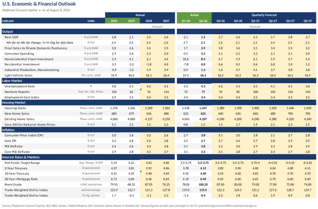
Sources and Notes
Sources: Bureau of Labor Statistics; Bureau of Economic Analysis; US Treasury; Federal Reserve Board and CME FedWatch; Institute for Supply Management; Challenger, Gray & Christmas; Freddie Mac; NFIB; National Association of Realtors; University of Michigan; Energy Information Administration; the Atlanta, Cleveland, Dallas, Kansas City and St. Louis Federal Reserve Banks; Oxford Economics; Goldman Sachs; Bank of America; PGIM; Carson Group; First Trust; Fifth Third.
Notes: All market levels are official Friday, August 7 closes. Treasury yields are the published constant-maturity series and the thirty-year breakeven is derived from the nominal and real curves. Payroll figures are seasonally adjusted. The Memorial Day and Labor Day span is calculated from the statutory definitions, the last Monday in May and the first Monday in September. Copyright 2026 Piedmont Crescent Capital.
Mark P. Vitner
President & Chief Economist, Piedmont Crescent Capital
mark.vitner@piedmontcrescentcapital.com · 704-458-4000
A View from the Piedmont is published weekly by Piedmont Crescent Capital for informational purposes only and does not constitute investment, legal, or tax advice. Views expressed are those of the author as of the date of publication and are subject to change.
The Long End Does The Tightening | A View from the Piedmont
A View from the Piedmont — Our Weekly Commentary on Money, Credit, Exchange Rates & Geopolitics
Week ended August 21, 2026, published Sunday, August 23 · Mark P. Vitner, President & Chief Economist · mark.vitner@piedmontcrescentcapital.com · 704-458-4000
The Long End Does the Tightening
Thirty-four sessions with the 30-year Treasury at or above 5 percent, gross federal debt topping $40 trillion and Brent back above $93 moved the binding constraint on this expansion from the funds rate to the yield curve.
Market Dashboard
Treasury constant maturity yields and the mortgage rate are Federal Reserve H.15 and Freddie Mac readings through Thursday, August 20. Equity, energy and metals levels are Friday, August 21 closes. The purchasing managers' index is the August flash reading published Friday. Weekly changes are measured against the comparable prior reading. The term premium is the Federal Reserve Board's three-factor estimate for August 14. The MOVE and VIX levels are Friday closes.
Summary
Our Central Thesis
For most of this expansion the critical question about monetary policy has been what the Committee would do with the funds rate. That question has largely settled. The funds rate has sat in a 3.50 to 3.75 percent range all year, the market prices no change at the September meeting, and our own call has been unchanged since June. We expect no cut in 2026, with the next move a hike in the first half of 2027. The more interesting question now sits thirty years out. The 30-year Treasury has closed at or above 5 percent for thirty-four consecutive sessions and touched 5.34 percent intraday on Tuesday, and German and Japanese long yields made multi-year or record highs in the same stretch. A global duration selloff is doing work the Committee has not had to do.
Three separate arguments are pushing on the same maturity, and it is worth separating them. The first is fiscal. Gross federal debt crossed $40 trillion on Wednesday, interest already absorbs roughly a fifth of federal tax receipts and the service cost has climbed sharply this year. The second is energy. Brent has run from $68.53 on July 2 to the low nineties, and the 5-year TIPS breakeven added 10 basis points on the week while the nominal 30-year fell 2 basis points, which is the market marking up expected inflation with the term premium roughly unchanged. The third is private credit demand tied to the artificial intelligence buildout. Investment-grade corporate issuance has passed $1.5 trillion this year, up 36 percent from the same period in 2025, and borrowing by the largest technology companies has run at roughly a quarter of net Treasury note and bond issuance. A second Treasury is standing in the same queue, competing for the same long-dated savings. Only the first of those is a story about Washington, and Treasury's response addressed only the first.
The practical consequence is that financial conditions are tightening in the part of the curve that prices capital spending, mortgages and corporate refinancing, while the part the Committee controls sits still. The economy is absorbing that tightening, and it argues for patience at the September meeting. We are staying cautious on duration, and we would rather own the belly than reach for the long bond at these levels. The condition that would change our positioning is a credible fiscal consolidation that the market believes, which Secretary Bessent has said the administration will detail in the coming days, or an energy resolution that takes the inflation-compensation bid out of the long end.
This Week's Argument
The long-end selloff was global, ruling out most of the U.S. aimed explanations for it
The same week the 30-year Treasury touched 5.34 percent, the 30-year Japanese government bond climbed to 4.1 percent, the 30-year bund reached 3.7 percent and the 30-year gilt reached 5.8 percent. The Japanese level sits near a record. The German level is the highest since the euro-area debt crisis in 2011 and the British level is close to the highest since 1998. Four sovereigns with four fiscal positions, four central banks and four inflation histories sold off in the same maturity in the same week. Whatever is repricing is not the American deficit alone, and it is not the September FOMC.
Figure 1 shows how one-directional this year has been in the American case. The 30-year began 2026 at 4.86 percent, spent February and March in the high fours, first closed above 5 percent on May 4, and has not closed below it since July 7.
Treasury's response tested the supply-composition explanation and the test failed. Secretary Bessent announced on Wednesday that buyback operations in the 10- to 20-year and 20- to 30-year sectors would double from $2 billion to at least $4 billion, running from September 9 through November 4, and said the move reflected a view that yields do not reflect underlying fundamentals. The 30-year fell to 5.19 percent on Thursday and was back to 5.23 percent by the close, and the whole announcement was worth about a day.
We expect the long end to stay in a 5.00 to 5.40 percent range through the September meeting. The conditions that would break that range are a fiscal package the market finds credible or a squeeze in that speculative short on the downside, or a Hormuz escalation that pushes Brent through $110 on the upside.
Hormuz is open and rationed, and the insurance market is the binding constraint
The strait is not physically closed and it is not functioning. Before the war, roughly one-fifth of seaborne oil and a large share of global LNG moved through Hormuz, and more than 100 vessels a day made the transit. Commodity transits this week have been running around nine a day. Over the first nineteen days of August, tracking services counted 236 ships of all types, on the order of one-tenth of the peacetime pace. The working description as of Friday morning is open but severely restricted, with extreme risk. A projectile strike on August 18 produced another seafarer casualty, and the United Arab Emirates subsequently suspended financial and economic transactions with Iran after missile attacks on affiliated vessels.
War-risk insurance is what keeps most hulls out of the strait. Premia that used to run near 0.25 percent of hull value have been quoted in recent months at several percent and as high as 7.5 to 10 percent. On a VLCC that turns a single transit into a multi-million-dollar insurance bill before a barrel is sold, which is why owners stay away even when a vessel could physically pass and even when the Navy says the water is open. Market commentary keeps underweighting that. The binding constraint sits in the London underwriting market, and it will loosen on the underwriters' timetable rather than on the diplomats'.
Figure 2 is the reason a treasurer should care about a shipping lane. Brent peaked at $138.21 on April 7, fell all the way to $68.53 on July 2 as the market decided the war would stay contained, and has climbed back to the low nineties as the rationing hardened. That round trip is a 100 percent range inside seven months on the input that sits underneath freight, plastics, fertilizer and roughly a third of the CPI's month-to-month volatility. We raised our 2026 average forecast to $88.30 a barrel on August 18, with the third quarter marked up to $92.00, and the spot price still sits above it.
The consumer is trading down without falling over
July retail sales fell 0.6 percent, the largest monthly decline since May 2025, after a 0.2 percent June gain. That print, which was largely driven by a big seasonally adjusted drop in online sales after an earlier than usual Prime Day, set up this week's earnings as a live read on the household, and the earnings came back more nuanced than the headline. Home Depot reported sales of $47.9 billion, up 5.7 percent, with comparable sales up 1.7 percent and U.S. comparable sales up 1.3 percent, and management described broad demand for smaller projects and continued strength among professional customers while reaffirming full-year guidance. Lowe's sales rose to $26.0 billion with comparable sales up only 0.2 percent, a fifth consecutive quarterly gain carried by Pro, home services and a 15.7 percent rise in online sales. Discretionary do-it-yourself demand was soft at both. Owners are repairing and upgrading. They are not financing the rate-sensitive renovation, which is exactly what a 6.65 percent mortgage and a locked-in existing loan would predict.
Walmart is the print that moved the tape, and the composition is more interesting than the miss. Second-quarter revenue rose 5.9 percent to $187.9 billion and adjusted earnings of $0.81 beat the Street, but U.S. comparable sales excluding fuel rose only 2.6 percent against expectations near 3.7 percent, the slowest pace in more than six years. Pharmacy price regulation subtracted about 80 to 125 basis points, which leaves an underlying 3.4 percent. The number that says the most about the household, however, is average ticket, up 1.1 percent against 3.1 percent a year earlier. E-commerce rose about 23 to 24 percent, and the company said it would apply $2.9 billion in tariff refunds to holding prices down even while flagging roughly $2 billion in additional fuel-related costs. The 9 percent drop in the stock was the market's way of saying the consumer is still spending, just more carefully and more often at the value end.
Behind the Numbers
Underlying inflation slipped again in July, to 2.51 percent from 2.55 percent in June on our HP filter gauge. The measure is a one-sided Hodrick-Prescott trend on monthly annualized core CPI with lambda set at 129,600 and the sample starting in January 2000, so the published estimate uses only data available at the time and never revises. It has now fallen for six consecutive months, from 2.89 percent last December. Figure 3 plots it against core CPI compounded over trailing three, six and twelve months, and the convergence is the strongest defense the measure has. Twelve-month core ran 2.47 percent in July, six-month 2.42 percent and the trend 2.51 percent. Three-month core ran 1.64 percent, well below the others, which is the one reading that argues underlying inflation is lower still.
The energy pass-through question turns on core goods, and July's detail is at most a first hint. Core commodities excluding food and energy rose 0.2 percent in July after declining in May and June, and are up 0.8 percent over the year. Core services excluding energy rose 0.23 percent and 3.0 percent over the year. Energy itself fell 1.5 percent in July, which is why the headline came in at 0.1 percent and 3.4 percent over the year. July's index, however, was collected before Brent made most of its move back toward the nineties. The August and September prints are the ones that will show whether $93 crude is reaching the goods basket, and the August print arrives on September 11. Two pieces of evidence point in opposite directions ahead of it. Nonfuel import prices rose firmly in July with the pressure concentrated in sectors exposed to the artificial intelligence buildout, even as the headline import price index fell on oil. Against that, the August flash PMI has input costs rising at their slowest pace since February and selling prices at their slowest since last November. The survey is more current than the index.
GDPNow has given back everything it added in early August, and the path is more instructive than the level. The Atlanta Fed's estimate for the third quarter opened at 5.0 percent on July 30, jumped to 6.2 percent on August 3 on the Census and ISM releases, and has fallen in four consecutive updates to 4.0 percent on August 18. Figure 4 plots the six vintages. The decisive move was August 14, when the consumption nowcast was cut from 4.1 percent to 2.5 percent, and the August 18 revision took gross private domestic investment from 15.2 percent to 13.7. Two things are worth holding onto. The first is that the underlying demand signal never printed anything like 6 percent. Real private domestic final purchases, which strips inventories and net trade, sits at 2.7 percent against a headline of 4.0, so roughly 1.3 points of the current estimate is in the two components that mean revert. That 2.7 percent is close to the 2.5 percent median in the Philadelphia Fed's third-quarter survey, and it is close to our own view. The second is that the model's root mean squared error since 2011 is 1.17 percentage points, which puts a one-standard-error band around today's reading of roughly 2.8 to 5.2 percent. The Atlanta Fed says in its own documentation that the accuracy metrics “do not give compelling evidence that the model is more accurate than professional forecasters.” A nowcast that has traveled 220 basis points in fifteen days is measuring the arrival of data, not a change in the economy. The next update lands Wednesday alongside the second estimate of second quarter GDP and the July personal income report.
The Canada postponement did not hold. Talks collapsed Friday night and the 50 percent tariffs took effect at 12:01 Saturday morning. Prime Minister Carney suspended negotiations and recalled his team, saying late changes to the American terms were “unfair, uneconomic, and called into question the reliability of any deal.” The measures cover roughly $20 billion of Canadian goods, about 5 percent of Canada's exports to the United States, with energy, potash and critical minerals exempt.
Canada will retaliate dollar for dollar effective September 8, after Labour Day, on steel, dairy, appliances, agricultural equipment, pulp and paper and electronics. The authority is the part that matters for anyone modeling tariff risk: this is the first use of Section 338 of the Tariff Act of 1930 in the statute's history. An untested authority invoked six months after the Supreme Court voided the IEEPA tariffs is a litigation risk carrying a refund liability, and the market has one precedent for how that ends. The direct price effect is small, roughly two-tenths of a point on the overall effective rate, and it lands in the September and October goods prints rather than in August.
Bottom Line
The FOMC does not need to act, because the curve is acting for it. A 5.23 percent 30-year, a 6.65 percent mortgage and a 2s-30s spread near 104 basis points are tightening financial conditions in exactly the maturities that price capital spending and housing, and they are doing it without the Committee spending any of its credibility. Underlying inflation is moving the right way, with our HP filter trend at 2.51 percent and six-month core at 2.42 percent, and the labor market is soft in hiring while separations stay low. We expect a hold on September 16, no cut in 2026 and a first hike in the first half of 2027. We are the only house we know of carrying that hike, and nothing this week moved us off it.
We stay cautious on duration and we would rather own the belly than the long bond. The three arguments pushing on thirty-year paper are fiscal, energy and the private credit demand behind the artificial intelligence buildout, and a buyback program addresses none of them. This is still a capital-led, employment-light expansion, protein rather than carbohydrates, and the week's events did not change that characterization so much as raise the price of financing it.
Three calls, put down in a form that can be scored. We expect the 30-year to trade between 5.00 and 5.40 percent through the September 16 meeting. We expect Brent to average between $85 and $100 a barrel through year end, against the $92.00 third quarter and $83.00 fourth quarter in our own table. And we expect either the August or the September payroll print to come in above 125,000 on the calendar artifact we described in July, which is the same view the table carries. A 70,000 monthly average for the third quarter, after July's decline of 23,000, requires roughly 116,000 a month across August and September. Friday's flash purchasing managers' survey put employment at its second-best reading in four years in the August period, the first real-time evidence for that third call. We add a fourth this week: we expect the MOVE index to hold above 70 through the September 16 meeting. That is the cleanest available test of whether the missing reaction function is costing the Treasury market anything, and it is a cheaper test than waiting to see it in the 30-year. Check us on all four the week of October 5.
CFO and Treasurers Corner
The buyback window is a liquidity window, and it has dates. Treasury operations in the 10- to 20-year and 20- to 30-year sectors run at a minimum of $4 billion apiece from September 9 through November 4. Off-the-run long paper should trade with a better bid across those two months. If you hold seasoned long Treasuries you were planning to sell, that window is the better half of the quarter to do it in.
Cash and reinvestment still pay well and the bill is doing the work. With the funds rate at 3.50 to 3.75 percent and the 2-year at 4.19 percent, the reinvestment decision is nearly free of duration risk for the first time in this cycle. We would not extend the operating portfolio past two years to pick up the 50 basis points the long end is offering, because the volatility that comes with it is the same volatility that moved the 30-year 12 basis points in three sessions this week.
Piedmont Perspective
The Shock That Already Happened
Abridged from the standalone essay of the same title, published August 21. The full version carries the three figures, the axis arithmetic, the literature and the sources, and it is the version to send anyone who wants to argue with the conclusion.
A chart has been circulating that shows the corporate profit share of national income at a postwar high and the compensation share near a postwar low. It sits behind a great deal of what candidates in both parties now say about wages, and behind the assumption that the gain to capital came out of the paycheck. Our position is that the shift is real, the drawing overstates it, and the mechanism that caused it has already run its course.
Two of the three problems are in the drawing. The circulating version puts profits on a left axis spanning ten points and compensation on a right axis spanning twelve across the same vertical distance, so the profit swings are drawn about a fifth taller than the compensation swings. Roughly 16 percent of the profits in the numerator are earned abroad while all of the compensation is paid domestically. Put both series on one scale starting at zero and the decline is still real but smaller and slower than advertised: compensation from 67.1 percent of national income in 1980 to 61.7 percent in 2025, against a profit share up from 8.1 percent in 1982 to 16.5 percent.
The third problem is the seesaw itself, because factor shares do not sum to two. National income has six claimants, and net interest is the line nobody discusses. It fell from 9.8 percent of national income in 1982 to 0.6 percent in 2025 while the profit share rose 8.4 points. Profits and net interest together peaked in 2006 at 20.2 percent and now sit at 17.1 percent, below where they were in 1982. Capital's total claim on national income is not at a record. The large reallocation of the past forty years ran from creditors to owners, and disinflation did most of it.
What did move labor's share was a labor supply shock in the textbook sense, and the timing is the evidence. Essentially the entire decline happened between 2000 and 2010, from 65.9 percent to 61.9 percent, and China acceded to the World Trade Organization in December 2001. The global supply curve for labor moved out and to the right while demand for labor rose by much less. In the fifteen years since 2010 the compensation share has gone nowhere, ending 2025 at 61.7 percent. A shock that explains a decade of decline and then stops is a shock that finished.
The paycheck complaint is not imaginary, and it is a different complaint than the chart shows. Wages and salaries alone fell from 58.8 percent of national income in 1970 to 50.8 percent in 2025 while supplements rose from 7.7 percent to 10.9 percent. About half of what left the paycheck between 1970 and 2010 went into benefits rather than into profits, which is why a worker can be told the compensation share barely moved and still be right that the check feels smaller. Housing costs, long-term unemployment and the skills mismatch are the parts of the grievance that map onto the real economy.
Figure 5 speaks to the worry underneath the policy response, which is that artificial intelligence is the next labor supply shock. Manufacturing employment bottomed in December 2025 and has added 31,000 jobs since, hiring intentions have broadened, and the cost of physical capital and long-term finance has risen rather than fallen. None of that is what the early stage of a labor-displacing shock looks like. Labor is now the scarce factor, the labor force is barely growing, and the only durable path to higher wages in that setting is more output per worker, which is precisely what a moratorium on the buildout would ration.
The call, with its check date and its breaking condition. We expect the compensation share of national income to be higher in 2027 than the 61.7 percent recorded for 2025, and the place to check is the annual national accounts revision each September. We are wrong if artificial intelligence turns out to be the next labor supply shock rather than a complement to scarce workers, or if the capital spending cycle breaks before the labor market tightens further. The second has started to become observable, and credit is where to watch it before the equity of the same companies. Investment-grade spreads widened to 81 basis points from 79 this week and high yield to 273 from 266, led from the bottom, with CCC weakness concentrated in bonds tied to the artificial intelligence buildout. That is the thread tying this essay to the long-end selloff described earlier in the issue.
The Week Ahead
Three of the entries below could move our call. We have marked them, along with what specifically would do the moving.
Monday, August 24. One to watch. No scheduled federal release, but Secretary Bessent holds a press conference at the Treasury Department in the afternoon covering the Iran sanctions package and the long-end yield strategy, and it is the likeliest venue for the fiscal consolidation he promised for “the end of this week, beginning of next week.” A specific package with numbers attached is the one thing that could take term premium out of the long end without help from oil. What would move us: a credible multi-year consolidation would pull our 30-year range lower and would be the first argument this year for extending duration. A press conference that announces a process rather than a number leaves the long end where it is, and we would read a second buyback increase in the absence of a fiscal number as confirmation that Treasury has nothing else to bring. Markets also open to the collapse of the Canada talks and 50 percent Section 338 tariffs in force since Saturday.
Friday, August 28. Chair Warsh at Jackson Hole, and one to watch. He delivers his first Jackson Hole keynote as Chair, expected mid-morning Eastern, on a program devoted to financial innovation and payments. What we would listen for, and what would move us, is set out in the special report published alongside this issue. In short: an explicit framing of the long-end selloff as a monetary problem rather than a fiscal one would be a change in the reaction function and would raise the odds of an earlier hike than our first-half 2027 call.
Friday, August 28. The payroll benchmark revision, and one to watch. The Bureau of Labor Statistics publishes its preliminary benchmark revision to the national Current Employment Statistics at 10:00 a.m., restating the level of payroll employment through March 2026 against unemployment insurance tax records. Consensus expects something small and positive, which would leave the labor market narrative where it is. What would move us: a large downward revision would mean this expansion has been even more employment-light than the establishment survey has shown, which strengthens the capital-led characterization. A large upward revision is the version that would give us trouble.
The rest of the calendar. Tuesday brings August consumer confidence. Wednesday is the heavy one: the second estimate of second-quarter GDP with corporate profits, the July personal income report with the core PCE deflator the Committee actually targets, and advance durable goods, all at 8:30. Consensus looks for something close to 0.1 percent on core PCE, and a print above 0.3 percent would be the first real evidence of energy pass-through. Thursday brings the Jackson Hole opening and weekly claims; Saturday, Week Zero. Then ISM and construction spending September 1, revised productivity September 3, the August employment report September 4, producer and consumer prices September 10 and 11, and the FOMC decision with a Summary of Economic Projections on September 16.
Special Report, Published Today
Also published this morning: The Speech and the Curve, a special outlook ahead of Jackson Hole. Chair Warsh delivers his first symposium keynote as Chair on Friday, nineteen days before the September meeting, and the report sets out what we think he is trying to accomplish, what the missing reaction function has cost so far in rate volatility and forecast dispersion, and the five things we would listen for. It also carries the Cleveland Fed decomposition showing that this year's rise in the 10-year is almost entirely a real-rate story with essentially no contribution from expected inflation, and it closes with what we would do about it in a funding calendar and a portfolio.
U.S. Economic & Financial Outlook
Sources and Notes
Sources. Bureau of Labor Statistics for consumer prices, payroll employment, average hourly earnings and initial claims; Census Bureau for advance retail sales and new residential construction; Federal Reserve Board H.15 for Treasury yields; Freddie Mac for the mortgage rate; U.S. Energy Information Administration for Brent; U.S. Department of the Treasury for the August 19 buyback announcement and debt totals; Home Depot, Lowe's, Walmart, TJX, Target and Ross Stores second-quarter releases; Kpler, Reuters and maritime risk monitors for Hormuz transits and war-risk premia; Federal Reserve Bank of Atlanta for GDPNow and Federal Reserve Bank of Philadelphia for the Survey of Professional Forecasters; Office of the U.S. Trade Representative and the Prime Minister of Canada for the August 22 Section 338 action.
Notes. Treasury yields and the mortgage rate are readings through Thursday, August 20; equity, energy and metals levels are Friday, August 21 closes. Our underlying inflation trend is a one-sided recursive Hodrick-Prescott filter on monthly annualized core CPI with the smoothing parameter set at 129,600 and the sample beginning in January 2000, so each published estimate uses only the data available at the time and never revises. Comparable sales figures are as reported by each company and are not adjusted to a common definition. The six GDPNow vintages plotted are the ones published for the third quarter, verified against the chain of dated commentaries; the model's root mean squared error since 2011 is 1.17 percentage points. All figures are subject to revision. This commentary is for informational purposes only and does not constitute investment advice.
Mark P. Vitner
President & Chief Economist, Piedmont Crescent Capital
mark.vitner@piedmontcrescentcapital.com · 704-458-4000
A View from the Piedmont is published weekly by Piedmont Crescent Capital for informational purposes only and does not constitute investment, legal, or tax advice. Views expressed are those of the author as of the date of publication and are subject to change.